library(SingleCellMultiModal)
library(MultiAssayExperiment)
library(SingleCellExperiment)
library(Seurat)
library(Signac)
library(EnsDb.Hsapiens.v86)
library(GenomicRanges)    # peak/gene coordinate operations (resize, findOverlaps)
library(GenomeInfoDb)     # keepStandardChromosomes(), seqlevelsStyle()
library(Matrix)
library(ggplot2)
library(patchwork)41 Label transfer: annotating scATAC-seq from an scRNA-seq reference
In the previous chapter the multiome assay handed us a gift: RNA and ATAC measured in the same nucleus, so the correspondence between the two modalities was free. This chapter is about the harder, and far more common, situation where that gift is missing. You ran scRNA-seq on one batch of cells last year and scATAC-seq on a different batch this year; or you have a beautifully annotated scRNA-seq atlas and a fresh scATAC-seq dataset you need to make sense of. The two datasets share a tissue but not a single cell. The question becomes: can we use the well-understood transcriptomic data to put names on the chromatin-accessibility cells?
This is label transfer, and it is the workhorse of diagonal integration. The idea is to treat the annotated scRNA-seq data as a reference and the scATAC-seq data as a query, then carry the reference’s cell-type labels across to the query. Doing so forces us to confront, head-on, the thing the multiome chapter let us ignore: with no shared cells, we have to infer which query cells correspond to which reference cells — across two completely different feature spaces.
We will build the method up from its two key ideas — casting ATAC into gene space and anchors — and then do something the standard tutorials cannot: because we will simulate the unpaired problem by un-pairing a real multiome dataset, we will know the true answer and can measure how much information is lost when we give up the pairing.
41.1 What you’ll learn
- Why diagonal (unpaired) integration is harder than the vertical (paired) case, and what “label transfer” means.
- How to bridge the feature-space gap with gene activity — and a small catalog of the ways accessibility is turned into a gene-level signal (and what each trades off).
- How anchors (mutual nearest neighbors across datasets) let labels flow from a reference to a query.
- How to run the Seurat/Signac label-transfer pipeline (
FindTransferAnchors+TransferData) from a Bioconductor starting point. - How to quantify the information lost going from paired to unpaired analysis, by grading transferred labels against a known ground truth.
This chapter builds on the multiome chapter (the MultiAssayExperiment, TF-IDF/LSI, the Bioconductor→Seurat bridge) and the scRNA-seq chapter (clustering, markers). For the broader method landscape, see Argelaguet et al. (2021) and Vandereyken et al. (2023).
41.2 Why unpaired is the hard case
It is worth being precise about why we cannot just reuse the multiome recipe. There, the two assays were aligned cell-for-cell, so “integration” only meant combining two views of known-corresponding cells. Here we face two gaps at once:
- No cell correspondence. Nothing tells us that a given ATAC cell and a given RNA cell are “the same kind.” We must infer the alignment from the data.
- Different feature spaces. RNA is measured over genes; ATAC over peaks (genomic intervals). We cannot compare a gene vector to a peak vector directly — they are not even the same length, and the coordinates mean different things.
The strategy that resolves both is to project the two datasets into a single shared space and then find corresponding cells there. The shared space is gene space: RNA already lives there, so we only need to cast ATAC into it. That bridge is gene activity.
41.3 Bridging the gap: gene activity (and its variants)
A gene’s accessibility ought to say something about whether it is expressed — open promoters and enhancers are a precondition for transcription. Gene activity turns that intuition into a number: for each gene, in each cell, summarize the ATAC signal in and around the gene into a single value that stands in for “how expressed is this gene likely to be.” That recasts the ATAC cells as vectors over genes, directly comparable to the RNA cells.
The catch — and it is worth stating plainly — is that gene activity is a proxy, and a rough one. Accessibility is not expression; a poised-but-silent enhancer looks “active.” So every gene-activity method is an approximation, and they differ mainly in one design choice: which regulatory DNA do I credit to a gene, and how does that credit fall off with distance? Figure 41.1 sketches the three you will meet most often.

We use (A), gene-body + promoter summation, for two honest reasons: it is the most transparent (you can compute it in a few lines and see exactly what it does), and it needs only the peak matrix — no fragment file, which our curated dataset does not include. The cost is real (we miss distal enhancers), and at the end of the chapter we will measure part of that cost rather than wave at it.
41.4 How labels travel: anchors
Once both datasets live in gene space, how do labels actually move from reference to query? Through anchors.
An anchor is a pair of cells — one in the reference, one in the query — that are mutual nearest neighbors: the query cell is among the reference cell’s closest matches and vice versa. Such a pair is a small “Rosetta stone”: strong evidence that these two cells are the same biological type, even though they came from different experiments and assays. Find enough anchors and you can translate the reference’s labels onto the whole query, weighting each query cell’s prediction by the anchors nearest to it (Stuart et al. 2019). Figure 41.2 shows the flow.
41.5 The setup: borrow ground truth from the multiome data
Here is the trick that makes this chapter more than a recipe. Real unpaired data has no answer key — that is the whole problem. But a multiome dataset does: we know, cell by cell, which ATAC profile goes with which RNA profile. So we will take the 10x PBMC multiome data from the previous chapter, split it into an RNA dataset and an ATAC dataset, and then pretend we don’t know the pairing. We run label transfer as if the two were unrelated experiments — and then un-blind ourselves and check each ATAC cell’s transferred label against the cell type of its true RNA partner.
That gives us a rare thing: a direct, quantitative measurement of how much we lose by going unpaired. Let’s build it.
mae <- scMultiome("pbmc_10x", modes = "*", dry.run = FALSE, format = "MTX")Working on: pbmc_atac_se.rdsWorking on: pbmc_atac.mtx.gzWorking on: pbmc_rna_se.rdsWorking on: pbmc_rna.mtx.gzWorking on: pbmc_atac,
pbmc_rnasee ?SingleCellMultiModal and browseVignettes('SingleCellMultiModal') for documentationloading from cacheLoading required namespace: HDF5Arraysee ?SingleCellMultiModal and browseVignettes('SingleCellMultiModal') for documentationloading from cacheWorking on: pbmc_atac,
pbmc_rnasee ?SingleCellMultiModal and browseVignettes('SingleCellMultiModal') for documentationloading from cachesee ?SingleCellMultiModal and browseVignettes('SingleCellMultiModal') for documentationloading from cacheWorking on: pbmc_colDataWorking on: pbmc_sampleMapsee ?SingleCellMultiModal and browseVignettes('SingleCellMultiModal') for documentationloading from cachesee ?SingleCellMultiModal and browseVignettes('SingleCellMultiModal') for documentationloading from cachesce.rna <- experiments(mae)[["rna"]]
sce.atac <- experiments(mae)[["atac"]]41.5.1 The reference: annotate the RNA
We process the RNA exactly as in the scRNA-seq chapter — normalize, find variable genes, reduce, and cluster — and then give each cluster a name from its dominant canonical marker. Those names are our reference labels; because the cells are paired, they are also the ground-truth answer key for the ATAC cells.
rna <- CreateSeuratObject(counts = counts(sce.rna), assay = "RNA")
rna <- NormalizeData(rna)
rna <- FindVariableFeatures(rna, nfeatures = 2000)
rna <- ScaleData(rna)
rna <- RunPCA(rna, npcs = 30)
rna <- FindNeighbors(rna, dims = 1:30)
rna <- FindClusters(rna, resolution = 0.6)
Modularity Optimizer version 1.3.0 by Ludo Waltman and Nees Jan van Eck
Number of nodes: 10032
Number of edges: 398182
Running Louvain algorithm...
Maximum modularity in 10 random starts: 0.8985
Number of communities: 13
Elapsed time: 1 secondsClustering groups cells that look alike, but the groups come out numbered (0, 1, 2, …), not named. To turn those numbers into cell-type names we use a small, transparent rule: score a panel of canonical PBMC markers, and label each cluster by whichever marker is, on average, highest within it. A production reference would be annotated far more carefully — many markers, expert curation — but this is enough to give us believable labels to transfer and, crucially, to grade against.
We start from a candidate panel: one well-known marker per cell type we might expect in blood.
   CD4 T    CD8 T        B       NK     Mono       DC Platelet
  "IL7R"   "CD8A"  "MS4A1"   "GNLY"    "LYZ" "FCER1A"   "PPBP"
This panel is a menu, not a guarantee — and that distinction explains something you’ll notice in a moment. Each cluster is assigned the single type whose marker wins the argmax, so a type appears in the final labels only if some cluster expresses its marker most strongly. Two consequences follow:
- Not every listed type will appear. Rare populations like platelets or dendritic cells may be too few to form their own cluster at this resolution; their marker never wins, and the label is simply never used. We deliberately list more markers than we expect to recover.
-
One type can claim several clusters. T cells often split into multiple clusters that all score highest on
IL7RorCD8A, so several clusters collapse onto the same name.
Now we compute each marker’s average (normalized) expression within each cluster, and read off the winner per cluster:
expr <- GetAssayData(rna, assay = "RNA", layer = "data")[panel, , drop = FALSE]
cl   <- rna$seurat_clusters
avg  <- sapply(levels(cl), function(g) rowMeans(expr[, cl == g, drop = FALSE]))

cluster.type <- setNames(names(panel)[apply(avg, 2, which.max)], colnames(avg))
cluster.type            # which cell type each numbered cluster became
0 1 2 3 4 5 6 7 8 9
"Mono" "CD4 T" "CD4 T" "CD4 T" "NK" "Mono" "NK" "B" "B" "Mono"
10 11 12
"CD4 T" "CD4 T" "Mono" The cluster.type vector is the key to the puzzle above: you can read off directly which clusters folded into which type — and which menu items went unused. Finally we map the cluster labels back onto the individual cells (dropping the names so the assignment is by position, not by barcode); Table 41.1 shows how many cells each recovered type ends up with.
rna$celltype <- factor(unname(cluster.type[as.character(cl)]))
knitr::kable(as.data.frame(table(rna$celltype), responseName = "cells"),
col.names = c("cell type", "cells"))| cell type | cells |
|---|---|
| B | 715 |
| CD4 T | 4708 |
| Mono | 3325 |
| NK | 1284 |
41.5.2 The query: build gene activity from peaks
Now the ATAC side. To compare ATAC cells to RNA cells at all, we must cast accessibility into gene space — the (A) gene-activity score from Figure 41.1: for each gene, sum the accessibility of the peaks in its body and promoter. Everything in this subsection builds toward that one matrix.
The first ingredient is a definition of each gene’s region — the stretch of genome whose peaks we will credit to it. We pull gene coordinates from an Ensembl annotation and tidy them in four steps, each for a concrete reason:
- keep protein-coding genes only — non-coding genes mostly add noise to an expression proxy;
- restrict to the standard chromosomes — drop the scaffolds and patch contigs the peaks never use;
- relabel chromosomes to the
chr1(UCSC) style the peaks use — otherwisechr1and1won’t overlap; - extend each gene 2 kb upstream of its start, so the region includes the promoter, where much of the cell-type-defining accessibility actually sits.
genes.gr <- genes(EnsDb.Hsapiens.v86)
genes.gr <- genes.gr[genes.gr$gene_biotype == "protein_coding" & genes.gr$gene_name != ""]
genes.gr <- keepStandardChromosomes(genes.gr, pruning.mode = "coarse")
seqlevelsStyle(genes.gr) <- "UCSC"                       # "1" -> "chr1"
# resize with fix = "end" holds the 3' end and grows the 5' end (strand-aware),
# so we add 2 kb of promoter upstream of each gene's start
genes.ext <- suppressWarnings(trim(resize(genes.gr, width = width(genes.gr) + 2000, fix = "end")))
With gene regions defined, we turn the peak matrix into a Signac object and pull out the peaks’ own genomic coordinates:
atac <- CreateChromatinAssay(counts = counts(sce.atac), sep = c(":", "-"))
atac <- CreateSeuratObject(counts = atac, assay = "ATAC")
peaks.gr <- granges(atac[["ATAC"]])
Now the aggregation. We could loop over all ~20,000 genes, find each one’s overlapping peaks, and sum them — but that is slow and clumsy. A single sparse matrix multiply does the whole thing at once, and the trick is worth understanding because it shows up all over genomics.
The idea: build a gene × peak membership matrix M, where M[g, p] = 1 if peak p overlaps gene g’s region, and 0 otherwise. findOverlaps hands us exactly the (gene, peak) pairs to set to 1, which we drop into a sparse matrix (storing only the 1s — the vast majority of entries are 0):
ov <- findOverlaps(peaks.gr, genes.ext)
gene_factor <- factor(genes.ext$gene_name)
membership <- sparseMatrix(
  i = as.integer(gene_factor)[subjectHits(ov)],   # gene (row) for each overlap
  j = queryHits(ov),                              # peak (column) for each overlap
  x = 1,
  dims = c(nlevels(gene_factor), length(peaks.gr)),
  dimnames = list(levels(gene_factor), NULL)
)
dim(membership)                                   # genes x peaks
[1] 19905 108344Here is why multiplying does what we want. Matrix multiplication computes, for each gene g and cell c, the sum over peaks p of M[g, p] × counts[p, c]. Since M[g, p] is 1 only for peaks belonging to gene g, that sum is exactly “the total accessibility, in cell c, of all of gene g’s peaks” — the gene-activity score. One %*% replaces the whole loop:
peak.counts <- GetAssayData(atac, assay = "ATAC", layer = "counts")   # peaks x cells
activity    <- membership %*% peak.counts                             # genes x cells

atac[["ACTIVITY"]] <- CreateAssayObject(counts = activity)
atac <- NormalizeData(atac, assay = "ACTIVITY")
The ACTIVITY assay now describes each ATAC cell in gene space, directly comparable to the RNA reference.
We also give the ATAC cells their own LSI embedding (TF-IDF + SVD, as in the previous chapter); the transfer step uses it to weight predictions, and we’ll use its UMAP to view the result.
DefaultAssay(atac) <- "ATAC"
atac <- FindTopFeatures(atac, min.cutoff = 5)
atac <- RunTFIDF(atac)
Warning in RunTFIDF.default(object = GetAssayData(object = object, layer =
"counts"), : Some features contain 0 total countsWarning: The default method for RunUMAP has changed from calling Python UMAP via reticulate to the R-native UWOT using the cosine metric
To use Python UMAP via reticulate, set umap.method to 'umap-learn' and metric to 'correlation'
This message will be shown once per session41.5.2.1 Does the bridge carry signal?
Before transferring anything, a sanity check: if gene activity is a useful proxy, then a B-cell marker’s activity should be elevated in the cells that are truly B cells. We can check because we secretly hold the truth (the paired RNA label); Figure 41.3 does exactly that for MS4A1:
atac$truth <- rna$celltype[Cells(atac)]      # the paired RNA label = ground truth
DefaultAssay(atac) <- "ACTIVITY"
VlnPlot(atac, features = "MS4A1", group.by = "truth", pt.size = 0) +
  ggtitle("MS4A1 gene activity by true cell type")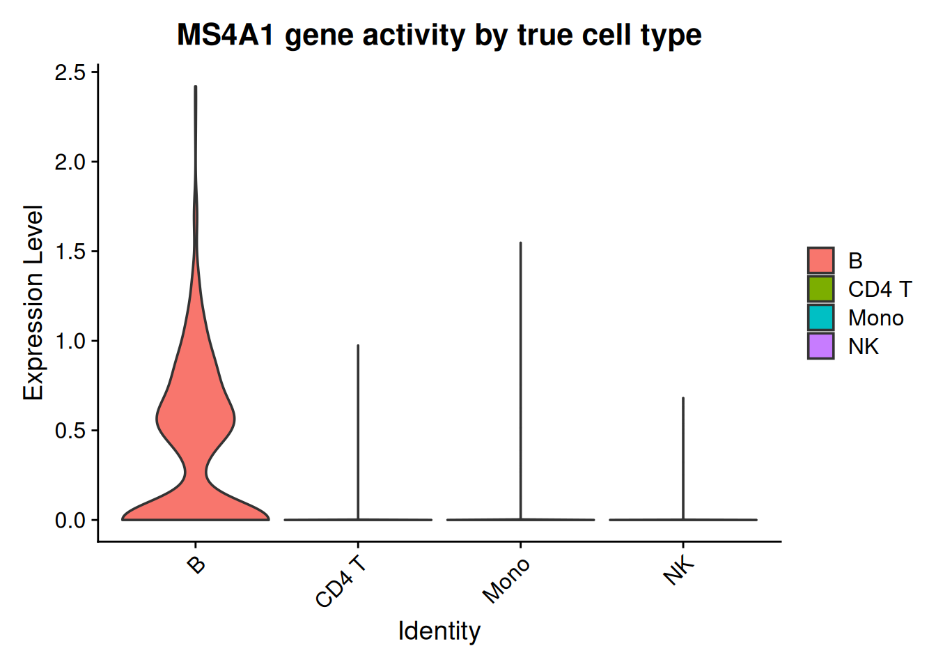
MS4A1 (a B-cell marker) gene activity, grouped by each ATAC cell’s true cell type. Activity concentrated in the true B cells confirms the peak-based proxy carries real cell-type signal before we rely on it for transfer.
41.5.3 Transfer the labels
Both datasets now live in gene space — the RNA reference in real expression, the ATAC query in gene activity — so we can finally find anchors and move labels. This is two steps: find the anchors, then transfer along them.
FindTransferAnchors does the matching, and three of its arguments earn comment:
-
reference/queryplus their assays point it at RNA expression and ATACACTIVITY; -
featuresrestricts anchoring to genes that are both informative in the reference (its variable features) and present in the activity matrix — there is no value in anchoring on a gene we can’t measure on both sides; -
reduction = "cca"selects canonical correlation analysis, the cross-modality choice motivated above.
DefaultAssay(rna)  <- "RNA"
DefaultAssay(atac) <- "ACTIVITY"

anchors <- FindTransferAnchors(
  reference = rna, query = atac,
  reference.assay = "RNA", query.assay = "ACTIVITY",
  features = intersect(VariableFeatures(rna), rownames(atac[["ACTIVITY"]])),
  reduction = "cca"
)
TransferData then carries the reference’s celltype labels across those anchors: each query cell’s predicted label is a weighted vote of the anchors near it. The subtle argument is weight.reduction — how we measure “near.” We weight by the ATAC cells’ own LSI embedding (dropping component 1, as before), so neighbourhoods are judged in the query’s native, higher-quality accessibility space rather than the noisier gene-activity proxy used for anchoring.
pred <- TransferData(anchorset = anchors, refdata = rna$celltype,
                     weight.reduction = atac[["lsi"]], dims = 2:30)
Finding integration vectorsFinding integration vector weightsPredicting cell labelsatac <- AddMetaData(atac, metadata = pred)Each ATAC cell now has a predicted.id (its transferred label) and a prediction.score.max (how confident the transfer was). Figure 41.4 shows the transferred labels on the ATAC cells’ own UMAP, beside the truth:
p1 <- DimPlot(atac, reduction = "umap.atac", group.by = "predicted.id", label = TRUE, repel = TRUE) +
  ggtitle("Transferred labels (from ATAC)") + NoLegend()
p2 <- DimPlot(atac, reduction = "umap.atac", group.by = "truth", label = TRUE, repel = TRUE) +
  ggtitle("True labels (from paired RNA)") + NoLegend()
p1 + p2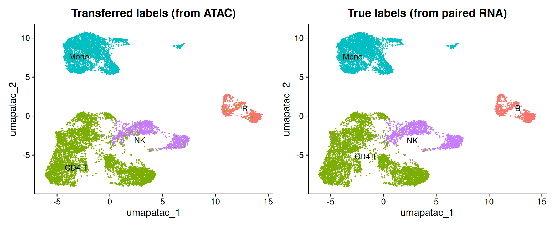
41.6 How much did we lose? Grading against the truth
Because every ATAC cell’s true type is known, we can score the transfer directly. The headline number is the fraction of cells whose transferred label matches the truth:
accuracy <- mean(atac$predicted.id == as.character(atac$truth))
round(accuracy, 3)
[1] 0.977A single accuracy hides where the method succeeds and fails, though, and that pattern is the real lesson. A confusion matrix — true type in rows, predicted type in columns, each row scaled to sum to 1 — shows exactly which types transfer cleanly and which get confused for each other (Figure 41.5):
cm <- table(truth = atac$truth, predicted = atac$predicted.id)
cm.norm <- sweep(cm, 1, rowSums(cm), "/")
cm.df <- as.data.frame(cm.norm)

ggplot(cm.df, aes(predicted, truth, fill = Freq)) +
  geom_tile(color = "grey90") +
  geom_text(aes(label = ifelse(Freq >= 0.01, sprintf("%.2f", Freq), "")), size = 3) +
  scale_fill_gradient(low = "white", high = "#2166ac", limits = c(0, 1), name = "row\nfraction") +
  labs(x = "predicted from ATAC", y = "true (from RNA)") +
  coord_equal() +
  theme_minimal(base_size = 11) +
  theme(axis.text.x = element_text(angle = 45, hjust = 1))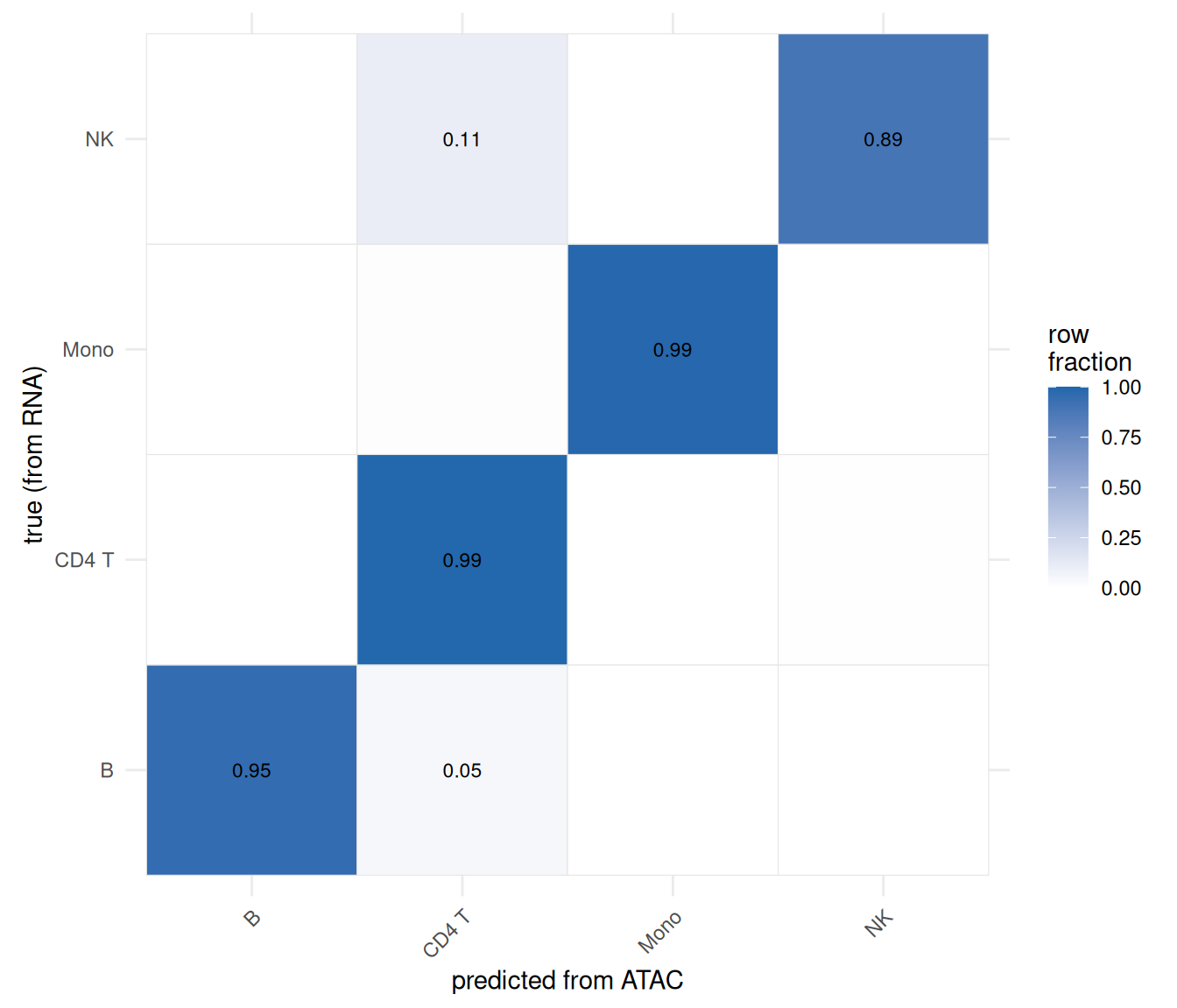
This is the “information loss” made concrete. With paired multiome data (previous chapter), every one of these cells had its RNA and ATAC read together, and cell type was never in doubt. Throwing away the pairing and reconstructing the labels from accessibility alone costs us the cells in the off-diagonal — and that cost is not spread evenly. It concentrates exactly where you’d predict: among rare populations (few anchors to lean on) and transcriptionally similar types (whose distinguishing genes are precisely the ones a coarse gene-body proxy smears together). The strongly distinct, abundant types come through nearly intact.
Two levers would narrow the gap, and both point back to earlier discussions: a better gene-activity model (the distance-weighted or co-accessibility variants in Figure 41.1, which recover distal regulatory signal the gene-body sum discards), and, if available, the fragment file (enabling the full Signac::GeneActivity() and richer features). Neither makes unpaired analysis as good as paired — but the gap is a quantity you can now measure for your own data, rather than guess at.
41.7 Summary
- Diagonal (unpaired) integration has no cell correspondence and two different feature spaces; label transfer solves it by projecting both datasets into a shared gene space and carrying labels from an annotated reference to a query.
- Gene activity is the bridge — a proxy for expression built from nearby accessibility. Methods (Figure 41.1) differ in how far they reach and how they weight distance; we used the transparent, fragment-free gene-body + promoter sum, at the cost of distal enhancers.
- Anchors (mutual nearest neighbors across datasets, found with CCA) are the conduit along which labels travel (Stuart et al. 2019).
- By un-pairing a multiome dataset we kept an answer key, letting us measure the information lost going from paired to unpaired — loss that concentrates in rare and transcriptionally similar cell types, and that a better gene-activity model or fragment-level data would partly recover.