download.file('https://raw.githubusercontent.com/seandavi/ITR/master/BRFSS-subset.csv',
destfile = 'BRFSS-subset.csv')17 Case Study: Behavioral Risk Factor Surveillance System
The Behavioral Risk Factor Surveillance System (BRFSS) is a large health survey run every year by the U.S. Centers for Disease Control and Prevention (CDC). Each year it phones hundreds of thousands of adults and asks about their health behaviors, chronic conditions, and use of preventive care. Public-health researchers lean on it to track risk factors, shape policy, and judge whether prevention programs are working.
In this chapter you take on the role of one of those researchers. You’ll work with a small slice of the BRFSS data and walk it through a full exploratory data analysis (EDA): load it, look at it, summarize it, plot it, and ask whether the variables relate to one another. EDA is the first thing you do with any new dataset — before any fancy modeling — because it’s how you learn the shape of your data and catch problems early. By the end you’ll go one step further and fit a simple statistical model to a question the data can actually answer.
Everything here uses base R — no extra packages — so you can follow along on a fresh R install.
17.1 What you’ll learn
- Download a dataset and load a CSV into R with
download.file()andread.csv(). - Inspect a data frame’s size and structure with
head(),dim(), andsummary(). - Visualize single variables with
hist()andboxplot(), and pairs of variables withplot(). - Measure the strength of a linear relationship with
cor(), and handle the missing-value trap that makes it returnNA. - Compare a measurement between two groups with a
t.test(), and fit and read a simple linear regression withlm().
17.2 Loading the dataset
First you need the data. You can download it from this link by hand, or — better — let R fetch it for you straight from the command line. The download.file() function takes a URL and a local filename to save it under:
That writes a file called BRFSS-subset.csv into your working directory. Now you point R at that file and read it in with read.csv(), storing the result in a data frame called brfss:
path <- "BRFSS-subset.csv"
stopifnot(file.exists(path))
brfss <- read.csv(path)
The stopifnot(file.exists(path)) line is a small safety check: if the file isn’t where you said it is, R stops immediately with a clear message instead of failing in some confusing way two steps later.
TipWorking interactively? Let R pop up a file picker
If you downloaded the file by hand and aren’t sure of its exact path, you can let R open a file-chooser dialog instead of typing the path:
path <- file.choose()    # opens a dialog; navigate to BRFSS-subset.csv
brfss <- read.csv(path)
That’s handy when you’re poking around interactively, but for a script or a reproducible document you want a fixed path like the one above so it runs the same way every time.
17.3 Inspecting the data
Whenever you load a dataset, your very first move should be to look at it. Start with head(), which prints the first six rows:
head(brfss) Age Weight Sex Height Year
1 31 48.98798 Female 157.48 1990
2 57 81.64663 Female 157.48 1990
3 43 80.28585 Male 177.80 1990
4 72 70.30682 Male 170.18 1990
5 31 49.89516 Female 154.94 1990
6 58 54.43108 Female 154.94 1990That gives you a feel for what each column holds and what type of value it is. Here you can see an Age, a Weight, a Height, a Sex, and a Year.
Next, check how big the dataset is with dim(), which reports the number of rows and columns:
dim(brfss)[1] 20000 5Knowing the size matters: it tells you whether you have a handful of records or many thousands, which shapes what analyses make sense.
17.4 Summary statistics
Now that you know the structure, get a quick numeric overview of every column at once with summary():
summary(brfss) Age Weight Sex Height
Min. :18.00 Min. : 34.93 Length :20000 Min. :105.0
1st Qu.:36.00 1st Qu.: 61.69 N.unique : 2 1st Qu.:162.6
Median :51.00 Median : 72.57 N.blank : 0 Median :168.0
Mean :50.99 Mean : 75.42 Min.nchar: 4 Mean :169.2
3rd Qu.:65.00 3rd Qu.: 86.18 Max.nchar: 6 3rd Qu.:177.8
Max. :99.00 Max. :278.96 Max. :218.0
NAs :139 NAs :649 NAs :184
Year
Min. :1990
1st Qu.:1990
Median :2000
Mean :2000
3rd Qu.:2010
Max. :2010
For each numeric column (Age, Weight, Height) this prints the minimum, first quartile, median, mean, third quartile, and maximum. For text/categorical columns you get a simpler count. Two things to notice right away: the Weight and Height columns list a number of NA’s (missing values), and the spread between the median and the maximum hints at the shape of each distribution. Both of those observations will matter shortly.
17.5 Visualizing single variables
Numbers in a summary table only take you so far. A picture of a single variable — its distribution — tells you far more about its shape, center, and spread. Start with a histogram of Age using hist():
hist(brfss$Age, main = "Age Distribution",
     xlab = "Age", col = "lightblue")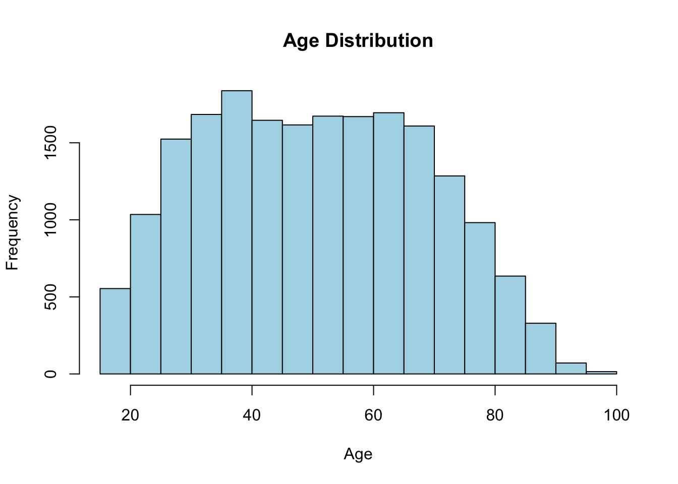
Each bar counts how many respondents fall in that age range. You can read the center, the spread, and whether the distribution is roughly symmetric or lopsided straight off the picture.
TipA function has many options — read its help page
hist() has many options: the number of bins, the bar color, the title, the axis labels, and more. You can pull up the full list any time by typing ?hist in the R console.
This is a habit worth building for every function you use. The documentation for any function f is one keystroke away with ?f or help("f"), and it’s the fastest way to learn what a function can do.
Next, compare a variable across groups. A boxplot is perfect for this. Here you compare the Weight distribution between the two sexes. The formula Weight ~ Sex reads as “weight broken down by sex”:
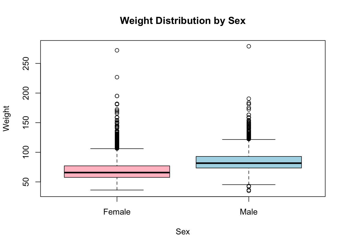
Each box spans the middle 50% of weights, the thick line is the median, and the whiskers reach out toward the extremes. At a glance you can see whether one group tends to weigh more than the other and whether the spreads differ.
17.6 Analyzing relationships between variables
So far you’ve looked at variables one at a time. EDA gets really interesting when you ask whether two variables move together. Start with a scatterplot of age against weight using plot():
plot(brfss$Age, brfss$Weight, main = "Scatterplot of Age and Weight",
     xlab = "Age", ylab = "Weight", col = "darkblue")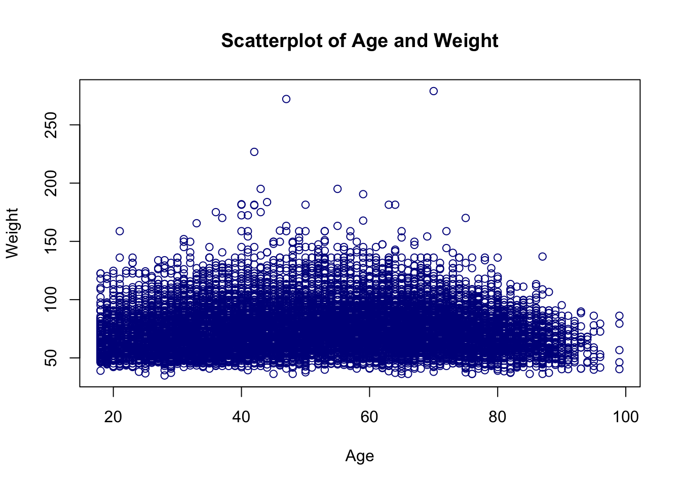
Each point is one respondent. A cloud with no obvious slope means little relationship; a tilted, tightening band means the two variables tend to rise or fall together.
To put a single number on that, compute the correlation coefficient with cor(). It runs from −1 (perfect negative relationship) through 0 (none) to +1 (perfect positive relationship):
cor(brfss$Age, brfss$Weight)[1] NAThat’s not a number — it’s NA. This is one of the most common surprises in R, so it’s worth pausing on.
Remember those NA’s the summary() flagged in the Weight column? By default cor() refuses to guess what a missing value should be, so if any pair has a missing value the whole result comes back NA. A quick look at help("cor") points to the fix: the use argument. Setting use = "complete.obs" tells cor() to drop the rows with missing values and compute the correlation on the rest.
cor(brfss$Age, brfss$Weight, use = "complete.obs")[1] 0.02699989Now you get a real number. It’s small and positive, telling you age and weight are only weakly related in this dataset.
17.7 Comparing two groups: a t-test
EDA naturally raises questions that a picture alone can’t settle. Here’s one: the BRFSS subset spans two survey years, 1990 and 2010. Did the average weight of female respondents change between those years?
R read the Year column as a plain integer, but for grouping it’s really a category with two levels. Convert it to a factor so R treats it that way:
brfss$Year <- factor(brfss$Year)Now pull out just the female respondents into their own data frame so you can compare them across years:
brfssFemale <- brfss[brfss$Sex == "Female", ]
summary(brfssFemale)
Age Weight Sex Height Year
Min. :18.00 Min. : 36.29 Length :12039 Min. :105.0 1990:5718
1st Qu.:37.00 1st Qu.: 57.61 N.unique : 1 1st Qu.:157.5 2010:6321
Median :52.00 Median : 65.77 N.blank : 0 Median :163.0
Mean :51.92 Mean : 69.05 Min.nchar: 6 Mean :163.3
3rd Qu.:67.00 3rd Qu.: 77.11 Max.nchar: 6 3rd Qu.:168.0
Max. :99.00 Max. :272.16 Max. :200.7
NAs :103 NAs :560 NAs :140 A boxplot of weight by year shows the comparison at a glance. The formula Weight ~ Year again reads “weight broken down by year”:
plot(Weight ~ Year, brfssFemale)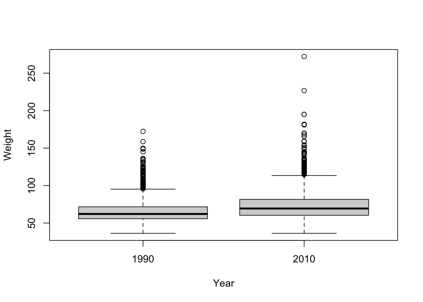
The 2010 box looks shifted up from the 1990 box — average weight appears higher in the later year. But “appears higher” isn’t an answer. To decide whether that gap is larger than you’d expect from chance alone, use a two-sample t-test. (We cover the t-test in depth in Section 22.6; here we just put it to work.)
t.test(Weight ~ Year, brfssFemale)
    Welch Two Sample t-test

data:  Weight by Year
t = -27.133, df = 11079, p-value < 2.2e-16
alternative hypothesis: true difference in means between group 1990 and group 2010 is not equal to 0
95 percent confidence interval:
 -8.723607 -7.548102
sample estimates:
mean in group 1990 mean in group 2010
          64.81838           72.95424
Read the output from the bottom up. The two group means show 2010 females weigh more on average than 1990 females. The p-value is tiny — far below the usual 0.05 threshold — so the difference is statistically significant: a gap this large is very unlikely to be a fluke of sampling. The confidence interval for the difference doesn’t include zero, telling the same story. You can now say, with evidence, that average female weight was higher in 2010 than in 1990.
17.8 Fitting a model: weight and height
A t-test compares groups. A different kind of question asks how one continuous variable depends on another: for 2010 males, how does weight change with height? That’s a job for linear regression.
First, subset to 2010 males with subset(), then look at the pieces:
      Age            Weight              Sex           Height      Year
 Min.   :18.00   Min.   : 36.29   Length   :3679   Min.   :135   1990:   0
 1st Qu.:45.00   1st Qu.: 77.11   N.unique :   1   1st Qu.:173   2010:3679
 Median :57.00   Median : 86.18   N.blank  :   0   Median :178
 Mean   :56.25   Mean   : 88.85   Min.nchar:   4   Mean   :178
 3rd Qu.:68.00   3rd Qu.: 99.79   Max.nchar:   4   3rd Qu.:183
 Max.   :99.00   Max.   :278.96                    Max.   :218
 NAs    :30      NAs    :49                        NAs    :31
Look at each variable on its own first, then look at the relationship:
hist(brfss2010Male$Weight)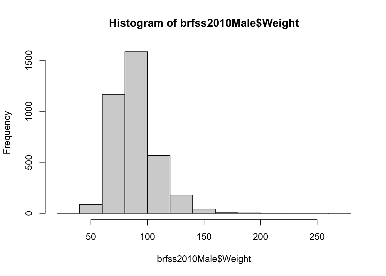
hist(brfss2010Male$Height)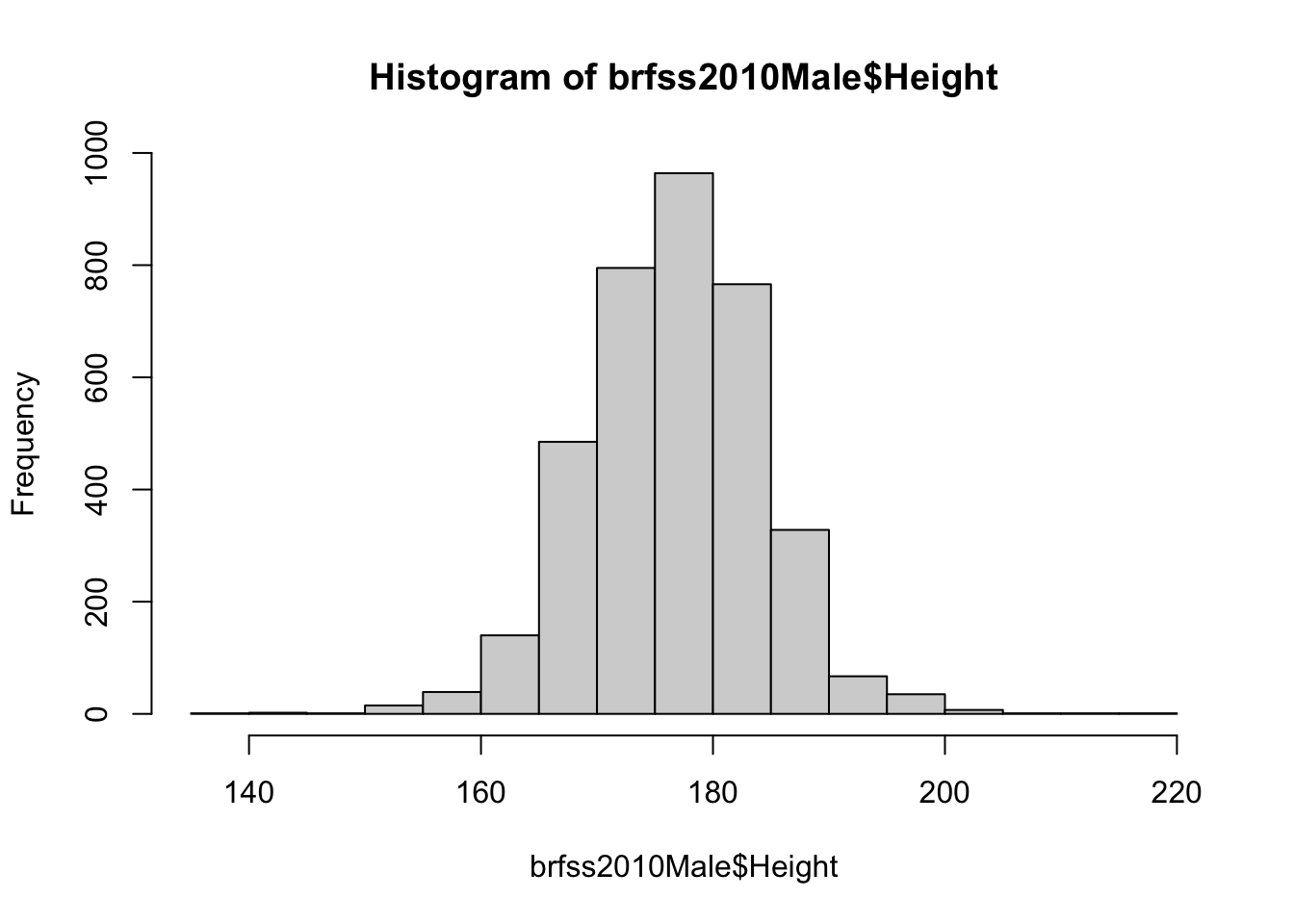
plot(Weight ~ Height, brfss2010Male)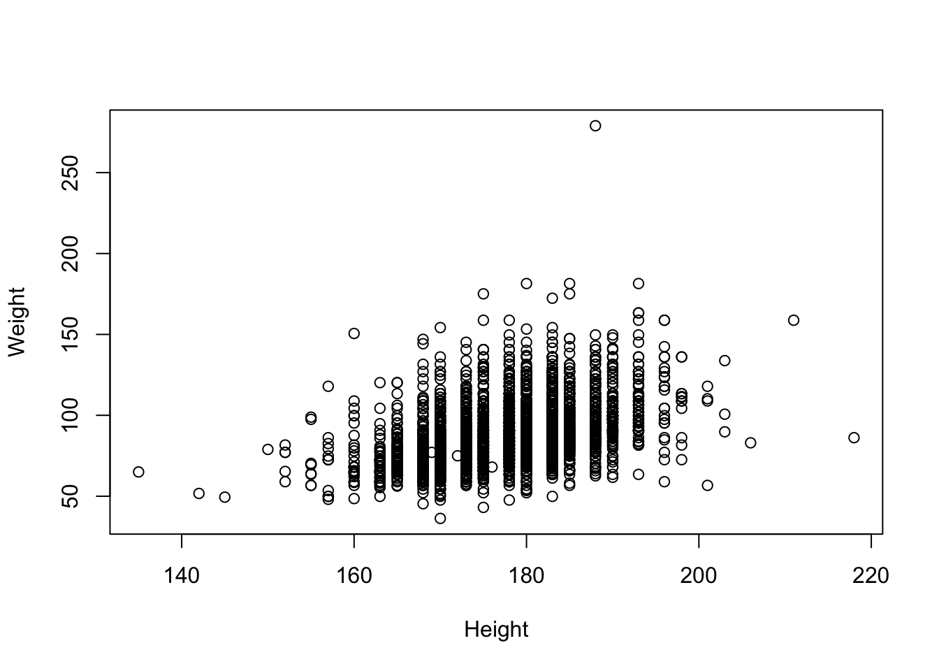
The scatterplot shows the expected upward trend: taller men tend to weigh more. Now quantify that trend by fitting a straight line through the cloud with lm() (“linear model”). The formula Weight ~ Height reads “model weight as a function of height”:
fit <- lm(Weight ~ Height, brfss2010Male)
fit
Call:
lm(formula = Weight ~ Height, data = brfss2010Male)

Coefficients:
(Intercept)       Height
   -86.8747       0.9873
The printout gives two coefficients. The (Intercept) is where the line crosses zero height (not physically meaningful here, just where the math anchors the line). The Height coefficient is the slope: for each additional centimeter of height, predicted weight goes up by that many kilograms. That single number is the relationship, summarized.
You can lay out the same fit as an ANOVA table, which partitions the variability in weight and tests whether height explains a significant share of it:
anova(fit)Analysis of Variance Table
Response: Weight
Df Sum Sq Mean Sq F value Pr(>F)
Height 1 197664 197664 693.8 < 2.2e-16 ***
Residuals 3617 1030484 285
---
Signif. codes: 0 '***' 0.001 '**' 0.01 '*' 0.05 '.' 0.1 ' ' 1The small p-value on the Height row confirms what the scatterplot suggested: height explains a statistically significant amount of the variation in weight.
To see the fitted model, redraw the scatterplot and superimpose the regression line with abline(), which knows how to read the line straight out of a fitted model object:
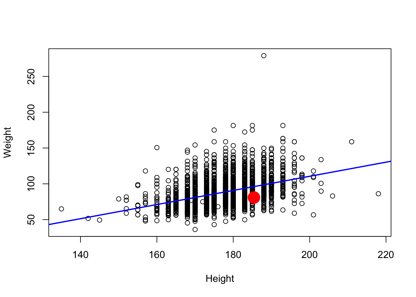
The blue line is the model’s best guess at average weight for any given height. The red dot is one person’s height and weight (converted to centimeters and kilograms); swap in your own numbers to see where you’d fall relative to the trend.
NoteReading the model’s diagnostics
A fitted model is a noun; the things you can do to it are verbs (R calls them methods). When you call plot() on a linear model, R quietly routes it to a special version, plot.lm(), that draws diagnostic plots instead of a scatterplot. The first one, Residuals vs Fitted, is the most useful: it plots the model’s errors against its predictions. You want a shapeless cloud centered on zero — any strong pattern (a curve, a funnel) is a sign the straight-line model is missing something.
plot(fit, which = 1)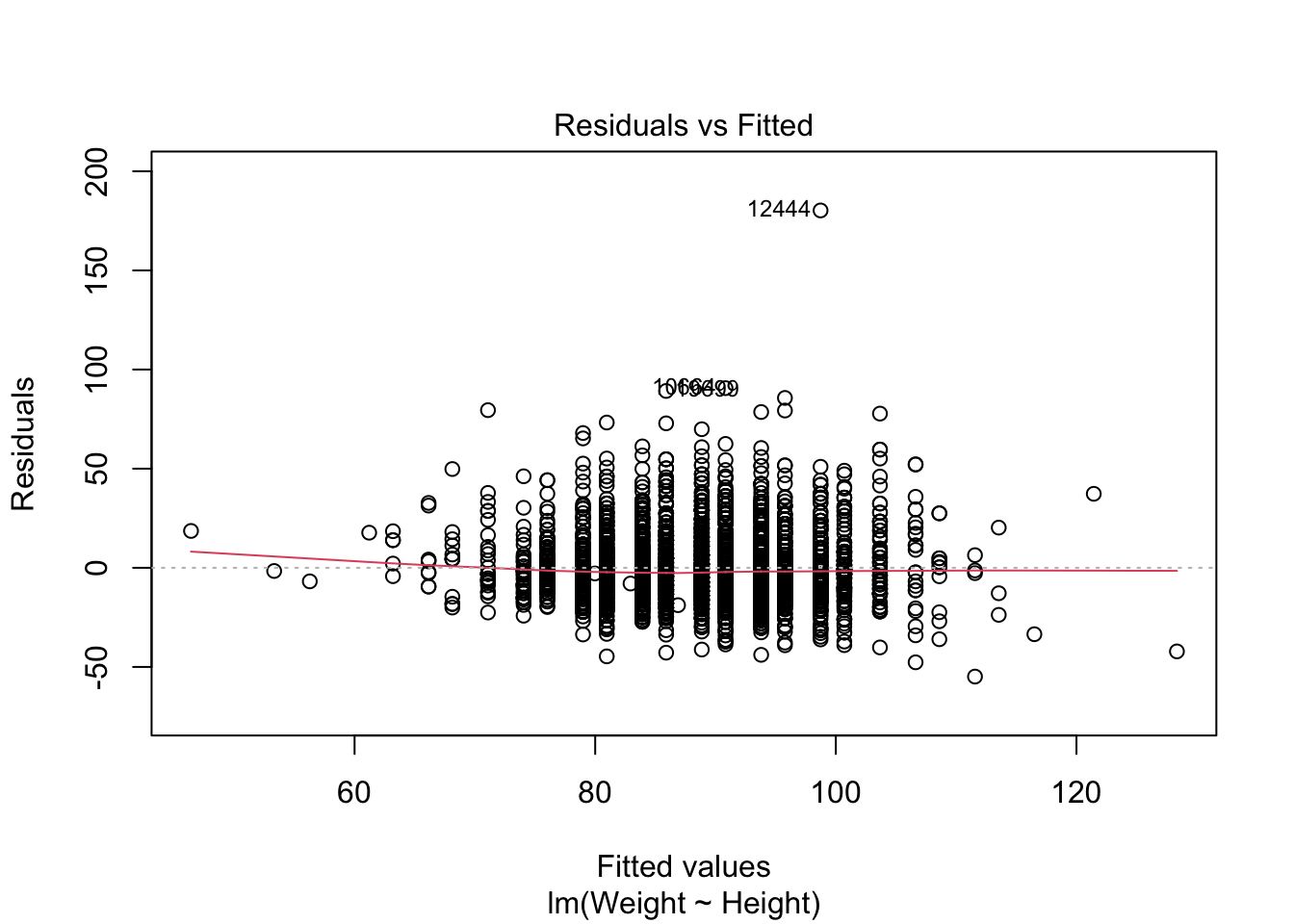
You can see the full set of diagnostics with plot(fit) (it draws four), and read about them with ?plot.lm.
Figure 17.9: Residuals-versus-fitted diagnostic plot for the weight-versus-height model.
17.9 Exercises
-
What is the mean weight in this dataset? How about the median? What is the difference between the two, and what does that tell you about the shape of the weight distribution?
Show answer
mean(brfss$Weight, na.rm = TRUE)[1] 75.42455Show answer
median(brfss$Weight, na.rm = TRUE)[1] 72.57478[1] 2.849774The mean sits above the median, which is the signature of a distribution with a long right tail — a few very heavy individuals pull the mean up. (Note the
na.rm = TRUE: just likecor(), these functions need to be told to ignore the missing values.) -
Using what you just found about the mean and median, draw a histogram of the weight distribution with
hist(). How would you describe its shape?Show answer
hist(brfss$Weight, xlab = "Weight (kg)", breaks = 30)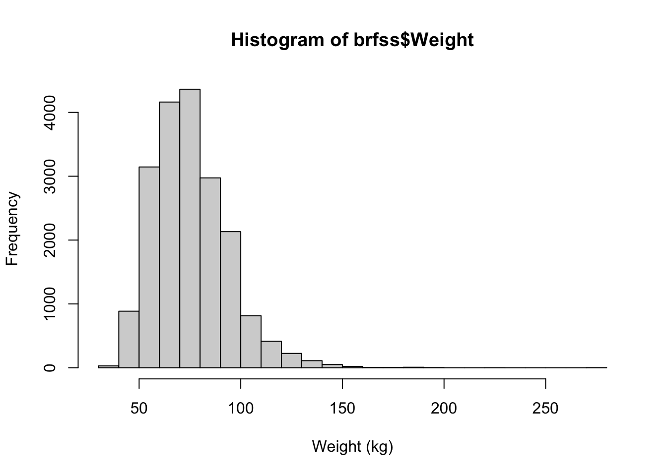
The histogram is right-skewed: most respondents cluster at lower weights with a tail stretching toward the high end — exactly what the mean-above-median result predicted.
-
Use
plot()to examine the relationship between height and weight.Show answer
plot(brfss$Height, brfss$Weight)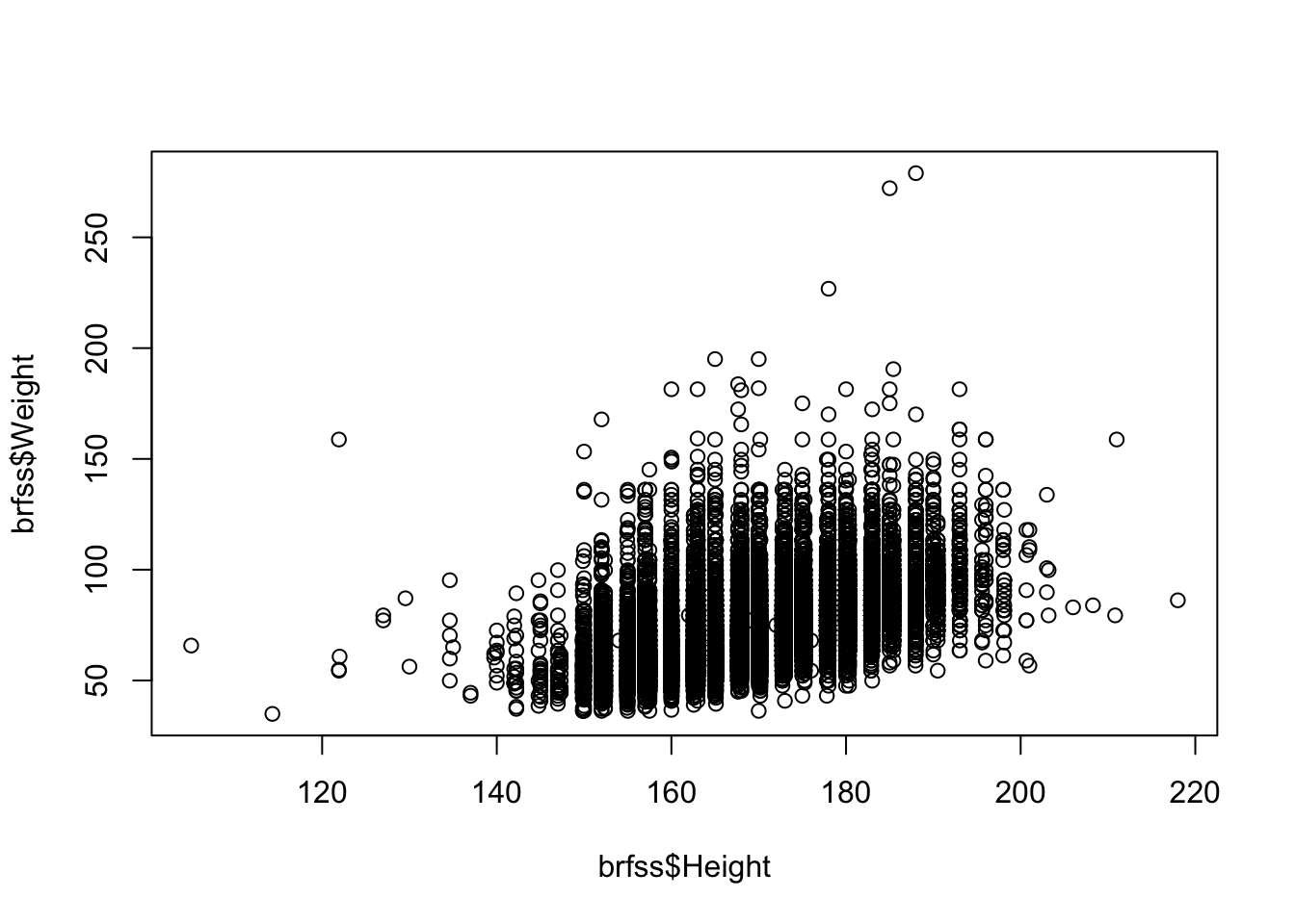
Taller people tend to be heavier, so the points drift upward to the right.
-
What is the correlation between height and weight? What does it tell you about their relationship?
Show answer
cor(brfss$Height, brfss$Weight, use = "complete.obs")[1] 0.5140928A moderate-to-strong positive correlation, confirming numerically what the scatterplot showed. (Don’t forget
use = "complete.obs"to skip the missing values.) -
Draw a histogram of the height distribution. How would you describe its shape compared to weight?
Show answer
hist(brfss$Height, xlab = "Height (cm)", breaks = 30)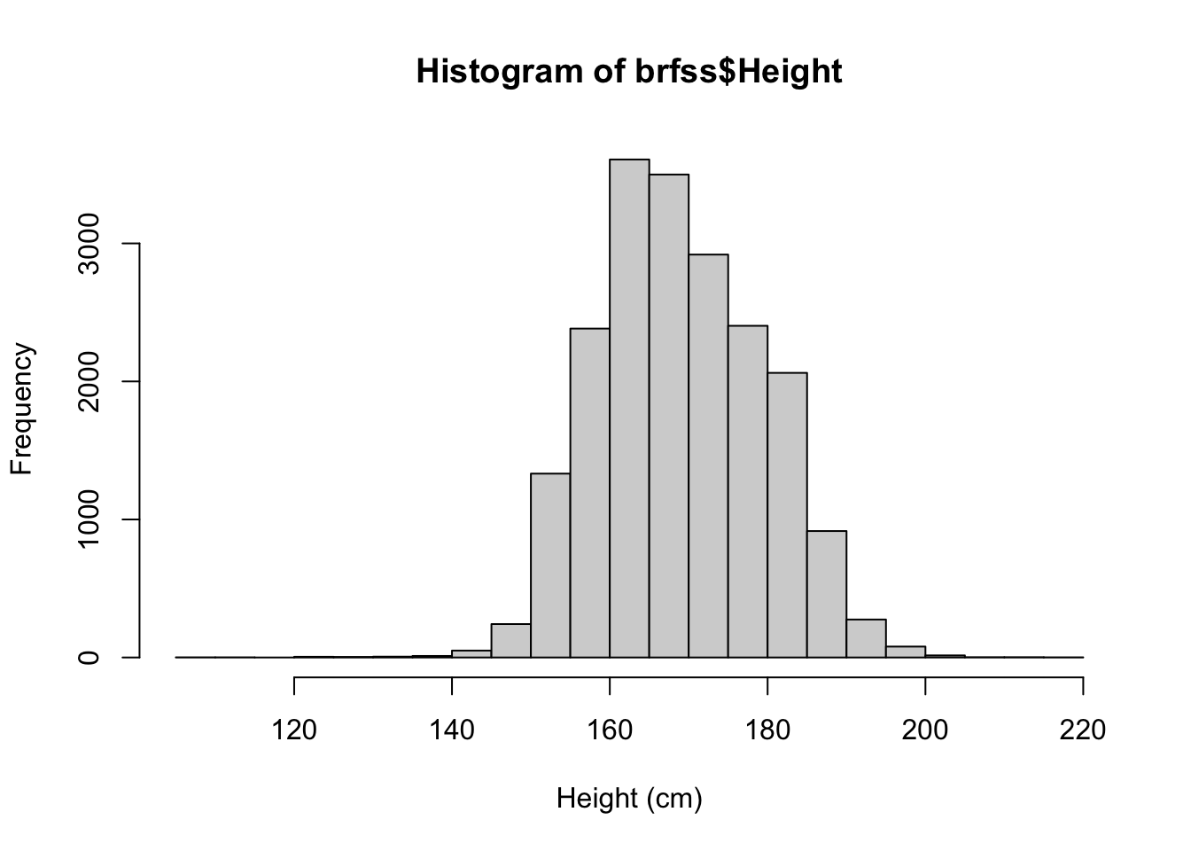
Height is far more symmetric than weight — closer to the bell-shaped normal curve, with no strong tail to either side.
17.10 Summary
You’ve now run a complete exploratory data analysis on a real public-health dataset, end to end:
- You loaded the data with
download.file()andread.csv(), and guarded the load withstopifnot(file.exists(path)). - You inspected it with
head(),dim(), andsummary(), which flagged the missing values that mattered later. - You visualized single variables with
hist()andboxplot(), and pairs of variables withplot(). - You measured a relationship with
cor()— and learned that missing values force you to adduse = "complete.obs". - You went beyond description to answer real questions: a
t.test()showed female weight rose between 1990 and 2010, and anlm()quantified how male weight rises with height.
EDA is the beginning of the data-analysis process, not the end — but it’s the part that keeps every later step honest. Knowing the shape of your data, its missing values, and its obvious relationships is what lets you choose the right model and trust the answer it gives. For more on the t-test you used here, see Section 22.6.