install.packages(c("ggplot2", "palmerpenguins"))18 Exploring data with ggplot2
A plot answers questions a table of numbers cannot. Does one measurement rise with another? Do two groups behave differently? Are there outliers worth a second look? ggplot2 is the package most R users reach for to ask those questions, and it does so with a small, consistent vocabulary you can combine to build almost any graphic. In this chapter you’ll start from a blank canvas and, one layer at a time, build up a single plot that shows four variables at once.
For our running example we’ll use the penguins dataset from the palmerpenguins package. It records body measurements — bill length and depth, flipper length, and body mass — for 344 penguins of three species (Adélie, Chinstrap, and Gentoo) living on three islands in the Palmer Archipelago near Antarctica. It’s a small, tidy table of real measurements, which makes it a friendly stand-in for the kind of morphometric and phenotype data you’ll meet throughout biology. (The data are released into the public domain under a CC0 license by Allison Horst, Alison Hill, and Kristen Gorman.)
18.1 What you’ll learn
- Initialize a plot with
ggplot()and tell it which data frame to use. - Add geometric layers (points, lines) with
geom_*()functions. - Map variables to aesthetics such as the x-axis, y-axis, and colour, and use colour to group observations.
- Adjust how variables are displayed with
scale_*()functions. - Split a plot into small multiples with
facet_wrap(). - Add informative labels and titles with
labs(), and restyle the plot with atheme_*().
NoteThe grammar of graphics
ggplot2 is built on an idea called the grammar of graphics: a plot is assembled from independent pieces you stack with +. The pieces are always the same — data (the data frame), aesthetics (which variable maps to x, to y, to colour, …), geoms (the shapes that get drawn: points, lines, bars), and optional scales, facets, labels, and themes. You don’t memorize a separate function for every chart type; you learn this handful of building blocks and recombine them. That is why the same code patterns produce a scatterplot here and, with a different data frame, a plot of gene-expression values.
To get started, you need to install and load the packages we’ll use. If you haven’t installed them yet, you can do so with:
Once installed, load them:
Attaching package: 'palmerpenguins'The following objects are masked from 'package:datasets':
penguins, penguins_rawThe penguins data frame comes with the package, so there’s no file to read in. A handful of penguins are missing one or another measurement (a scale that wasn’t read, a bird that wasn’t sexed), and those gaps show up as NA. To keep our first plots tidy and free of distracting warnings, we’ll work with the rows that have a complete set of values:
# keep only rows with no missing values
penguins <- penguins[complete.cases(penguins), ]
In RStudio you can use the View() function to inspect the dataset in a spreadsheet-style window. We don’t run it here because it only works in interactive RStudio, not when the book is rendered:
# view the dataset
View(penguins)
Next, we’ll add a variable that splits the penguins into two weight groups. We’ll call a penguin “heavy” if its body mass is at least 4200 grams and “light” otherwise. This kind of derived, categorical variable is handy for grouping later on:
# create a body-size category
penguins$size_class <- ifelse(penguins$body_mass_g >= 4200,
                              "heavy", "light")
When you build a ggplot2 graph, only the first two pieces below — ggplot() and at least one geom_*() — are required. The rest are optional and can appear in any order.
18.2 ggplot()
The ggplot() function initializes the plot. It takes a data frame as its first argument and can also include aesthetic mappings (aes()) that define how variables in the data map to visual properties such as the x and y axes, colour, and size.
Why is Figure 18.1 showing an empty panel? Because we haven’t added any layers yet. The ggplot() function only sets up the canvas; it doesn’t draw anything until we add a geom. We told it to map flipper_length_mm to the x-axis and body_mass_g to the y-axis, but we haven’t yet said what shape to put on the graph.
18.3 geom_*()
The geom_*() functions add layers to the plot. Each one corresponds to a specific geometric object: geom_point() adds points, geom_line() adds lines, geom_bar() adds bars, and so on. Let’s add points.
# add points to the plot
ggplot(data = penguins,
       mapping = aes(x = flipper_length_mm, y = body_mass_g)) +
  geom_point()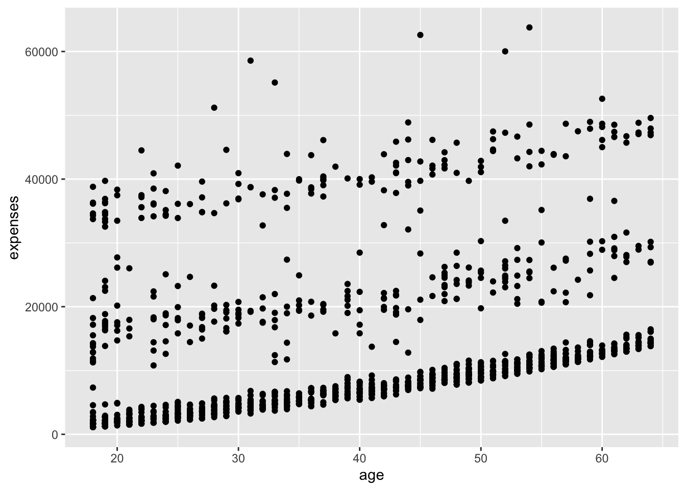
In Figure 18.2 we added points with geom_point(). The + operator stacks layers onto the plot, and the mapping argument in aes() specifies how variables map to visual properties. You can already see that heavier penguins tend to have longer flippers — body mass climbs steadily with flipper length.
A geom can take parameters (options) of its own. For geom_point(), the common ones are color, size, and alpha. These control point colour, point size, and transparency. Transparency ranges from 0 (completely transparent) to 1 (completely opaque).
# make points blue, larger, and semi-transparent
ggplot(data = penguins,
       mapping = aes(x = flipper_length_mm, y = body_mass_g)) +
  geom_point(color = "cornflowerblue",
             alpha = .7,
             size = 2)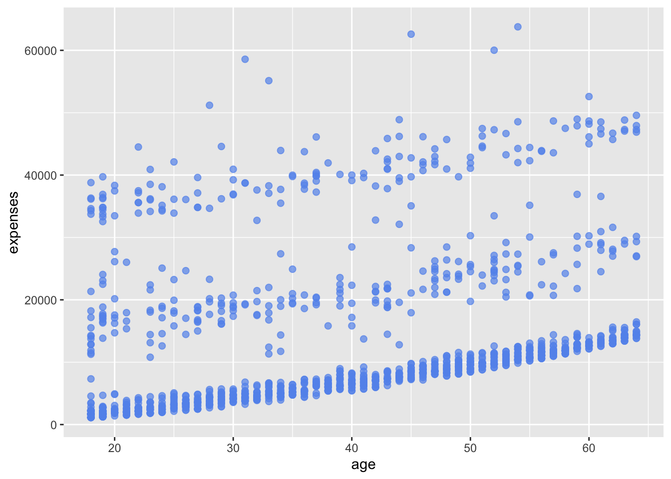
TipUse
alpha to see through crowded points
When many points land on top of one another — common with hundreds or thousands of observations — a solid plot hides how the data pile up. Setting alpha below 1 makes each point partly transparent, so dense regions render darker and sparse ones lighter. It’s the cheapest fix for an overplotted scatterplot, and it works the same way whether your points are penguins or single cells.
Next, let’s layer on a line of best fit — in other words, a regression fit. We do that with geom_smooth(). Its options control the type of line (linear, quadratic, nonparametric), the line’s thickness and colour, and whether a confidence band is shown. Here we ask for a linear regression line with method = "lm" (where lm stands for linear model).
# add a line of best fit
ggplot(data = penguins,
       mapping = aes(x = flipper_length_mm, y = body_mass_g)) +
  geom_point(color = "cornflowerblue",
             alpha = .7,
             size = 2) +
  geom_smooth(method = "lm")
`geom_smooth()` using formula = 'y ~ x'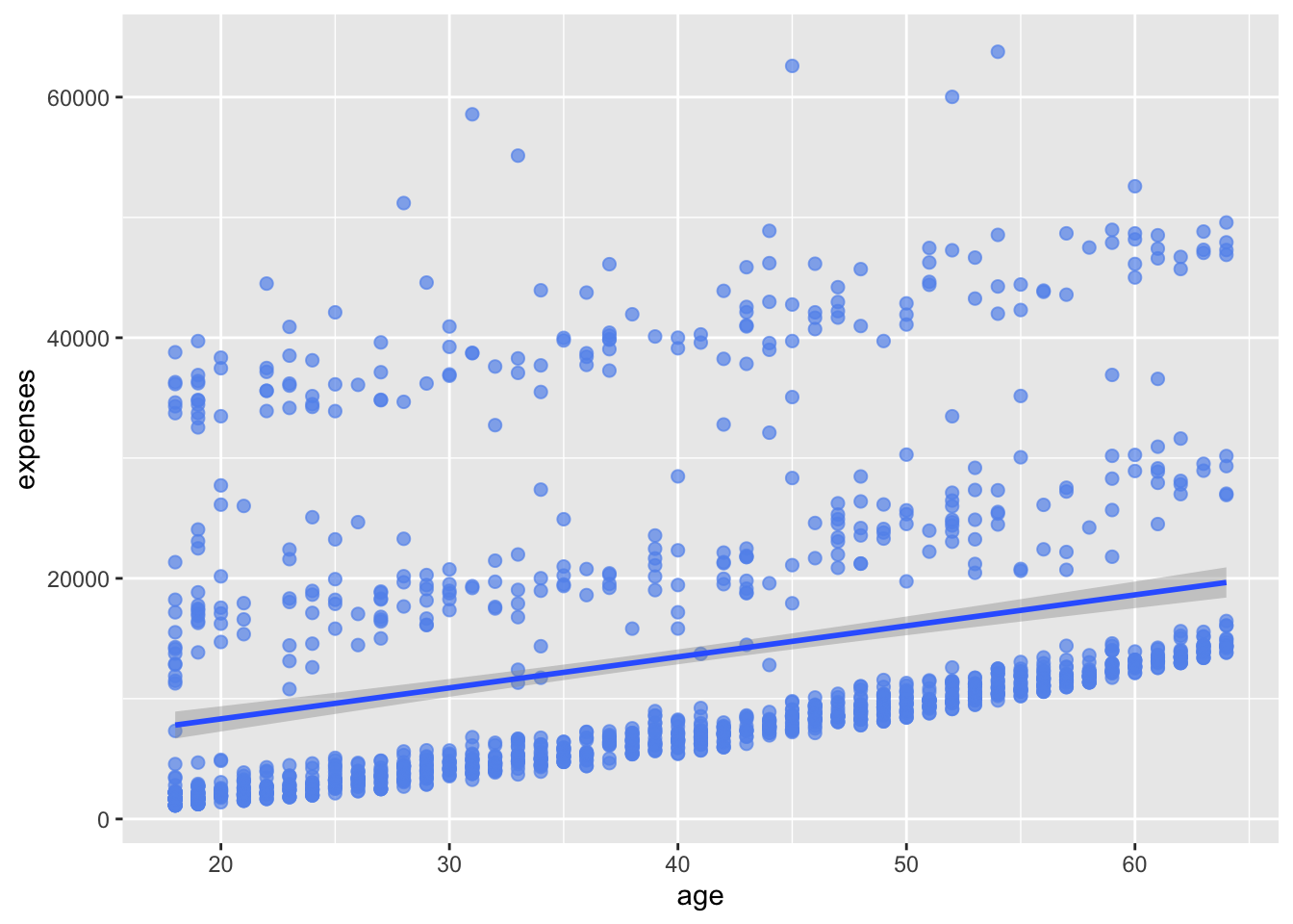
In Figure 18.4 we added a fitted line with geom_smooth(method = "lm"). The method argument chooses the type of fit; here a straight line summarizes the upward trend, and the shaded band around it is the confidence interval.
18.4 Grouping
Beyond the x and y axes, you can map groups of observations to colour, shape, size, transparency, and other visual characteristics. This lets you superimpose several groups in a single graph. Let’s add the penguin’s species and show it with colour.
# group points by species
ggplot(data = penguins,
       mapping = aes(x = flipper_length_mm, y = body_mass_g, color = species)) +
  geom_point(alpha = .7, size = 2) +
  geom_smooth(method = "lm", se = FALSE)
`geom_smooth()` using formula = 'y ~ x'
In Figure 18.5 we moved the color aesthetic into aes() and mapped it to the species variable. Because color is now part of the mapping, ggplot2 splits the data by species and draws a separate set of points and a separate fitted line for each group. A pattern that the single cloud of points hid now stands out: Gentoo penguins are noticeably larger, occupying the upper-right of the plot, while Adélie and Chinstrap penguins overlap at the lower end.
18.5 Scales
Scales control how variables are translated into the visual characteristics of the plot. Scale functions (which start with scale_) let you adjust that translation. Next we’ll change the spacing of the x and y axis tick marks and pick our own colours.
# modify the x and y axes and specify the colours to be used
ggplot(data = penguins,
       mapping = aes(x = flipper_length_mm,
                     y = body_mass_g,
                     color = species)) +
  geom_point(alpha = .5,
             size = 2) +
  geom_smooth(method = "lm",
              se = FALSE,
              linewidth = 1.5) +
  scale_x_continuous(breaks = seq(170, 240, 10)) +
  scale_y_continuous(breaks = seq(2000, 6500, 1000),
                     label = scales::comma) +
  scale_color_manual(values = c("darkorange",
                                "purple",
                                "cornflowerblue"))
`geom_smooth()` using formula = 'y ~ x'
In Figure 18.6 we used scale_x_continuous() and scale_y_continuous() to set the axis tick marks. The breaks argument specifies where the ticks fall, and the label argument formats the y-axis values with comma separators using scales::comma. scale_color_manual() then assigns our chosen colours to the three species. (Note that line thickness in geom_smooth() is set with linewidth, the current argument for the width of a line geom.)
18.6 Facets
Faceting splits a plot into small multiples — one panel per level of a categorical variable. This is handy for comparing relationships across groups. The facet_wrap() function does this; the ~size_class formula tells it to make one panel for each value of the size_class variable.
# reproduce the plot for heavy and light penguins
ggplot(data = penguins,
       mapping = aes(x = flipper_length_mm,
                     y = body_mass_g,
                     color = species)) +
  geom_point(alpha = .5) +
  geom_smooth(method = "lm",
              se = FALSE) +
  scale_x_continuous(breaks = seq(170, 240, 10)) +
  scale_y_continuous(breaks = seq(2000, 6500, 1000),
                     label = scales::comma) +
  scale_color_manual(values = c("darkorange",
                                "purple",
                                "cornflowerblue")) +
  facet_wrap(~size_class)
`geom_smooth()` using formula = 'y ~ x'
In Figure 18.7, facet_wrap(~size_class) produced separate panels for heavy and light penguins, letting us compare the flipper-versus-mass relationship side by side. We have now packed four dimensions of data — flipper length, species, body-size class, and body mass — into a single two-dimensional figure.
18.7 Labels and titles
Labels and titles make a plot self-explanatory. The labs() function sets the axis labels, the legend title, and the plot title, subtitle, and caption.
# add informative labels
ggplot(data = penguins,
       mapping = aes(x = flipper_length_mm,
                     y = body_mass_g,
                     color = species)) +
  geom_point(alpha = .5) +
  geom_smooth(method = "lm",
              se = FALSE) +
  scale_x_continuous(breaks = seq(170, 240, 10)) +
  scale_y_continuous(breaks = seq(2000, 6500, 1000),
                     label = scales::comma) +
  scale_color_manual(values = c("darkorange",
                                "purple",
                                "cornflowerblue")) +
  facet_wrap(~size_class) +
  labs(title = "Body mass increases with flipper length across penguin species",
       subtitle = "Palmer Archipelago penguins, 2007-2009",
       x = "Flipper length (mm)",
       y = "Body mass (g)",
       color = "Species")
`geom_smooth()` using formula = 'y ~ x'
In Figure 18.8 we used labs() to add a title, subtitle, and clearer axis and legend labels. A reader can now understand the figure without hunting for context elsewhere.
18.8 Theming
Finally, you can fine-tune the plot’s overall appearance with a theme. Theme functions (which start with theme_) control background colours, fonts, grid lines, legend placement, and other non-data features. Let’s switch to a cleaner look.
# use a minimalist theme
ggplot(data = penguins,
       mapping = aes(x = flipper_length_mm,
                     y = body_mass_g,
                     color = species)) +
  geom_point(alpha = .5) +
  geom_smooth(method = "lm",
              se = FALSE) +
  scale_x_continuous(breaks = seq(170, 240, 10)) +
  scale_y_continuous(breaks = seq(2000, 6500, 1000),
                     label = scales::comma) +
  scale_color_manual(values = c("darkorange",
                                "purple",
                                "cornflowerblue")) +
  facet_wrap(~size_class) +
  labs(title = "Body mass increases with flipper length across penguin species",
       subtitle = "Palmer Archipelago penguins, 2007-2009",
       x = "Flipper length (mm)",
       y = "Body mass (g)",
       color = "Species") +
  theme_minimal()
`geom_smooth()` using formula = 'y ~ x'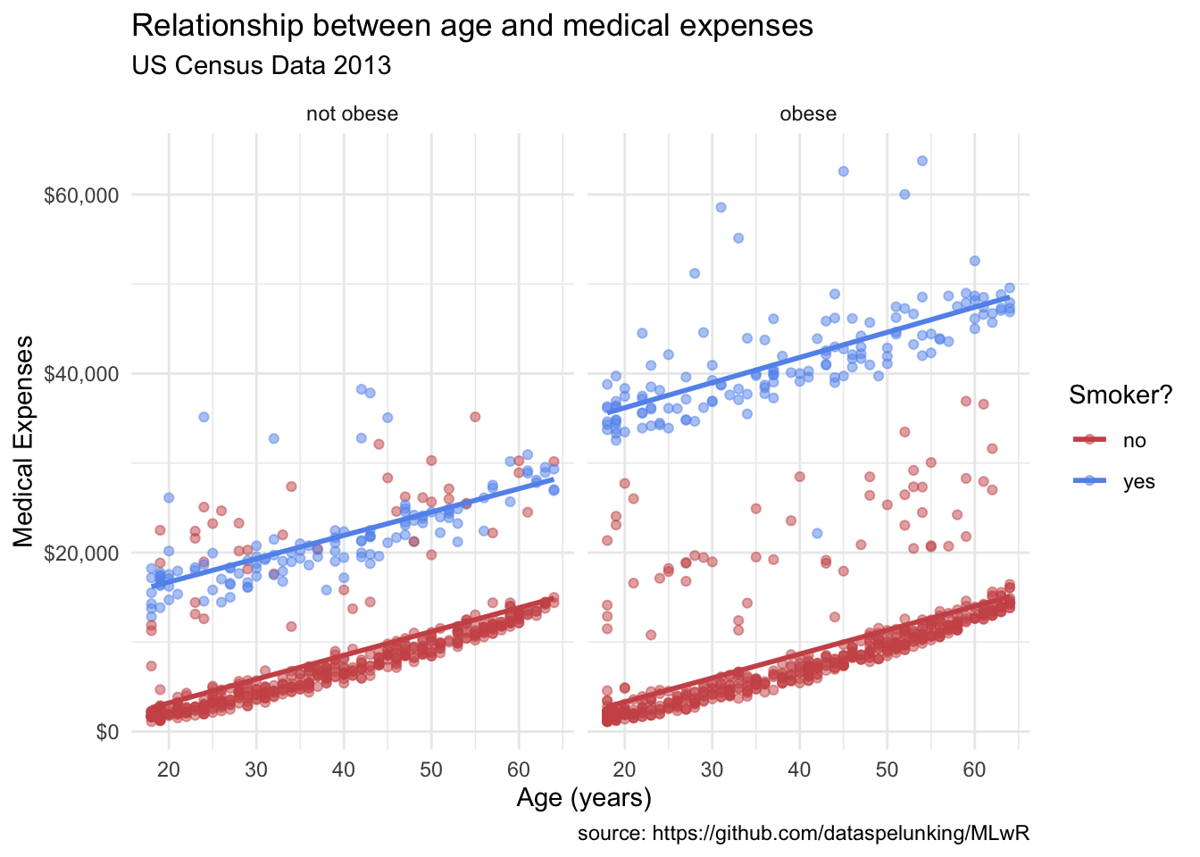
18.9 Exercises
The penguin data is a convenient, compact playground, but every technique below is exactly what you’d use to plot a biological dataset — swap body_mass_g for a gene’s expression level and species for a treatment group and the code is unchanged. Try these on the penguins data frame you loaded above.
-
A boxplot by group. Instead of a scatterplot, draw a boxplot of
body_mass_gsplit byspecies. Mapspeciesto the x-axis andbody_mass_gto the y-axis, and usegeom_boxplot().NoteSolutionggplot(data = penguins, mapping = aes(x = species, y = body_mass_g)) + geom_boxplot()
A boxplot is just a different geom on the same
aes()skeleton. The boxes make it obvious that Gentoo penguins are both heavier and more spread out in mass than the other two species. -
Colour by island. Make a scatterplot of
body_mass_gagainstflipper_length_mmand colour the points byisland. Addalpha = .6so crowded points stay readable.NoteSolutionggplot(data = penguins, mapping = aes(x = flipper_length_mm, y = body_mass_g, color = island)) + geom_point(alpha = .6)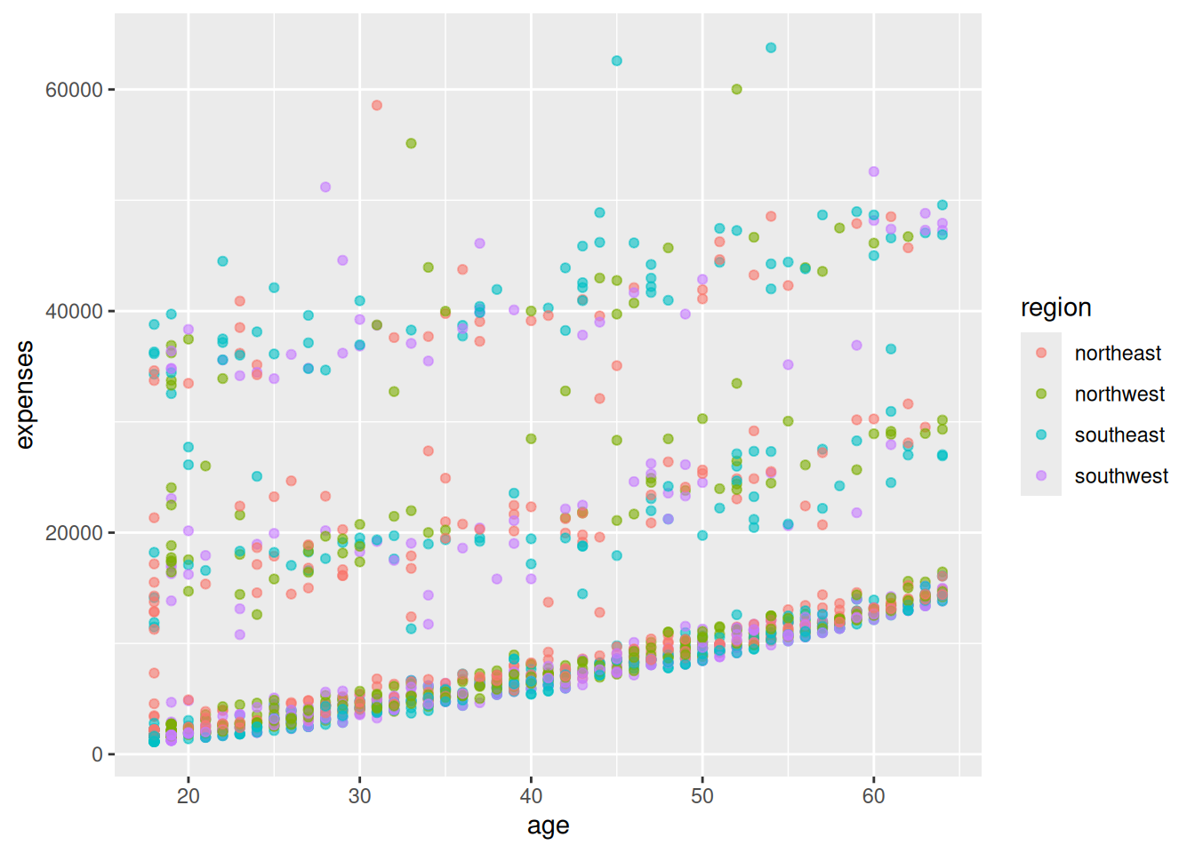
Mapping
islandtocolorinsideaes()gives each of the three islands its own colour. Because some species live on only one island, the colours separate cleanly — a hint that island and species are closely tied in this dataset. -
Facet by sex. Take the flipper-versus-mass scatterplot and split it into one panel per
sexwithfacet_wrap().NoteSolutionggplot(data = penguins, mapping = aes(x = flipper_length_mm, y = body_mass_g)) + geom_point(alpha = .5) + facet_wrap(~sex)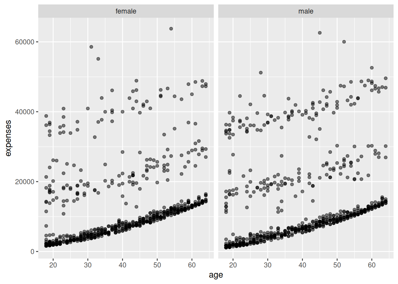
facet_wrap(~sex)draws the same plot once for each sex. The two panels have a similar shape, but males sit a little higher and to the right, reflecting that they tend to be larger. -
Add a fitted line. Starting from the plot in Exercise 3, add a linear fit with
geom_smooth(method = "lm")so each panel gets its own trend line.NoteSolutionggplot(data = penguins, mapping = aes(x = flipper_length_mm, y = body_mass_g)) + geom_point(alpha = .5) + geom_smooth(method = "lm") + facet_wrap(~sex)`geom_smooth()` using formula = 'y ~ x'
Because faceting splits the data first,
geom_smooth()fits a separate line within each panel. Both slopes point upward and look nearly parallel, reinforcing that the flipper-mass relationship holds for both groups.
18.10 Summary
You can now build a ggplot2 graphic from the ground up. You initialized a plot with ggplot(), drew data with geom_point() and geom_smooth(), mapped variables to aesthetics and used colour to separate groups, reshaped the display with scale_*() functions, split the plot into panels with facet_wrap(), labelled it with labs(), and restyled it with theme_minimal(). Each was an independent layer added with + — the grammar of graphics in action.
Reading the final figure (Figure 18.9), it appears that:
- There is a positive linear relationship between flipper length and body mass, and the slope stays roughly constant across species and size classes.
- Gentoo penguins are larger overall, with both longer flippers and greater mass.
- The relationship is consistent: within every species and size class, longer-flippered penguins are heavier.
- A few penguins sit well above or below their species’ trend line — individual variation worth a closer look.
These findings are descriptive. They rest on a single study’s sample and involve no statistical testing to assess whether the differences could be due to chance.
For the design principles behind these plots — the data-ink ratio, colorblind-safe palettes — and specialized plot types for genomics such as UpSet plots and heatmaps, see A self-guided tour of data visualization in R.