28 Worked example: predicting age from DNA methylation
How old is a tissue sample? Not the donor’s age on a birthday cake, but the biological age written into the DNA itself. It turns out you can read it off the DNA-methylation pattern: at certain sites the methylation level drifts steadily with age, and a model trained on those sites becomes an epigenetic clock. This example builds one, following the work of Naue et al. (2017).
This is the second of three worked examples. Unlike the cancer-classification example, where the target was a category, here the target — a person’s age — is a number, so this is a regression problem. We use the same mlr3 framework throughout; if you need the refresher on tasks, learners, measures, and the train/test split, see The mlr3verse and the cancer example for the general workflow. Here we keep our eyes on the biology and on how regression differs from classification.
The three core ideas from the cancer chapter all return, but each takes on a new shade once the goal is an epigenetic clock rather than a cancer label:
- The split is about validity, not just accuracy. A clock that predicts age beautifully on the very people it was trained on is worthless as a biomarker — of course it fits them, it learned them. The whole point of an epigenetic clock is to estimate the age of someone new, so the held-out test set is not a nicety here; it is the only thing that tells you whether you have built a real biomarker or an elaborate lookup table.
- Feature selection is forced on you. A methylation array measures hundreds of thousands of CpG sites, but a study has only dozens or hundreds of people. Far more features than samples — the p ≫ n regime — is the normal state of affairs in genomics, and it means selecting or limiting features is not an optional tidy-up but a requirement (see the warning below).
- The yardstick changes. Classification used accuracy and a confusion matrix. Regression has no “correct/incorrect” — instead we measure how far off the predictions are, with RMSE (typical error, in years) and R² (the fraction of the variation in age the model explains).
When the number of features p dwarfs the number of samples n, a flexible model can find some combination of CpG sites that fits the training ages perfectly by chance alone — pure memorization dressed up as signal. This is overfitting in its most dangerous form, because the training score looks fantastic. The defences are the same ones you already know: limit the features (keep only the CpG sites most associated with age), prefer simpler models, and always judge on the held-out test set. The next chapter shows a second defence — letting the model shrink its own coefficients.
28.1 What you’ll learn
- Build a regression task from a real methylation dataset with
as_task_regr(). - Fit and compare three regression learners — linear regression, a regression tree, and a random forest — through the same
mlr3calls. - Read regression diagnostic plots and a truth-versus-prediction scatter.
- Interpret R² as the fraction of variation explained (and RMSE as the typical error in years), and spot overfitting when the test R² falls below the training R².
- Explain why having far more CpG features than people (the p ≫ n problem) makes feature selection and an honest test set non-negotiable for a biomarker.
28.2 Setup
28.3 The data
The biology behind it: within each individual, the level of DNA methylation at certain sites changes steadily with age. The CpG sites whose methylation correlates most strongly with age make excellent biomarkers — and excellent features for a regression model. The data come from this Galaxy tutorial.1
1 The two files were originally published on Zenodo at https://zenodo.org/records/2545213 (test_rows_labels.csv and train_rows.csv). We keep a copy in this book’s repository and read it from the GitHub URL below, so the code runs unchanged on any machine.
# The data live in this book's GitHub repository; we read them straight from
# their URL so this code runs unchanged anywhere (no local checkout needed).
# fread() auto-detects the tab separator.
gh <- "https://raw.githubusercontent.com/seandavi/RBiocBook/main/data"
meth_age <- rbind(
    fread(file.path(gh, "methylation_age_test.csv")),
    fread(file.path(gh, "methylation_age_train.csv"))
)
A quick look at the data:
head(meth_age) RPA2_3 ZYG11A_4 F5_2 HOXC4_1 NKIRAS2_2 MEIS1_1 SAMD10_2 GRM2_9 TRIM59_5
<num> <num> <num> <num> <num> <num> <num> <num> <num>
1: 65.96 18.08 41.57 55.46 30.69 63.42 40.86 68.88 44.32
2: 66.83 20.27 40.55 49.67 29.53 30.47 37.73 53.30 50.09
3: 50.30 11.74 40.17 33.85 23.39 58.83 38.84 35.08 35.90
4: 65.54 15.56 33.56 36.79 20.23 56.39 41.75 50.37 41.46
5: 59.01 14.38 41.95 30.30 24.99 54.40 37.38 30.35 31.28
6: 81.30 14.68 35.91 50.20 26.57 32.37 32.30 55.19 42.21
LDB2_3 ELOVL2_6 DDO_1 KLF14_2 Age
<num> <num> <num> <num> <int>
1: 56.17 62.29 40.99 2.30 40
2: 58.40 61.10 49.73 1.07 44
3: 58.81 50.38 63.03 0.95 28
4: 58.05 50.58 62.13 1.99 37
5: 65.80 48.74 41.88 0.90 24
6: 70.15 61.36 33.62 1.87 43Each row is a person, each cg… column is the methylation level at one CpG site, and Age is what we want to predict. Because the target is a number, this is a regression task — so we use as_task_regr().
Before modelling, it is worth seeing the signal we are banking on. Figure 28.1 plots the four CpG sites whose methylation tracks age most closely. Each point is a person; the red line is a straight-line trend.
cpg_cols <- setdiff(names(meth_age), "Age")
cors <- sapply(cpg_cols, function(cg) cor(meth_age[[cg]], meth_age$Age))
top  <- names(sort(abs(cors), decreasing = TRUE))[1:4]
long <- do.call(rbind, lapply(top, function(cg)
  data.frame(cpg = cg, methylation = meth_age[[cg]], age = meth_age$Age)))
ggplot(long, aes(age, methylation)) +
  geom_point(alpha = 0.5, size = 0.9) +
  geom_smooth(method = "lm", se = FALSE, colour = "#b85450", linewidth = 0.9) +
  facet_wrap(~ cpg, scales = "free_y") +
  labs(x = "Chronological age (years)", y = "Methylation level") +
  theme_bw()
`geom_smooth()` using formula = 'y ~ x'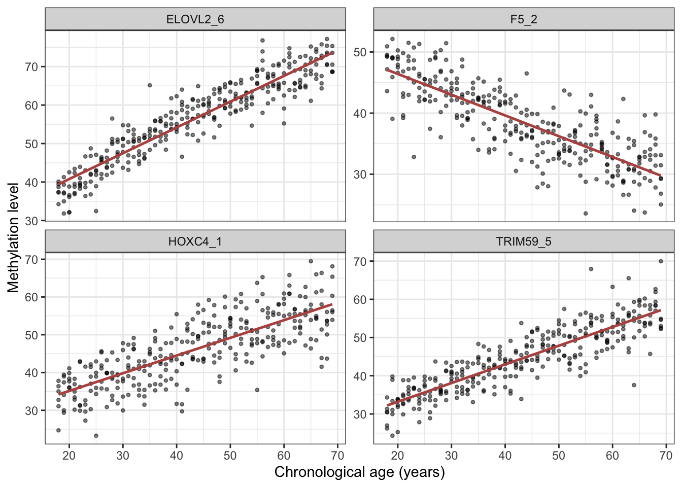
task <- as_task_regr(meth_age, target = 'Age')We split into training and test sets exactly as in the cancer example, seeding for reproducibility.
28.4 Linear regression
We start with the simplest regression model: a straight-line fit relating methylation to age.
learner <- lrn("regr.lm")28.4.1 Train
learner$train(task, row_ids = train_set)After fitting a linear model it pays to check it, not just trust it. Calling plot() on the fitted model draws four standard diagnostic plots (Figure 28.2), each a different test of an assumption that linear regression quietly makes. They all revolve around the residuals — the leftover errors, the gap between a person’s true age and the age the model predicted for them. If the model has captured the real pattern, those residuals should look like featureless random scatter; any structure left in them is a clue that something the model isn’t capturing.
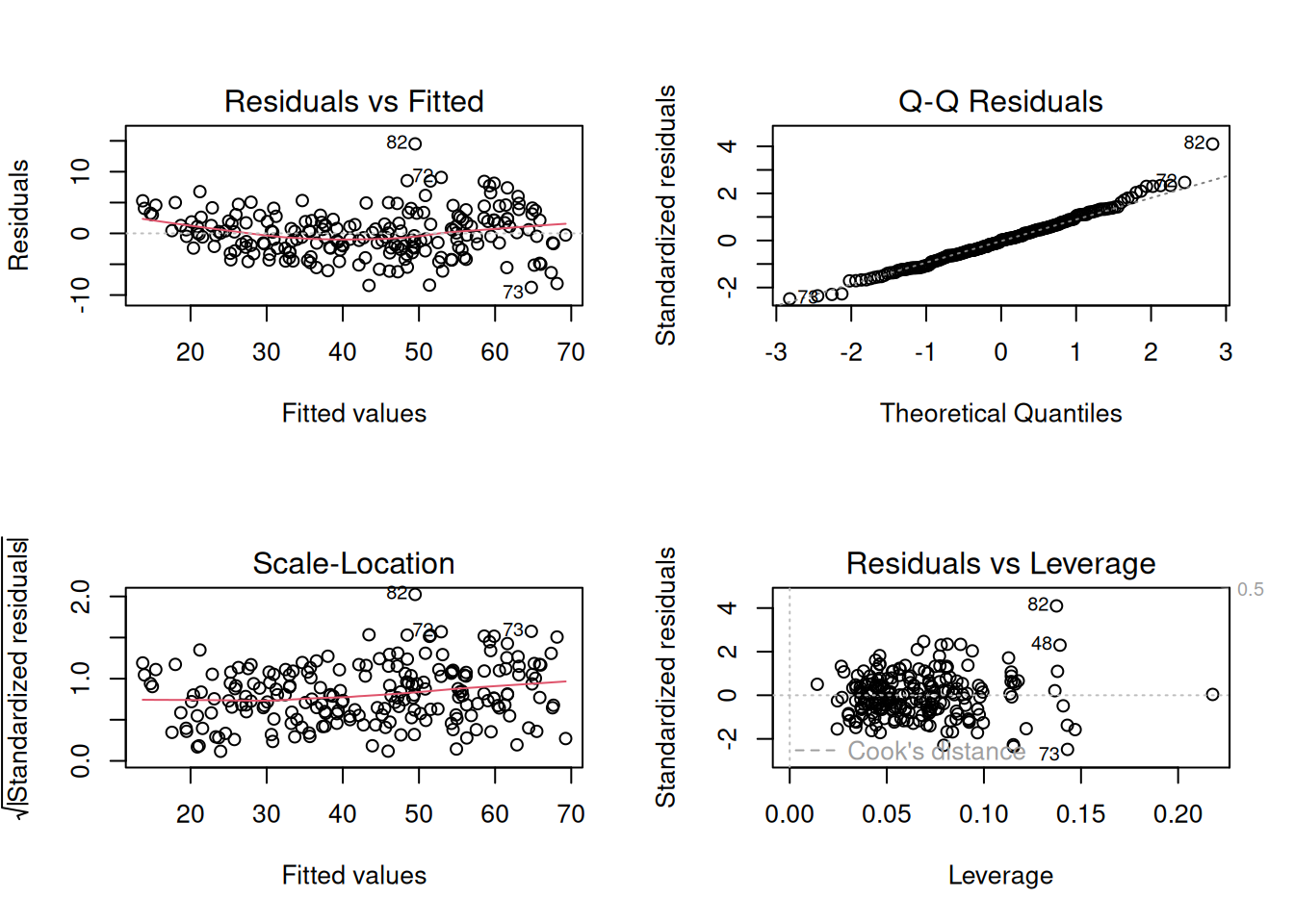
plot() on the fitted lm model. Top-left — Residuals vs Fitted: the residuals plotted against the model’s predictions. You want a shapeless horizontal band centred on zero with the red trend line roughly flat; a curve or a funnel shape signals a missed nonlinear relationship or a spread that changes across the range. Top-right — Normal Q-Q: checks whether the residuals are normally distributed. The points should hug the diagonal; systematic departures, especially at the two ends, mean heavy tails or outliers. Bottom-left — Scale-Location: the same residuals as the first panel but showing their size. A flat red line means the errors have roughly constant spread (homoscedasticity); an upward slope means the model is more precise at some ages than others. Bottom-right — Residuals vs Leverage: flags individual people with outsized influence on the fit. Points pushed toward the right (high leverage) and beyond the dashed Cook’s-distance contours deserve a look, because a single such point can tilt the entire line.
For our methylation clock, read the four panels together: are the residuals patternless (top-left), roughly normal (top-right), of even spread across the age range (bottom-left), and free of any single dominating sample (bottom-right)? Mild wobbles in any of these are normal and rarely cause for alarm. Strong structure, on the other hand — a clear curve, a fanning-out, a lone point far from the pack — would be the data telling you that a straight line is the wrong shape, and that a transformation or a more flexible model (like the tree and forest we try next) might serve better.
28.4.2 Predict
pred_train <- learner$predict(task, row_ids = train_set)
pred_test <- learner$predict(task, row_ids = test_set)
28.4.3 Assess
Printing a regression prediction shows the predicted (response) and true (truth) values side by side.
pred_train
── <PredictionRegr> for 209 observations: ──────────────────────────────────────
 row_ids truth response
     298    29 31.40565
     103    58 56.26019
     194    53 48.96480
     ---   ---      ---
     312    48 52.61195
     246    66 67.66312
     238    38 39.38414
A scatter plot of truth versus prediction makes the fit visible: a perfect model would put every point on the diagonal.
ggplot(pred_train, aes(x = truth, y = response)) +
    geom_point() +
    geom_smooth(method = 'lm')
`geom_smooth()` using formula = 'y ~ x'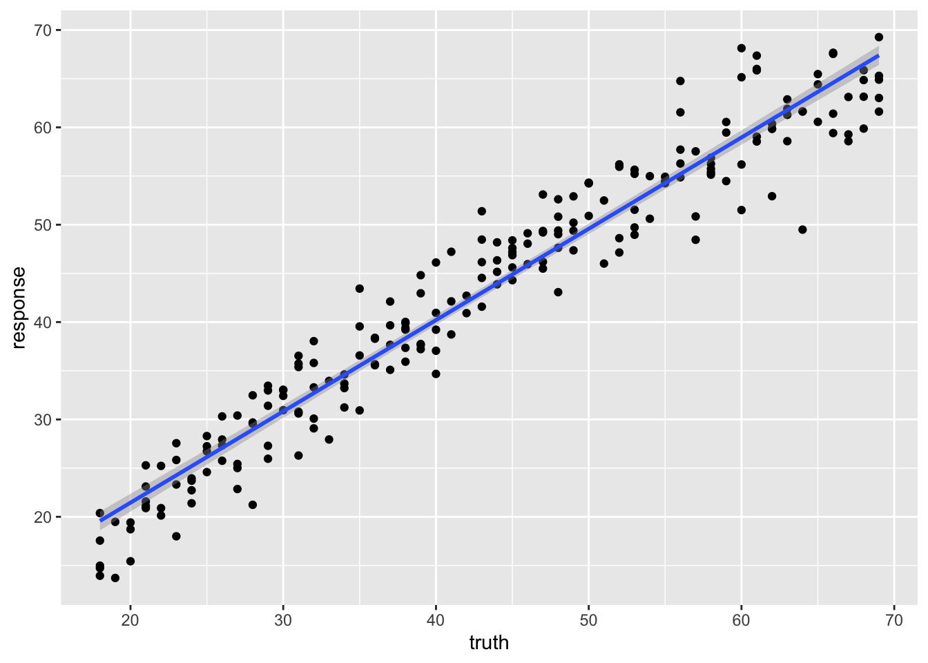
We summarize the fit with R² (the fraction of variation in age the model explains; 1.0 is perfect, 0 is no better than guessing the mean).
pred_test
── <PredictionRegr> for 103 observations: ──────────────────────────────────────
 row_ids truth response
       4    37 37.64301
       5    24 28.34777
       7    34 33.22419
     ---   ---      ---
     306    42 41.65864
     307    63 58.68486
309 68 70.41987pred_test$score(measures) regr.rsq
0.9363526 The training R² is high, but the test R² is the honest measure of how well the clock would predict the age of a new person. A drop from training to test is, again, the signature of overfitting.
28.5 Regression tree
We can use a tree for regression too. Instead of voting on a class, each leaf of the tree reports a predicted number.
learner <- lrn("regr.rpart", keep_model = TRUE)
learner$train(task, row_ids = train_set)
learner$model
n= 209
node), split, n, deviance, yval
* denotes terminal node
1) root 209 45441.4500 43.27273
2) ELOVL2_6< 56.675 98 5512.1220 30.24490
4) ELOVL2_6< 47.24 47 866.4255 24.23404
8) GRM2_9< 31.3 34 289.0588 22.29412 *
9) GRM2_9>=31.3 13 114.7692 29.30769 *
5) ELOVL2_6>=47.24 51 1382.6270 35.78431
10) F5_2>=39.295 35 473.1429 33.28571 *
11) F5_2< 39.295 16 213.0000 41.25000 *
3) ELOVL2_6>=56.675 111 8611.3690 54.77477
6) ELOVL2_6< 65.365 63 3101.2700 49.41270
12) KLF14_2< 3.415 37 1059.0270 46.16216 *
13) KLF14_2>=3.415 26 1094.9620 54.03846 *
7) ELOVL2_6>=65.365 48 1321.3120 61.81250 *Notice something odd: a single regression tree can only output a handful of discrete age values — one per leaf. It cannot predict, say, 43.7 if no leaf sits there.
28.5.1 Predict
pred_train <- learner$predict(task, row_ids = train_set)
pred_test <- learner$predict(task, row_ids = test_set)
28.5.2 Assess
pred_train
── <PredictionRegr> for 209 observations: ──────────────────────────────────────
 row_ids truth response
     298    29 33.28571
     103    58 61.81250
     194    53 46.16216
     ---   ---      ---
     312    48 54.03846
     246    66 61.81250
     238    38 41.25000
The discreteness is obvious in the scatter plot: predictions stack up into horizontal bands, one per leaf.
ggplot(pred_train, aes(x = truth, y = response)) +
    geom_point() +
    geom_smooth(method = 'lm')
`geom_smooth()` using formula = 'y ~ x'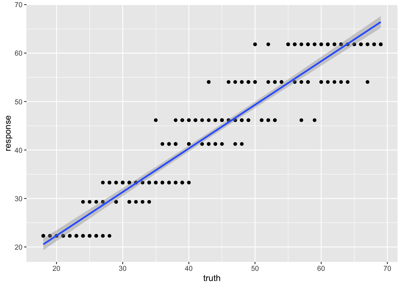
pred_test
── <PredictionRegr> for 103 observations: ──────────────────────────────────────
 row_ids truth response
       4    37 41.25000
       5    24 33.28571
       7    34 33.28571
     ---   ---      ---
     306    42 46.16216
     307    63 61.81250
309 68 61.81250pred_test$score(measures) regr.rsq
0.8545402 The R² differs noticeably from the linear model — the single tree’s blocky predictions are a poor fit for a continuous quantity like age.
28.6 Random forest
A random forest is also tree-based, but averaging over many trees smooths away the blocky, discrete behaviour of a single tree, giving genuinely continuous predictions.
$model
Ranger result

Call:
 ranger::ranger(dependent.variable.name = task$target_names, data = data,      min.node.size = 20L, mtry = 2L, num.threads = 1L)

Type:                             Regression
Number of trees:                  500
Sample size:                      209
Number of independent variables:  13
Mtry:                             2
Target node size:                 20
Variable importance mode:         none
Splitrule:                        variance
OOB prediction error (MSE):       18.46479
R squared (OOB):                  0.9154808
28.6.1 Predict
pred_train <- learner$predict(task, row_ids = train_set)
pred_test <- learner$predict(task, row_ids = test_set)
28.6.2 Assess
pred_train
── <PredictionRegr> for 209 observations: ──────────────────────────────────────
 row_ids truth response
     298    29 30.73644
     103    58 58.11206
     194    53 48.40537
     ---   ---      ---
     312    48 51.14171
     246    66 64.41901
238 38 37.83379ggplot(pred_train, aes(x = truth, y = response)) +
geom_point() +
geom_smooth(method = 'lm')`geom_smooth()` using formula = 'y ~ x'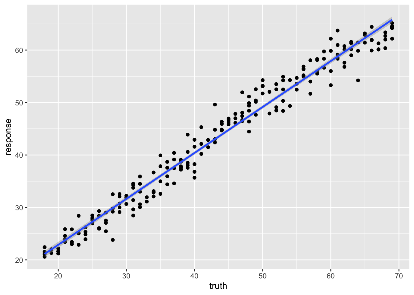
The points now scatter smoothly around the diagonal — no more horizontal bands.
pred_test
── <PredictionRegr> for 103 observations: ──────────────────────────────────────
 row_ids truth response
       4    37 37.65201
       5    24 29.29569
       7    34 32.89875
     ---   ---      ---
     306    42 40.57969
     307    63 58.52445
309 68 63.00209pred_test$score(measures) regr.rsq
0.9206675 Compare the test R² across the three regression models. The forest typically predicts age more accurately than either the linear model or the single tree, and without the single tree’s discrete artifacts.
28.7 Summary
You have now built an epigenetic clock — a complete regression analysis on real methylation data, through the same mlr3 workflow you used for cancer classification:
- You turned the methylation table into an
mlr3regression task withas_task_regr()and split it into training and test sets. - You fit a linear regression, a regression tree, and a random forest, and judged each with R² and a truth-versus-prediction scatter.
- The single tree’s predictions came in discrete bands — a poor fit for a continuous target — while the random forest’s smooth predictions typically beat both the straight line and the single tree.
The change from the cancer example was only the kind of target: a number instead of a category, so as_task_regr() instead of as_task_classif() and R² instead of accuracy. The discipline of trusting only the test-set score carries over unchanged.
28.8 Exercises
Each exercise reuses objects you already built, so the solutions are quick to run.
-
Tune the forest. The random forest used
mtry = 2andmin.node.size = 20. Refit it with the defaults (drop both arguments) and compare the test R². Did the hand-chosen settings help?NoteSolutionChanging
mtryandmin.node.sizeis a one-line edit to thelrn()call; everything else is identical. On this dataset the defaults are usually close, which is part of why random forests are a low-fuss default — but the honest comparison is always the held-out test R². -
Add a second measure. Alongside R², score the test predictions with root-mean-squared error,
msr("regr.rmse"), which reports the typical prediction error in years. Which number is easier to explain to a biologist?NoteSolutionR² is unitless and says what fraction of the variation in age the model explains; RMSE is in the target’s own units (years) and says how far off a typical prediction is. For an audience that thinks in years, RMSE is often the more intuitive headline number.