Rows: 333
Columns: 8
$ species <fct> Adelie, Adelie, Adelie, Adelie, Adelie, Adelie, Adel…
$ island <fct> Torgersen, Torgersen, Torgersen, Torgersen, Torgerse…
$ bill_length_mm <dbl> 39.1, 39.5, 40.3, 36.7, 39.3, 38.9, 39.2, 41.1, 38.6…
$ bill_depth_mm <dbl> 18.7, 17.4, 18.0, 19.3, 20.6, 17.8, 19.6, 17.6, 21.2…
$ flipper_length_mm <int> 181, 186, 195, 193, 190, 181, 195, 182, 191, 198, 18…
$ body_mass_g <int> 3750, 3800, 3250, 3450, 3650, 3625, 4675, 3200, 3800…
$ sex <fct> male, female, female, female, male, female, male, fe…
$ year <int> 2007, 2007, 2007, 2007, 2007, 2007, 2007, 2007, 2007…20 A self-guided tour of data visualization in R
Imagine you have just finished an experiment. You have a spreadsheet with a thousand rows of penguin measurements, or a matrix of gene-expression values across dozens of samples, and you need to see what is going on. Which species are bigger? Are two genes switched on together? Staring at a wall of numbers will not tell you — but the right picture will. Data visualization is the bridge between raw measurements and human understanding, and it is one of the most useful skills a biologist can own.
This chapter is a guided tour. We start with two ideas that make any plot better, then build up ggplot2 — R’s standard plotting system — one layer at a time so you understand why the code looks the way it does. From there we tour a few specialized plot types you’ll meet in genomics: UpSet plots for set overlaps, heatmaps for expression matrices, and a pointer to genome-track visualization. The companion chapter Exploring data with ggplot2 walks a single dataset end to end; here we focus on the grammar and on the wider toolbox.
20.1 What you’ll learn
- Apply two design principles — the data-ink ratio and clear labeling — to make any plot more readable.
- Read a
ggplot2call as a stack of layers: data → aesthetics (aes()) → geoms → scales → facets → themes. - Build a plot incrementally, adding one layer at a time and interpreting each result.
- Choose a colorblind-safe palette with
RColorBrewer. - Reach for the right specialized plot — an UpSet plot for many sets, a heatmap for a data matrix — and produce a runnable example of each.
20.2 Two principles that make any plot better
Before we touch a single ggplot() call, it helps to know what we are aiming for. Two ideas carry most of the weight.
20.2.1 Maximize the data-ink ratio
The statistician Edward Tufte, in his landmark book The Visual Display of Quantitative Information, coined the term data-ink ratio: the proportion of a graphic’s ink that is actually showing your data, rather than decoration. The goal is to keep that ratio high. Put simply, every mark on the plot should earn its place.
Common “chart junk” to delete:
- Redundant or heavy grid lines
- Busy backgrounds or unnecessary fill colors
- 3D effects on what is really 2D data
- Drop shadows and other decoration
Let’s see the difference. We’ll use R’s built-in mpg dataset (fuel-economy records for various car models) — the relationship is generic, but the lesson about ink transfers directly to a scatterplot of, say, gene length versus expression. First, a cluttered version:
library(ggplot2)

ggplot(mpg, aes(x = displ, y = hwy, color = class)) +
  geom_point() +
  theme_gray() +
  labs(title = "Fuel efficiency vs. engine displacement",
       subtitle = "This is a very busy plot",
       x = "Engine displacement (litres)",
       y = "Highway miles per gallon",
       color = "Vehicle class")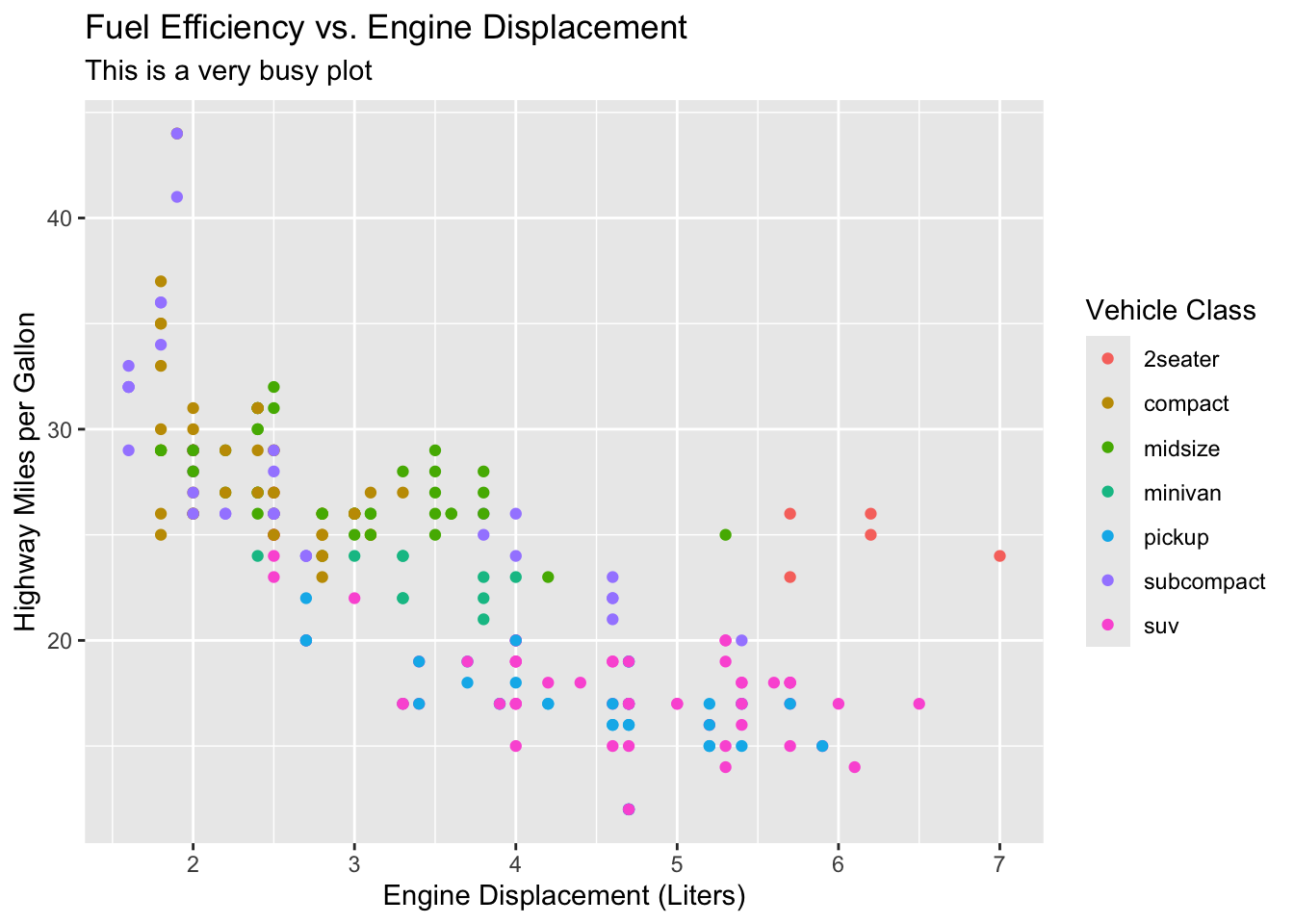
Now the same data with the decoration stripped away:
ggplot(mpg, aes(x = displ, y = hwy, color = class)) +
  geom_point() +
  theme_minimal() +
  labs(title = "Fuel efficiency vs. engine displacement",
       x = "Engine displacement (litres)",
       y = "Highway miles per gallon",
       color = "Class")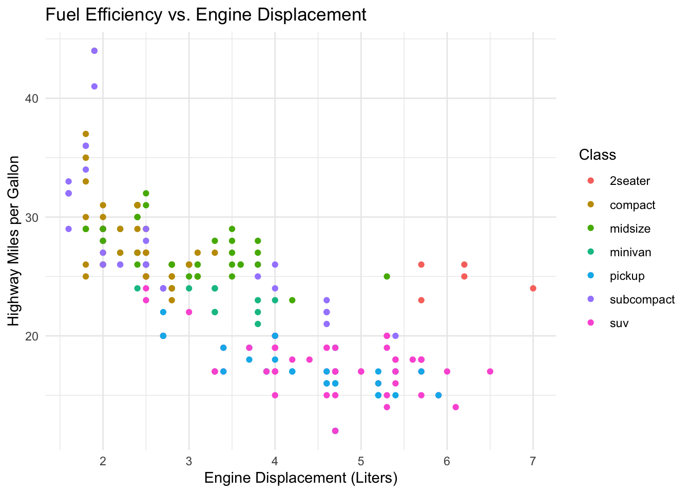
The only change between Figure 20.1 and Figure 20.2 is the theme, yet the second reads more easily: the trend (bigger engines get worse mileage) jumps out because nothing competes with it. This is a guideline, not a law — a faint gridline can genuinely help a reader estimate values — but “could I delete this?” is always worth asking.
20.2.2 Label everything
A plot without labels is just a picture. To be analysis, it has to carry its context with it. Every finished plot should have:
- A clear, descriptive title.
- Axis labels with units (e.g., “Body mass (g)”).
- A legend whenever color, shape, or size encodes a variable.
TipLabels are for future-you
The most common audience for your plot is yourself, three months later, trying to remember what it showed. Spelling out units and a title costs seconds now and saves an embarrassing email later.
20.2.3 Use color deliberately
Color is powerful and easy to overuse. Two rules of thumb: don’t use more colors than you have meaningful groups, and pick palettes that survive printing and colorblindness. The RColorBrewer package ships curated palettes in three families:
- Sequential palettes run light → dark and suit ordered data (a gradient from low to high expression).
- Qualitative palettes use distinct hues for categories with no order (species, treatment group).
- Diverging palettes emphasize a meaningful midpoint with two contrasting directions (log-fold-changes around zero).
library(RColorBrewer)

display.brewer.all()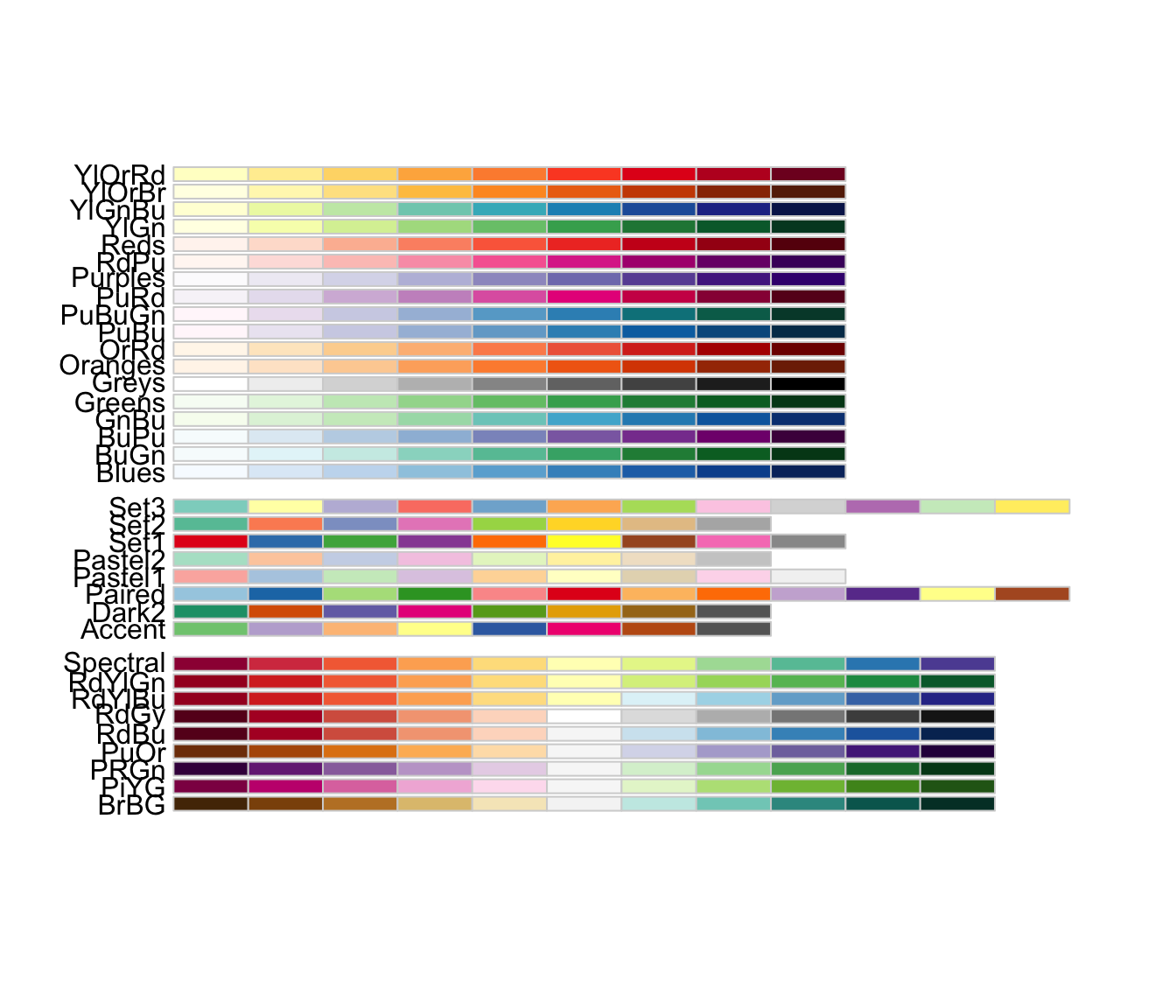
Figure 20.3 is a menu: pick a palette name (like "Set2" or "RdBu") and hand it to a scale_color_brewer() or scale_fill_brewer() layer.
WarningRoughly 1 in 12 men is red-green colorblind
A red/green scheme that looks fine to you can be unreadable to a chunk of your audience. RColorBrewer can show only the palettes that stay distinguishable under common color-vision deficiencies — restrict yourself to these when color carries meaning.
display.brewer.all(colorblindFriendly = TRUE)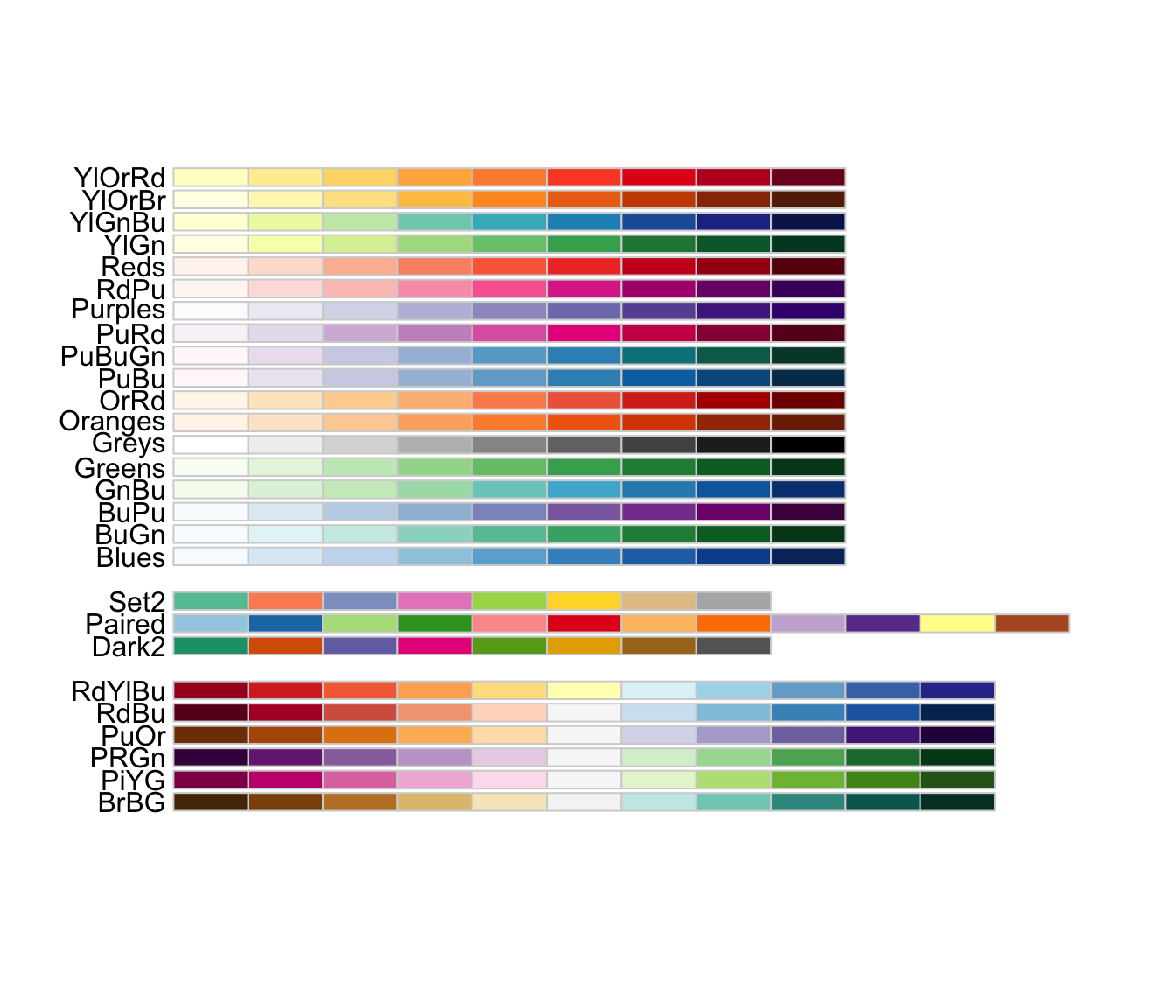
The palettes in Figure 20.4 are the safe default set. When in doubt, choose from here.
20.3 The grammar of graphics, layer by layer
ggplot2 is built on an idea called the grammar of graphics: every plot is assembled from a small set of independent parts, the way a sentence is built from nouns, verbs, and adjectives. Once you know the parts, you can describe an enormous variety of plots with the same handful of “words.” The parts are:
- Data — the data frame you’re plotting.
-
Aesthetics (
aes()) — which variable maps to which visual channel (x position, y position, color, size, shape). - Geoms — the geometric shapes that actually get drawn (points, lines, bars).
- Scales — how data values translate into pixels and colors (axis ranges, color palettes).
- Facets — splitting one plot into small multiples by a grouping variable.
- Themes — the non-data styling (fonts, background, gridlines).
Think of it like ordering a coffee: the data is the beans, the aesthetics say what goes in which cup, the geom is whether you get it as espresso or latte, and the theme is the mug it’s served in. We’ll build one plot up through these layers, adding exactly one new idea per step.
We’ll use the palmerpenguins dataset — body measurements for three penguin species (Adelie, Chinstrap, Gentoo) recorded near Palmer Station, Antarctica. It’s real organismal biology and small enough to reason about.
glimpse() shows each penguin has a species, an island, bill and flipper measurements, a body mass, and a sex. We’ll ask a biological question: how do the species differ in body size?
20.3.1 Step 1: data and aesthetics
We start by telling ggplot() what data to use and which variables map to which axes. Here, flipper length on x and body mass on y:
Figure 20.5 looks empty — and that’s the point. We’ve declared the axes (aes() mapped flipper_length_mm to x and body_mass_g to y), but we haven’t said what shape to draw. A plot with no geom has nothing to show.
20.3.2 Step 2: add a geom
A geom is the layer that draws something. We add layers with +. For two continuous variables, points make a scatterplot:
ggplot(data = penguins,
mapping = aes(x = flipper_length_mm, y = body_mass_g)) +
geom_point()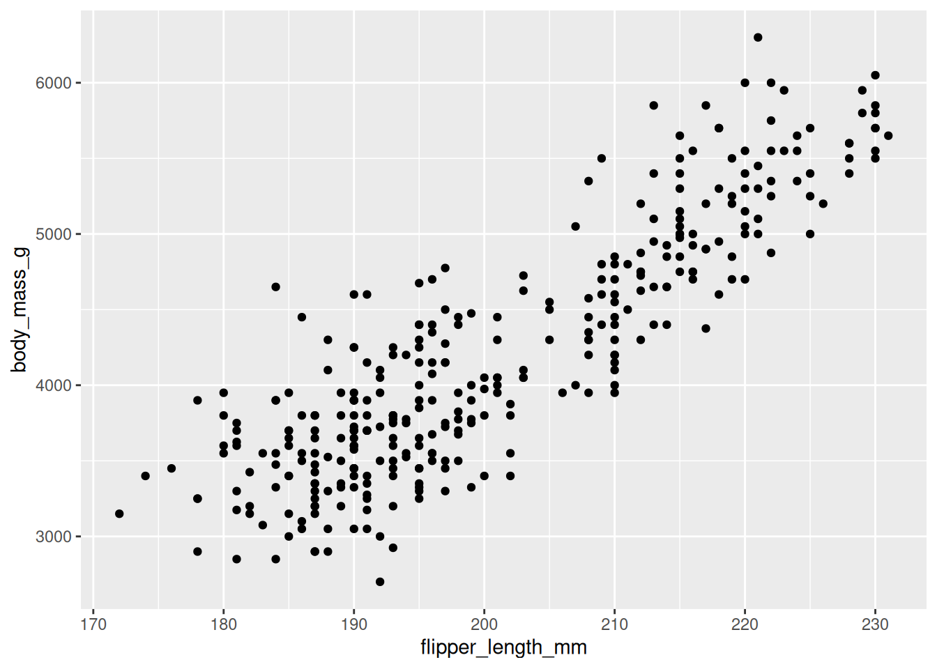
Now Figure 20.6 tells a story: heavier penguins tend to have longer flippers, a clear positive relationship. But the points seem to fall into a couple of clusters. Could that be the species?
20.3.3 Step 3: map a third variable to color
Aesthetics aren’t limited to x and y. We can map a categorical variable onto color to encode a third dimension on the same flat plot:
ggplot(data = penguins,
       mapping = aes(x = flipper_length_mm, y = body_mass_g, color = species)) +
  geom_point()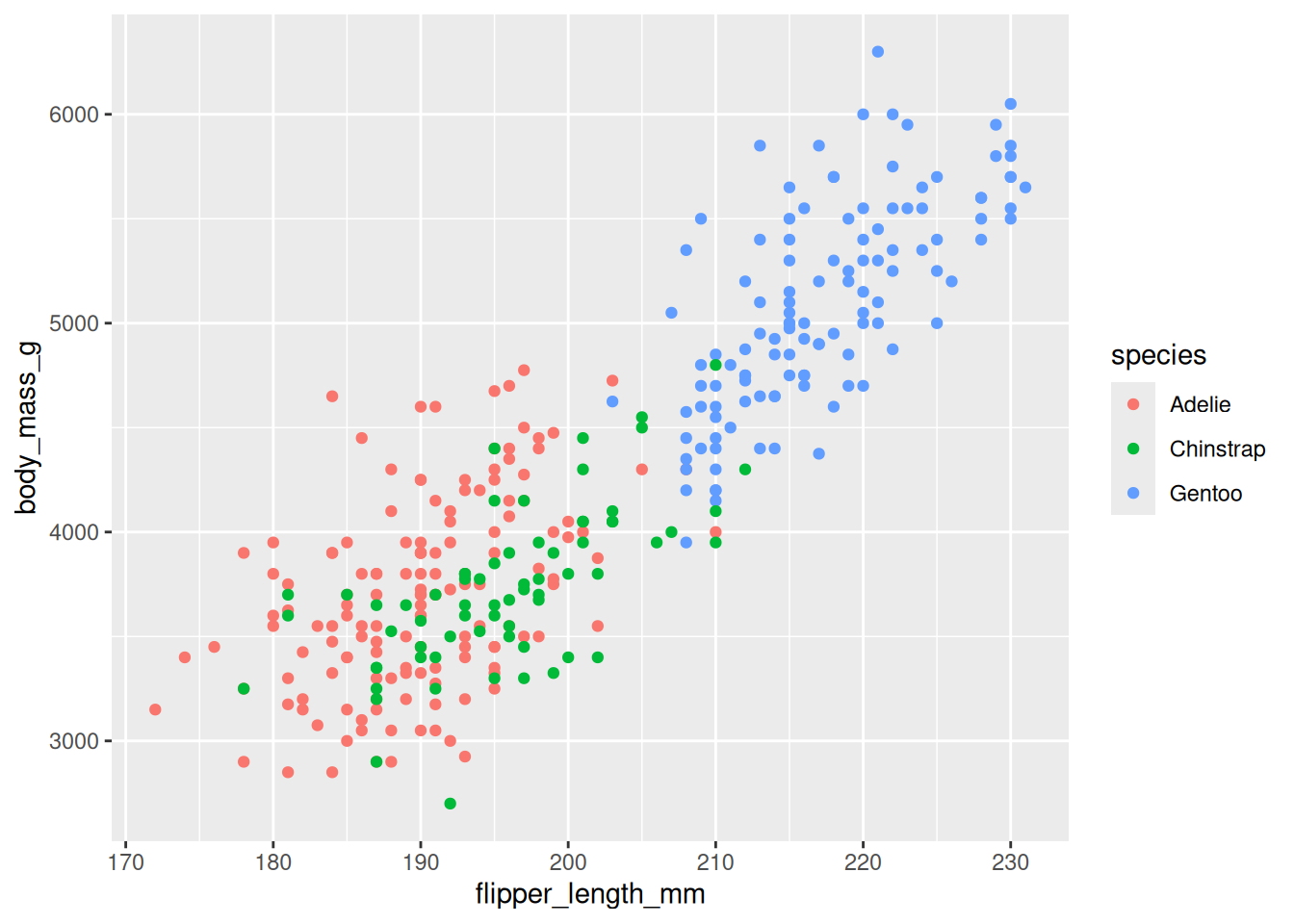
The clusters in Figure 20.7 resolve cleanly: Gentoo penguins are the large ones (long flippers, heavy), while Adelie and Chinstrap overlap at the smaller end. We answered our biological question by adding one word to aes().
20.3.4 Step 4: layer on a second geom
Layers stack. We can keep the points and add a geom_smooth() trend line on top. Because color = species is set in the shared aes(), we get one line per species for free:
ggplot(data = penguins,
       mapping = aes(x = flipper_length_mm, y = body_mass_g, color = species)) +
  geom_point(alpha = 0.6) +
  geom_smooth(method = "lm", se = FALSE)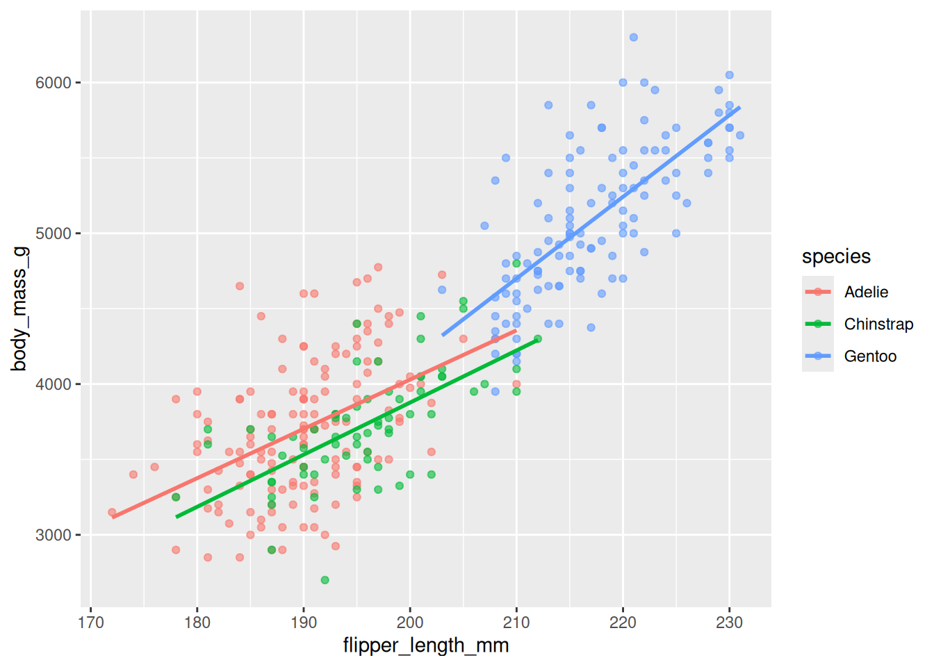
Figure 20.8 adds three regression lines (method = "lm"). All three slope upward, confirming the flipper-mass relationship holds within each species, not just across the pooled cloud. We also set alpha = 0.6 (outside aes(), so it’s constant) to make overlapping points semi-transparent.
20.3.5 Step 5: control scales
Scales govern the translation from data to pixels and colors. Let’s swap in a colorblind-safe Brewer palette and label the axis ticks with units:
ggplot(data = penguins,
       mapping = aes(x = flipper_length_mm, y = body_mass_g, color = species)) +
  geom_point(alpha = 0.6) +
  geom_smooth(method = "lm", se = FALSE) +
  scale_color_brewer(palette = "Set2") +
  scale_y_continuous(breaks = seq(3000, 6000, 1000))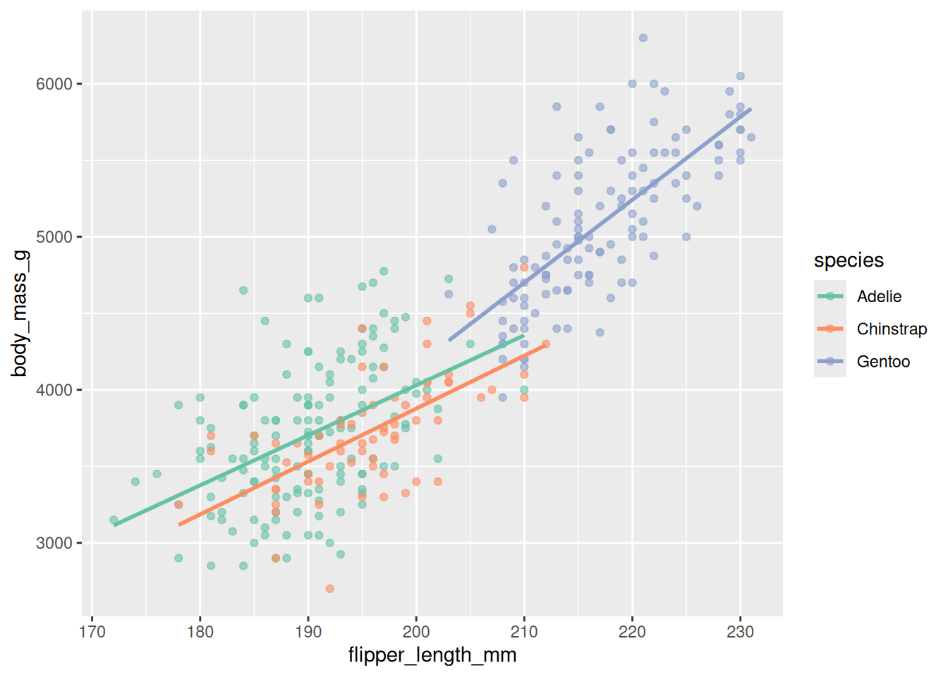
In Figure 20.9 the colors come from the qualitative "Set2" palette (safe under color blindness, per Section 20.2), and scale_y_continuous() sets even gridline breaks. Scales are where you take control of how the mapping looks without changing what is mapped.
20.3.6 Step 6: facet into small multiples
Faceting splits one plot into a grid of panels, one per group — often clearer than cramming everything together. facet_wrap(~ species) gives each species its own panel:
ggplot(data = penguins,
       mapping = aes(x = flipper_length_mm, y = body_mass_g, color = species)) +
  geom_point(alpha = 0.6) +
  geom_smooth(method = "lm", se = FALSE) +
  scale_color_brewer(palette = "Set2") +
  facet_wrap(~ species)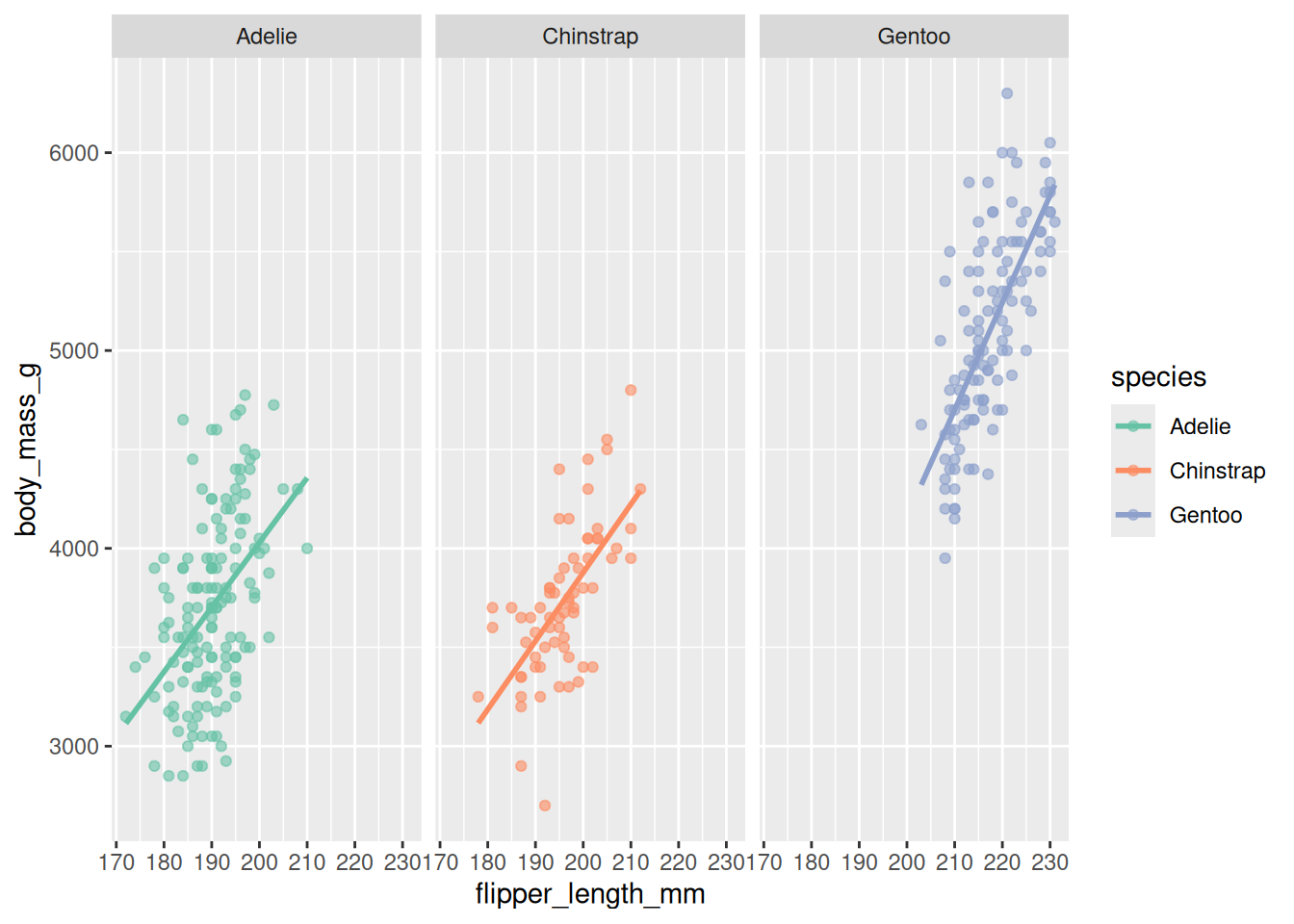
Figure 20.10 makes the per-species spread easy to compare: Gentoo not only sit higher and to the right, they also span a wider range of body mass than the other two.
20.3.7 Step 7: labels and theme
Finally, the theme controls non-data styling, and labs() supplies the human context from Section 20.2. Putting it together:
ggplot(data = penguins,
       mapping = aes(x = flipper_length_mm, y = body_mass_g, color = species)) +
  geom_point(alpha = 0.6) +
  geom_smooth(method = "lm", se = FALSE) +
  scale_color_brewer(palette = "Set2") +
  facet_wrap(~ species) +
  labs(title = "Body mass increases with flipper length in all three species",
       x = "Flipper length (mm)",
       y = "Body mass (g)",
       color = "Species") +
  theme_minimal()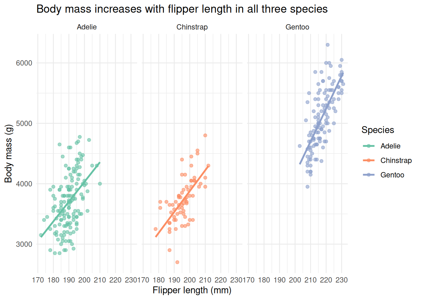
Figure 20.11 is publication-grade, and you built it one layer at a time. Read the call top to bottom and you can name every part: data, the aes() mapping, two geoms, a color scale, facets, labels, and a minimal theme. That is the whole grammar of graphics — every ggplot2 plot you ever write is some combination of these same pieces.
TipCombining whole plots:
patchwork
Faceting splits one plot by a variable. To place different plots side by side, the patchwork package lets you add them with + or stack them with /, e.g. plot_a + plot_b. It’s the easiest way to assemble multi-panel figures.
20.4 Specialized plots for biology
ggplot2 covers most everyday needs, but a few questions call for purpose-built plots. Here are two you’ll meet often in genomics.
20.4.1 Sets and intersections: UpSet plots
Suppose you have several gene lists — genes up in treatment A, up in treatment B, bound by a transcription factor — and you want to know which genes are shared. The classic tool is a Venn diagram, but Venn diagrams become unreadable past three sets. An UpSet plot scales to many sets: a bar chart shows the size of each intersection, and a dot matrix beneath it shows which sets each bar combines.
UpSetR takes a data frame of 0s and 1s — one row per element, one column per set, a 1 marking membership. We’ll use the movies dataset bundled with the package (already in that binary format) as a stand-in for “genes × gene-lists”:
library(UpSetR)

movies <- read.csv(system.file("extdata", "movies.csv", package = "UpSetR"),
                   header = TRUE, sep = ";")

upset(movies,
      nsets = 5,
      order.by = "freq",
      mainbar.y.label = "Intersection size",
      sets.x.label = "Total movies in genre")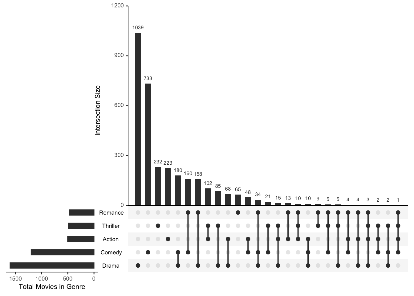
Figure 20.12 reads left to right by decreasing intersection size. The tallest bars with a single filled dot are the “only this set” groups; bars over two or more filled dots are the overlaps. You can see at a glance, for example, how many movies are both Drama and Comedy versus Drama alone — a comparison that a five-circle Venn diagram simply cannot show clearly. Swap the movie genres for your gene lists and the reading is identical.
20.4.2 Heatmaps for data matrices
A heatmap turns a matrix of numbers into a grid of colored tiles, so the eye can pick out blocks and patterns that a table hides. In genomics, the rows are typically genes, the columns are samples, and the color is expression level. Heatmaps also usually cluster similar rows and columns together, so co-behaving genes and similar samples sit next to each other.
NoteWhat is a matrix?
A matrix is a two-dimensional grid of values addressed by row and column, and — unlike a data frame — every entry must be the same type (here, all numbers). Heatmap functions expect a numeric matrix, not a data frame.
Let’s make a runnable example with pheatmap (“pretty heatmap”). We’ll use the mtcars data as a numeric matrix — treat the cars as “samples” and the measurements as “features,” exactly as you would genes and samples. The catch: the columns are on wildly different scales (horsepower in the hundreds, number of cylinders in single digits), so we scale each column to comparable units first. Scaling is routine for expression data too.
library(pheatmap)

# build a numeric matrix and scale each column to mean 0, sd 1
car_matrix <- scale(as.matrix(mtcars))

pheatmap(car_matrix,
         main = "Scaled car measurements",
         color = colorRampPalette(rev(brewer.pal(7, "RdBu")))(100))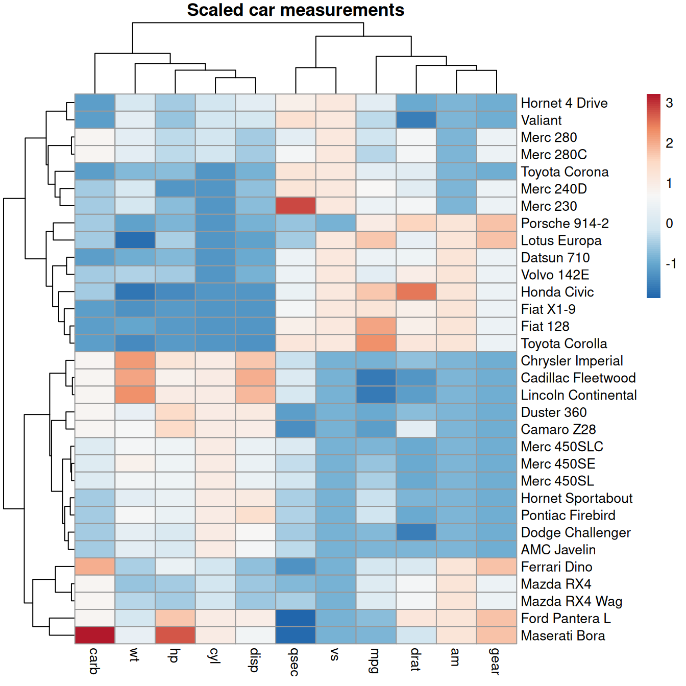
Figure 20.13 clusters the rows and columns automatically. The tree diagrams (dendrograms) on the top and left show how cars and features were grouped. You can read off blocks: the fuel-efficiency feature (mpg) sits opposite the power/weight features, and the cars split into a heavy-and-powerful block versus a light-and-efficient one. Read genes for cars and samples for features, and this is exactly how an expression heatmap is interpreted.
For richer needs — multiple annotation bars, split heatmaps, precise control over legends — Bioconductor’s ComplexHeatmap is the standard. It uses the same mental model (a matrix plus optional row/column annotations) with far more knobs; its reference book is the place to go when pheatmap runs out of room.
20.4.3 Visualizing the genome (further exploration)
The plots above are general-purpose. Some genomic questions need a view organized along genomic coordinates — gene models, read coverage, and peaks lined up against a chromosome. This is a heavier topic that leans on Bioconductor, so we flag it as further exploration rather than cover it in depth here:
- The
Gvizpackage builds publication-quality, multi-track genome browser views — stacking gene annotations, alignments, and quantitative data over a coordinate axis. - The
GenomicDistributionspackage summarizes where a set of genomic regions falls — for example, how ChIP-seq or ATAC-seq peaks distribute relative to transcription start sites.
When you reach a project that needs these, start from their vignettes; the grammar-of-graphics intuition from Section 20.3 still helps you read the layered tracks they produce.
20.5 Exercises
Use the cleaned penguins data frame from Section 20.3 for the first three exercises (library(palmerpenguins); library(ggplot2); penguins <- na.omit(penguins)).
-
A different geom. Make a scatterplot of bill length (
bill_length_mm, x) versus bill depth (bill_depth_mm, y), colored by species. What do you notice?NoteSolutionggplot(penguins, aes(x = bill_length_mm, y = bill_depth_mm, color = species)) + geom_point() + theme_minimal()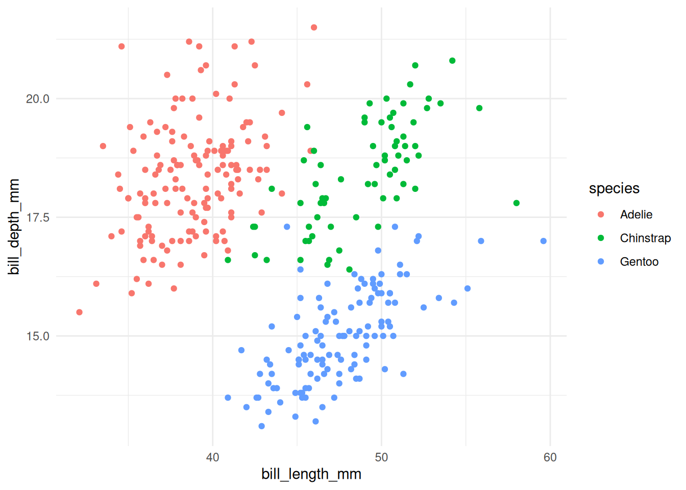
Within each species, deeper bills go with longer bills, but the three species sit in clearly separated regions — bill shape is a good species fingerprint.
Figure 20.14: Bill length vs. depth, colored by species. -
A distribution, not a relationship. Use
geom_boxplot()to compare body mass across the three species (species on x,body_mass_gon y). Which species is heaviest?NoteSolutionggplot(penguins, aes(x = species, y = body_mass_g, fill = species)) + geom_boxplot() + theme_minimal()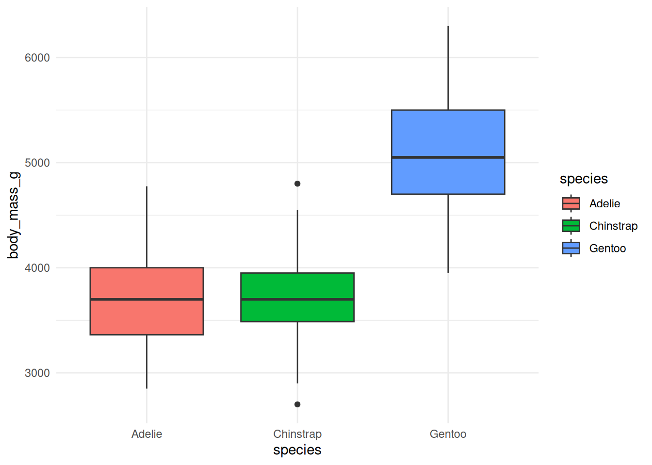
Gentoo penguins are clearly the heaviest; Adelie and Chinstrap have similar, lower body masses. A boxplot summarizes a distribution (median, spread, outliers) rather than a point-to-point relationship.
Figure 20.15: Body-mass distribution by species. -
Add the labels. Take your boxplot from Exercise 2 and give it a title and properly-labeled axes with units, following Section 20.2.
NoteSolutionggplot(penguins, aes(x = species, y = body_mass_g, fill = species)) + geom_boxplot() + labs(title = "Gentoo penguins are the heaviest of the three species", x = "Species", y = "Body mass (g)", fill = "Species") + theme_minimal()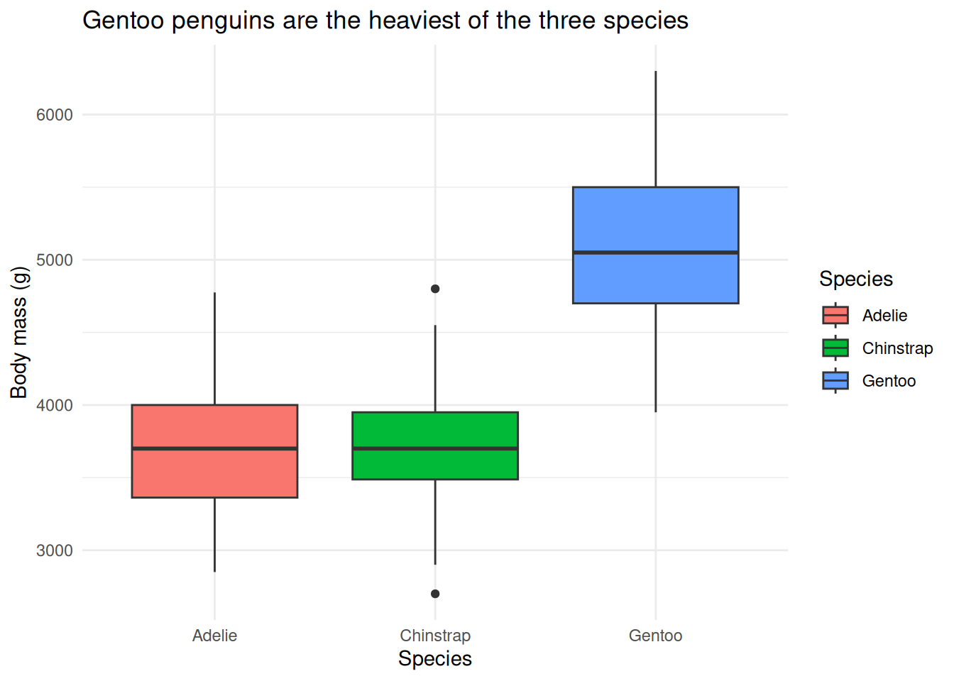
The title states the finding, not just the variables — a good title does the reader’s work for them.
Figure 20.16: The boxplot, now properly labeled. -
Pick the right palette family. You’re plotting log-fold-changes that range from strongly negative to strongly positive, with zero as the meaningful midpoint. Which
RColorBrewerpalette family should you use, and why?NoteSolutionA diverging palette (such as
"RdBu"). Diverging palettes give two contrasting colors that meet at a neutral midpoint, so zero reads as “no change” and the two directions of change are immediately distinguishable. A sequential palette would hide the sign of the change.
20.6 Summary
You now have both the principles and the toolbox for visualizing data in R:
- You can make any plot more readable by maximizing the data-ink ratio (deleting decoration) and labeling everything with a clear title and units.
- You can read and write a
ggplot2call as a stack of layers — data, aesthetics, geoms, scales, facets, themes — and you built one up one layer at a time on real penguin data. - You can map extra variables onto color and other aesthetics, and you know to put data-driven settings inside
aes()and constants outside it. - You can choose a colorblind-safe palette from
RColorBrewer. - You can reach for a specialized plot when you need one: an UpSet plot for intersections of many sets, and a clustered heatmap for an expression-style matrix.
The grammar of graphics is the throughline: once a plot is just data plus a stack of layers, the way to build any new plot is to ask which layer you need to add next. For more depth on a single dataset, see Exploring data with ggplot2; for inspiration, browse the R Graph Gallery and From Data to Viz.