path <- file.choose()    # opens a dialog; navigate to BRFSS-subset.csv

# We'll use dplyr throughout, so load it now
library(dplyr)19 Base R versus the tidyverse
There is almost never just one way to do something in R. The same task — count a variable, summarize a column, draw a boxplot — can be written in plain base R or with the tidyverse, a family of packages (dplyr, readr, ggplot2, and friends) built around a shared, readable style. Neither is “right.” They are two dialects, and good R users read and write both.
The best way to feel the difference is to watch the same analysis done both ways, side by side. So in this chapter we revisit the BRFSS dataset from the exploratory-data-analysis chapter and redo it twice: once with base R’s data frames and graphics, and once with tidyverse tibbles and ggplot2. Read across each pair of columns and you’ll start to recognize which dialect you reach for, and when.
19.1 What you’ll learn
- Read the same CSV into a base R
data.frameand a tidyversetibble, and describe how they differ. - Tabulate and summarize a variable with base R (
table(),aggregate()) and withdplyr(count(),summarize(),group_by()). - Reshape a count table with
tidyr::pivot_wider(). - Recreate the same plots — boxplot, density, scatter, regression line, histogram — in base graphics and in
ggplot2. - Read both dialects fluently, and choose the one that fits the task in front of you.
19.2 Loading the dataset
First we load the dataset two ways. Base R reads a CSV into a classic data.frame with read.csv(); the tidyverse’s readr package reads the same file into a tibble with read_csv(). As in the EDA chapter, point R at the BRFSS-subset.csv file in your working directory — interactively, file.choose() opens a dialog so you don’t have to type the path:
# loading using base R
stopifnot(file.exists(path))
brfss_DF <- read.csv(path)Let’s examine our objects:
# Classic data frame
head(brfss_DF)
Age Weight Sex Height Year
1 31 48.98798 Female 157.48 1990
2 57 81.64663 Female 157.48 1990
3 43 80.28585 Male 177.80 1990
4 72 70.30682 Male 170.18 1990
5 31 49.89516 Female 154.94 1990
6 58 54.43108 Female 154.94 1990# Tidyverse tibble
head(brfss_tbl)# A tibble: 6 × 5
Age Weight Sex Height Year
<dbl> <dbl> <chr> <dbl> <dbl>
1 31 49.0 Female 157. 1990
2 57 81.6 Female 157. 1990
3 43 80.3 Male 178. 1990
4 72 70.3 Male 170. 1990
5 31 49.9 Female 155. 1990
6 58 54.4 Female 155. 1990# Classic data frame
class(brfss_DF)[1] "data.frame"# Tidyverse tibble
class(brfss_tbl)[1] "spec_tbl_df" "tbl_df" "tbl" "data.frame"
Note
Note: A tidyverse tibble object inherits a data.frame class. This means that most data.frame operations like dim(), colnames(), $, [, etc. will work on the tibble object as well.
19.3 Clean data
Both ‘Sex’ and ‘Year’ are really factor values (each can only take on specific levels, ‘Female’ and ‘Male’ for ‘Sex’, and ‘1990’ and ‘2010’ for ‘Year’).
19.4 Data Exploration
Let’s do some basic exploration. summary() works the same on both objects, but let’s look at some summary tables and counts instead. The two dialects produce the same results in slightly different formats.
We’ll start with basic table of a single variable:
 1990  2010
10000 10000
# A tibble: 2 × 2
Year n
<fct> <int>
1 1990 10000
2 2010 10000
Female   Male
 12039   7961
# A tibble: 2 × 2
Sex n
<fct> <int>
1 Female 12039
2 Male 7961Now let’s look at contingency table
# base R / data.frame
table(brfss_DF$Sex, brfss_DF$Year)
         1990 2010
  Female 5718 6321
  Male   4282 3679
# dplyr / tibble
brfss_tbl |> count(Sex, Year)# A tibble: 4 × 3
Sex Year n
<fct> <fct> <int>
1 Female 1990 5718
2 Female 2010 6321
3 Male 1990 4282
4 Male 2010 3679We can get the tidy table to look even more similar to the base R table with the help of the tidyr package’s function pivot_wider
# base R / data.frame
table(brfss_DF$Sex, brfss_DF$Year)
         1990 2010
  Female 5718 6321
  Male   4282 3679
# dplyr / tibble
library(tidyr)
brfss_tbl |> count(Sex, Year) |>
tidyr::pivot_wider(names_from = "Year", values_from = "n")# A tibble: 2 × 3
Sex `1990` `2010`
<fct> <int> <int>
1 Female 5718 6321
2 Male 4282 3679What about some summary statistics on the columns of data? summarize() will create the new data.frame automatically; base R you have to create your own.
# base R / data.frame
data.frame(
  avg_age = mean(brfss_DF$Age, na.rm = TRUE),
  ave_wt  = mean(brfss_DF$Weight, na.rm = TRUE),
  ave_ht  = mean(brfss_DF$Height, na.rm = TRUE)
) avg_age ave_wt ave_ht
1 50.99164 75.42455 169.2131# A tibble: 1 × 3
avg_age ave_wt ave_ht
<dbl> <dbl> <dbl>
1 51.0 75.4 169.If we want to get more complex with groupings by Year and Sex, dplyr uses group_by() where base R would use aggregate().
     Sex Year      Age   Weight   Height
1 Female 1990 46.09153 64.84333 163.2914
2   Male 1990 43.87574 81.19496 178.2242
3 Female 2010 57.07807 73.03178 163.2469
4   Male 2010 56.25465 88.91136 178.0139
# A tibble: 4 × 5
# Groups: Sex [2]
Sex Year avg_age ave_wt ave_ht
<fct> <fct> <dbl> <dbl> <dbl>
1 Female 1990 46.2 64.8 163.
2 Female 2010 57.1 73.0 163.
3 Male 1990 43.9 81.2 178.
4 Male 2010 56.2 88.8 178.19.5 Visualization
Before we start visualizing, lets create a few different subsets of data.
# base R / data.frame
brfss_female_DF <-
    brfss_DF[brfss_DF$Sex == "Female",]
brfss_male_DF <-
    brfss_DF[brfss_DF$Sex == "Male",]
brfss_2010_DF <-
brfss_DF[brfss_DF$Year == "2010",]We should also load the ggplot2 package so we can compare base R graphics vs ggplot2
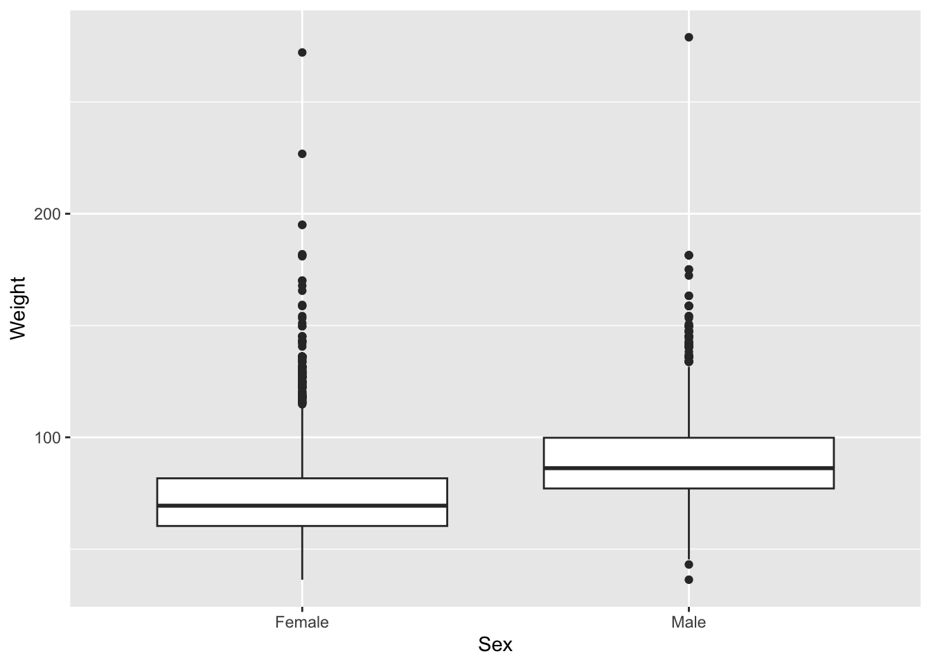
Let’s start with a boxplot that compares the Weights of Males vs Females for the 2010 dataset.
# base R
plot(Weight ~ Sex, brfss_2010_DF)
# ggplot2
ggplot(brfss_2010_tbl) +
aes(x = Sex, y = Weight) +
geom_boxplot()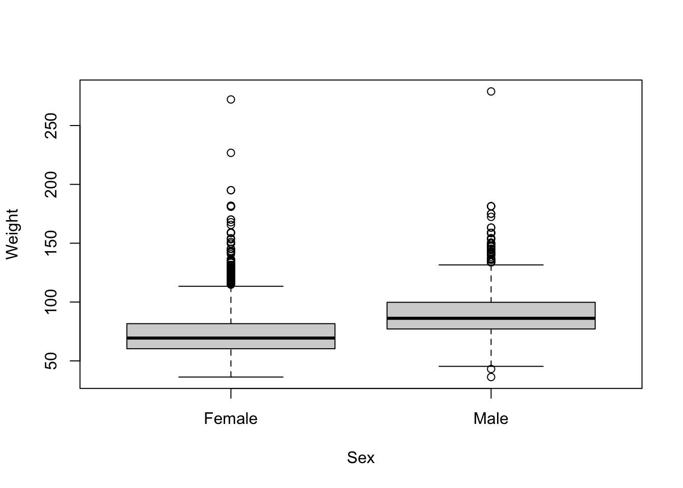
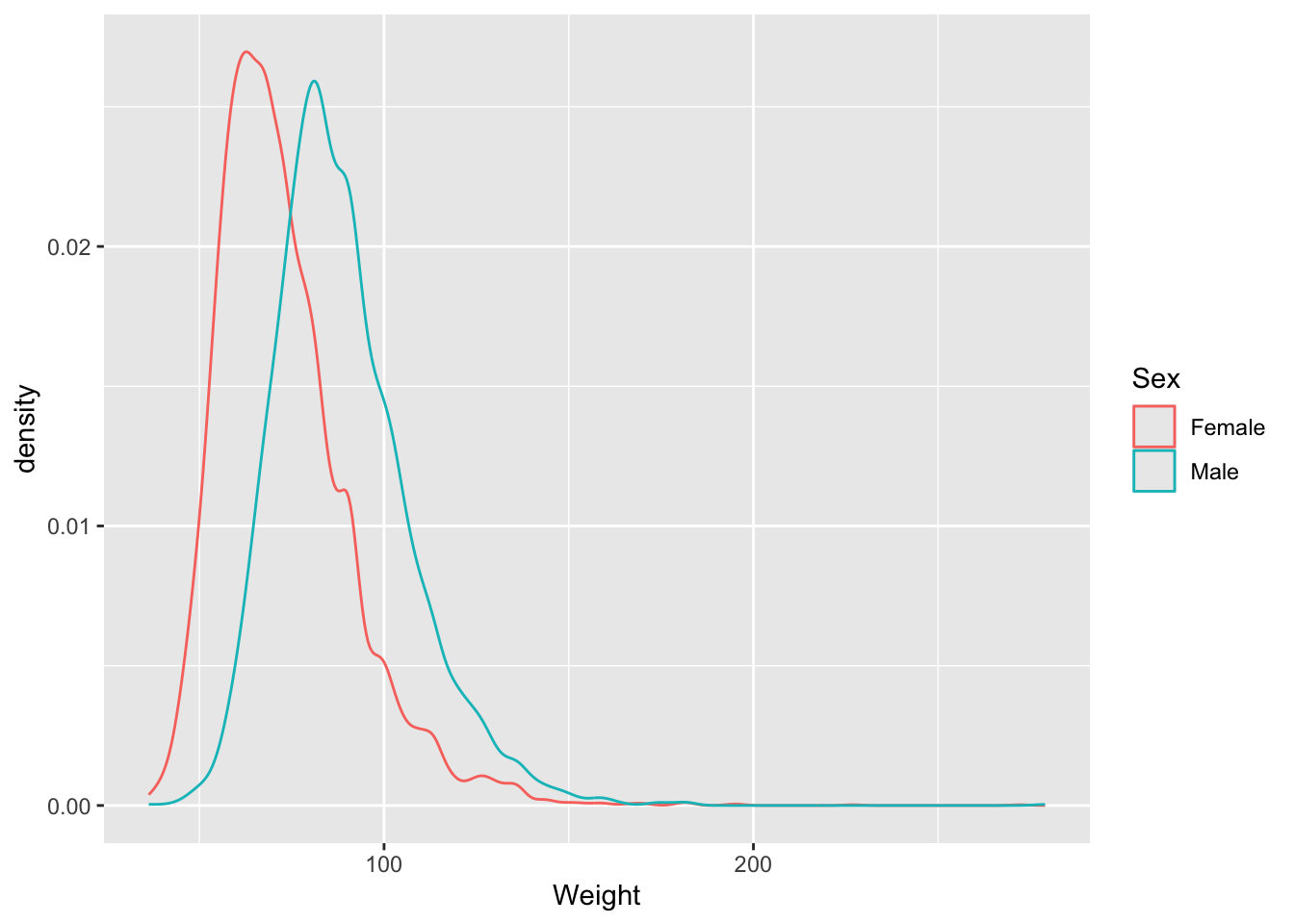
Let’s look at some density and scatterplots.
# base R
den_male <- density(brfss_2010_DF$Weight[brfss_2010_DF$Sex == "Male"], na.rm = TRUE)
den_female <- density(brfss_2010_DF$Weight[brfss_2010_DF$Sex == "Female"], na.rm = TRUE)
plot(den_male,
     col = "skyblue", lwd = 2,
     main = "Density of Weight by Sex",
     xlab = "Weight")

lines(den_female,
      col = "lightsalmon", lwd = 2)

legend("topright",
    legend = c("Male", "Female"),
    col = c("skyblue", "lightsalmon"), lwd = 2)
# ggplot2
brfss_2010_tbl |>
ggplot() +
aes(x = Weight, color= Sex) +
geom_density()
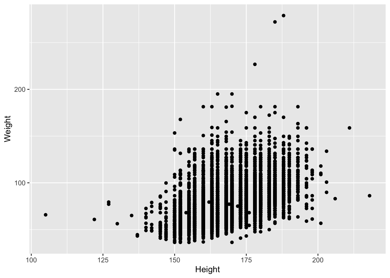
Presumably taller people are heavier than shorter people. Let’s examine this relationship.
# base R
plot(Weight ~ Height, brfss_2010_DF)
# ggplot2
brfss_2010_tbl |>
ggplot() +
aes(x = Height, y = Weight) +
geom_point()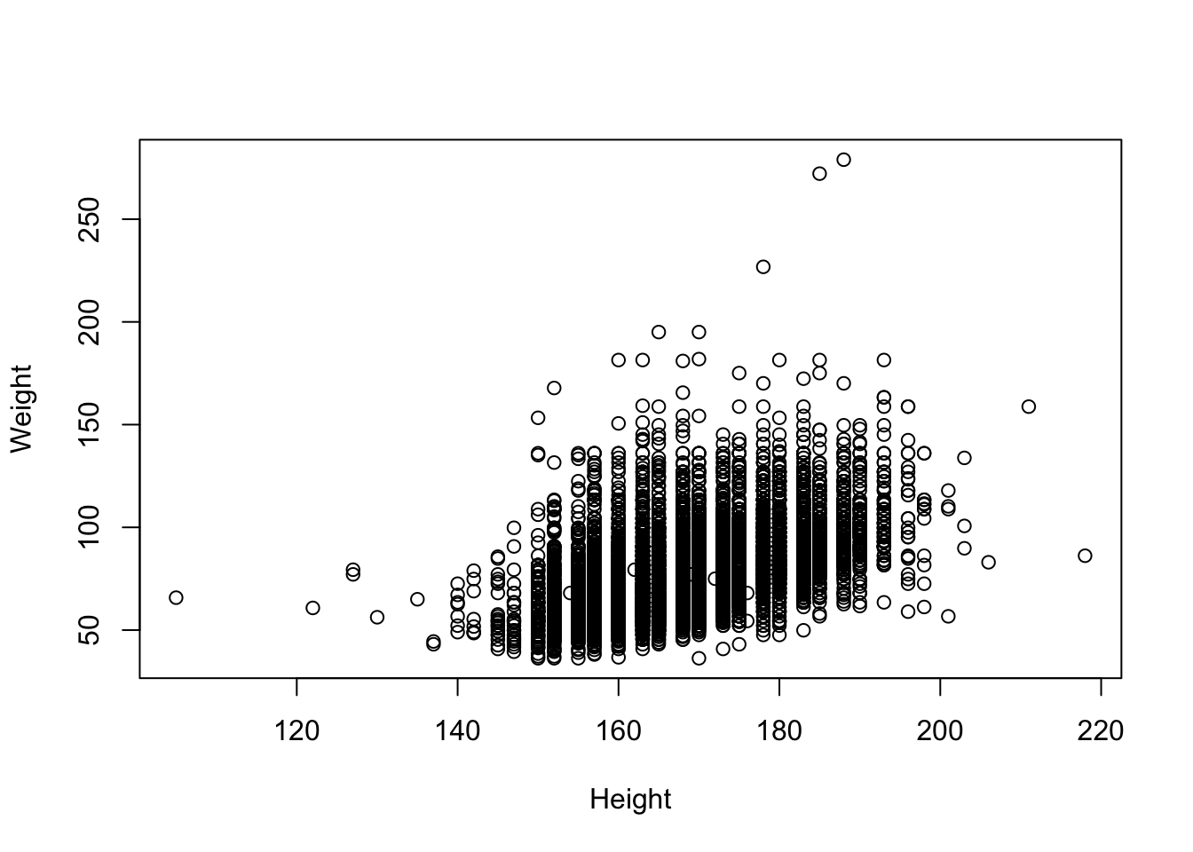
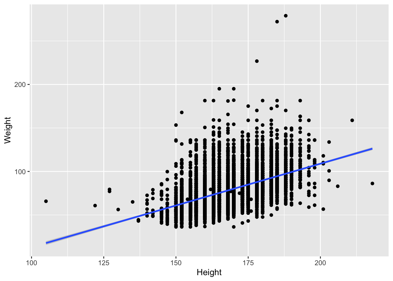
Let’s fit the linear regression
# ggplot2
brfss_2010_tbl |>
    ggplot() +
    aes(x = Height, y = Weight) +
geom_point() +
geom_smooth(method = "lm")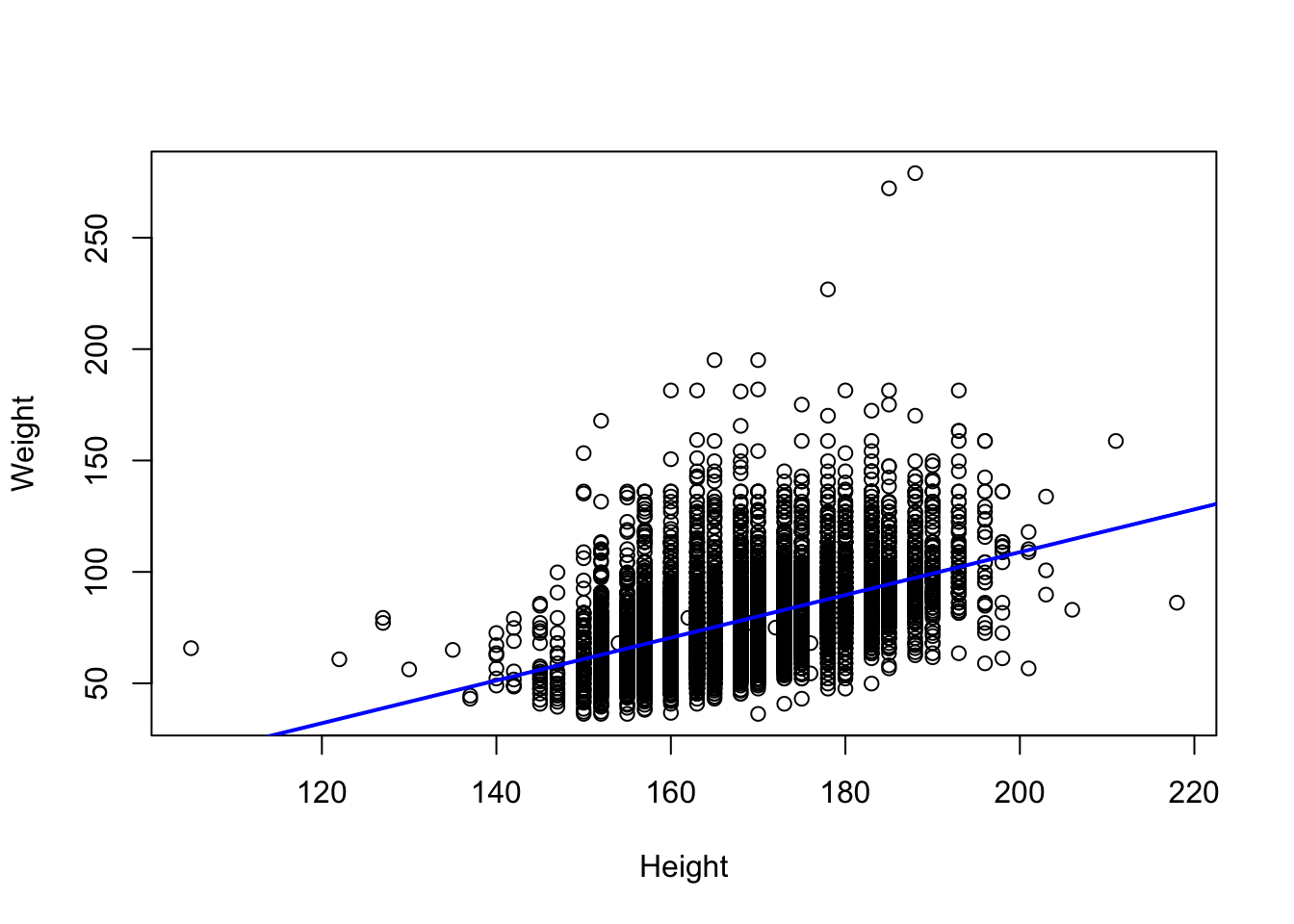
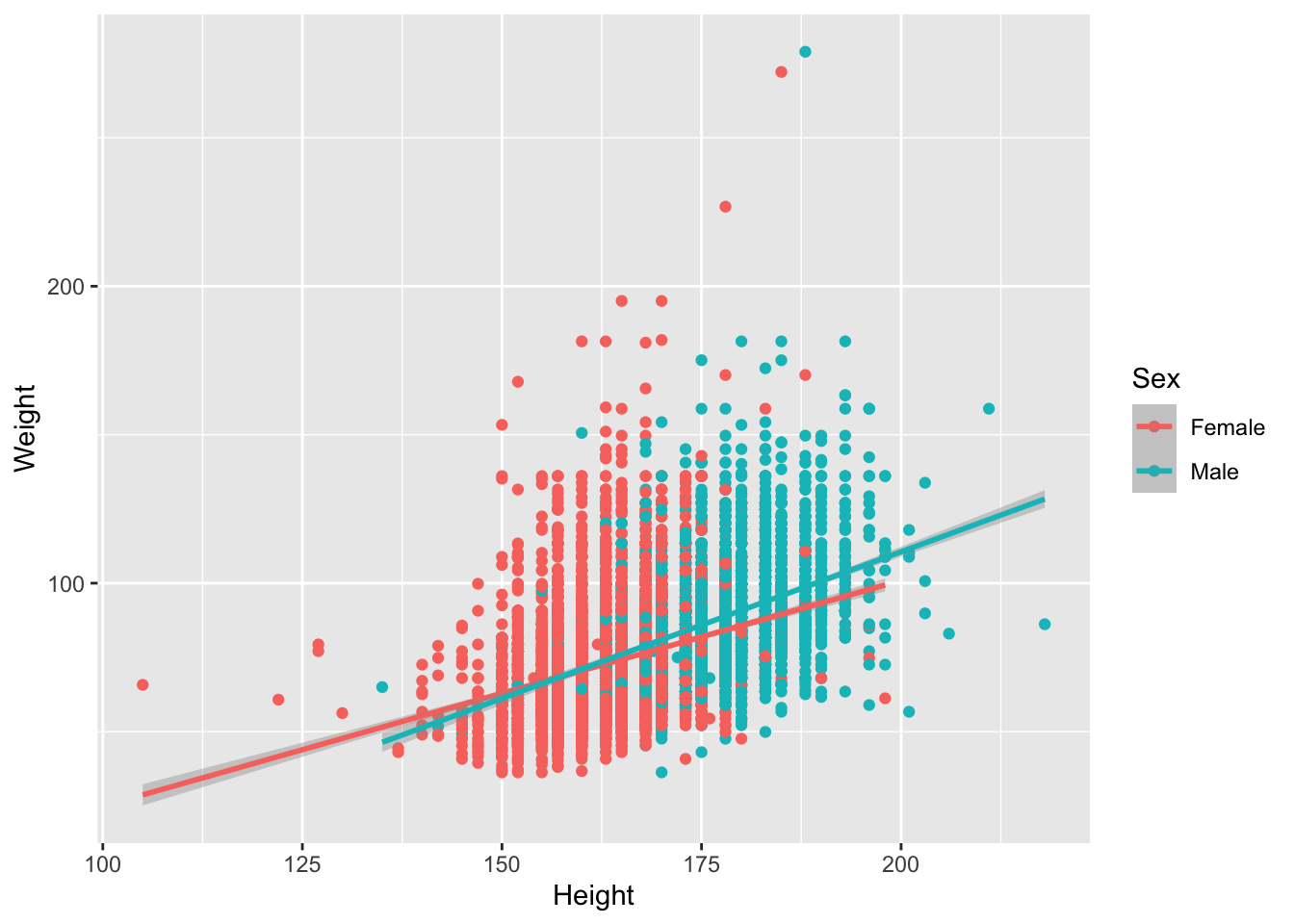
We saw that there could be a difference based on Sex. Let’s add color to the points
# base R
colors <- c("Female" = "lightsalmon", "Male" = "skyblue")
plot(Weight ~ Height, brfss_2010_DF,
  col = colors[Sex], pch = 16)
for (sex in levels(brfss_2010_DF$Sex)) {
  subset_data <- subset(brfss_2010_DF, Sex == sex)
  fit <- lm(Weight ~ Height, data = subset_data)
  abline(fit, col = colors[sex], lwd = 2)
}
legend("topleft", legend = levels(brfss_2010_DF$Sex),
       col = colors, pch = 16, bty = "n")
# ggplot2
brfss_2010_tbl |>
ggplot() +
aes(x = Height, y = Weight, color = Sex) +
geom_point() +
geom_smooth(method = "lm")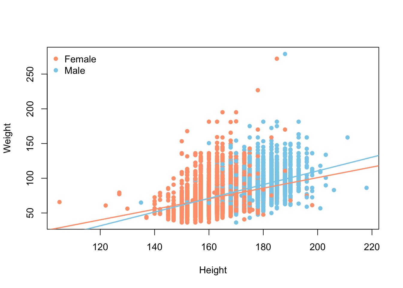
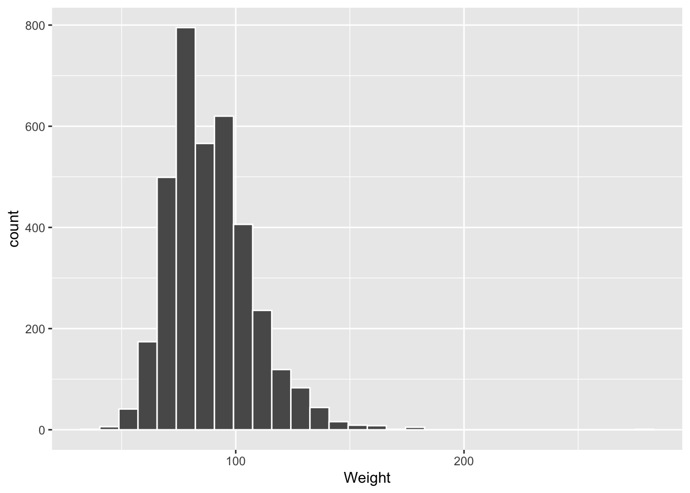
Let’s look at a histogram of Weight for the 2010 males. We didn’t make that subset earlier, so each dialect carves it out on the fly — base R with subset(), the tidyverse with filter().
# ggplot2
brfss_2010_tbl |> filter(Sex == "Male") |>
    ggplot() +
    aes(x = Weight) +
    geom_histogram(col = "white")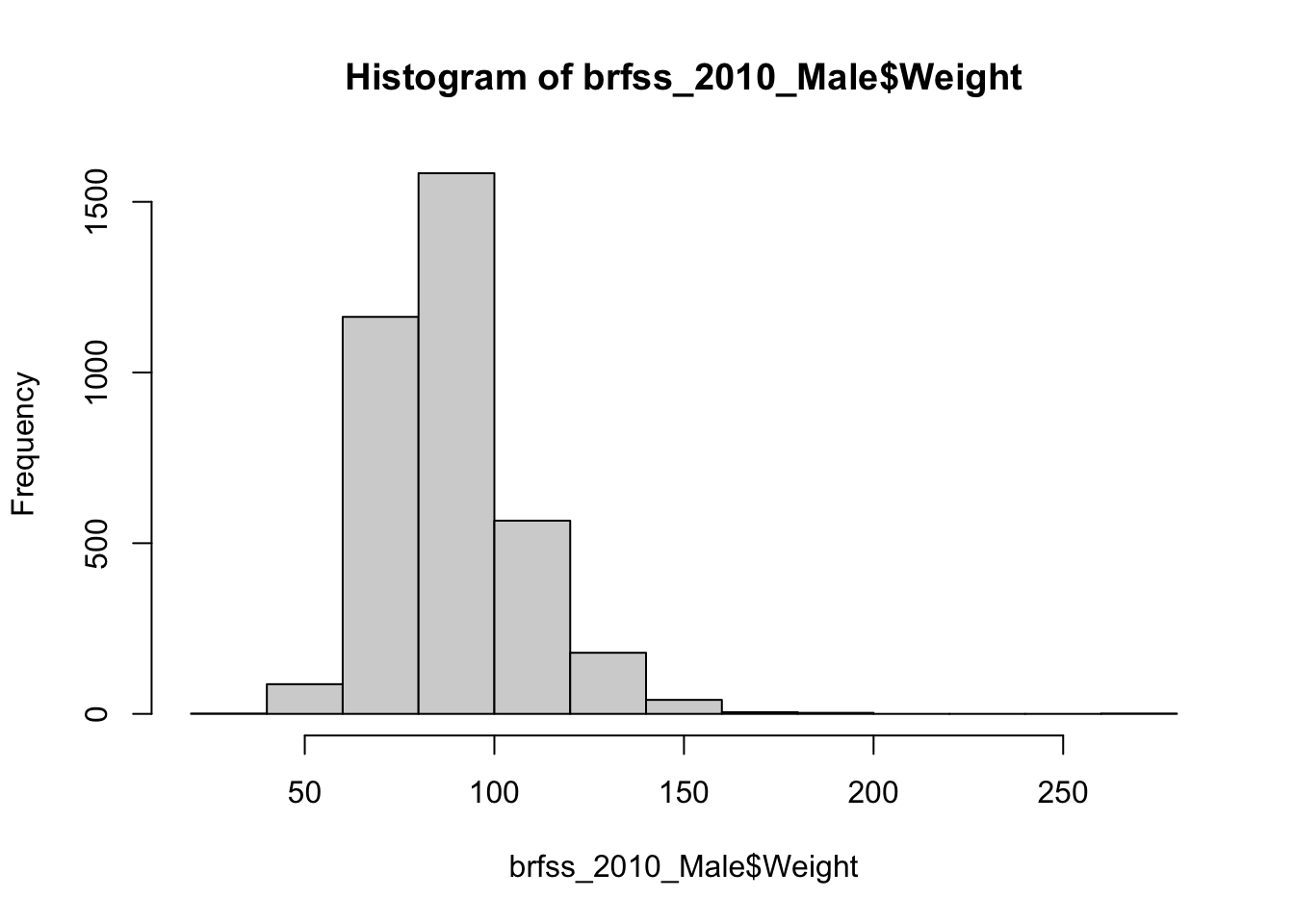
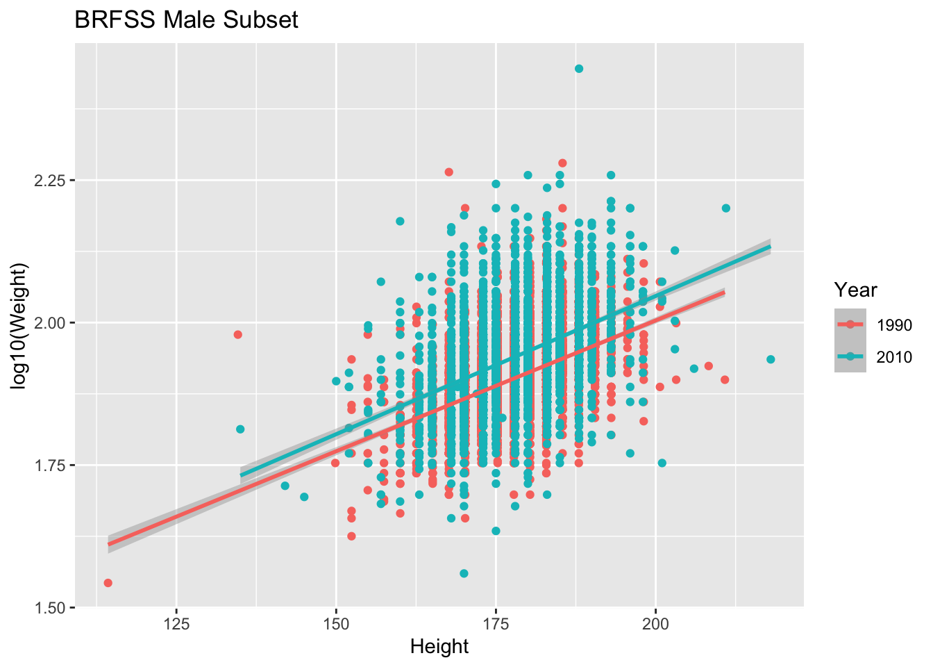
What if we took all the Males and looked to see if the relationship of Height and Weight changed between 1990 and 2010.
# base R
colors <- c("1990" = "lightsalmon","2010" = "skyblue")
plot(log10(Weight) ~ Height, brfss_male_DF,
  col = colors[Year], pch = 16, ylab = "log10(Weight)")
for (yr in levels(brfss_male_DF$Year)) {
  subset_data <- subset(brfss_male_DF, Year == yr)
  fit <- lm(log10(Weight) ~ Height, data = subset_data)
  abline(fit, col = colors[yr], lwd = 2)
}
legend("topleft", legend = levels(brfss_male_DF$Year),
       col = colors, pch = 16, bty = "n")
# ggplot2
ggplot(brfss_male_tbl) +
aes(x = Height, y = log10(Weight), color = Year) +
geom_point() +
geom_smooth(method = "lm") +
labs(title = "BRFSS Male Subset")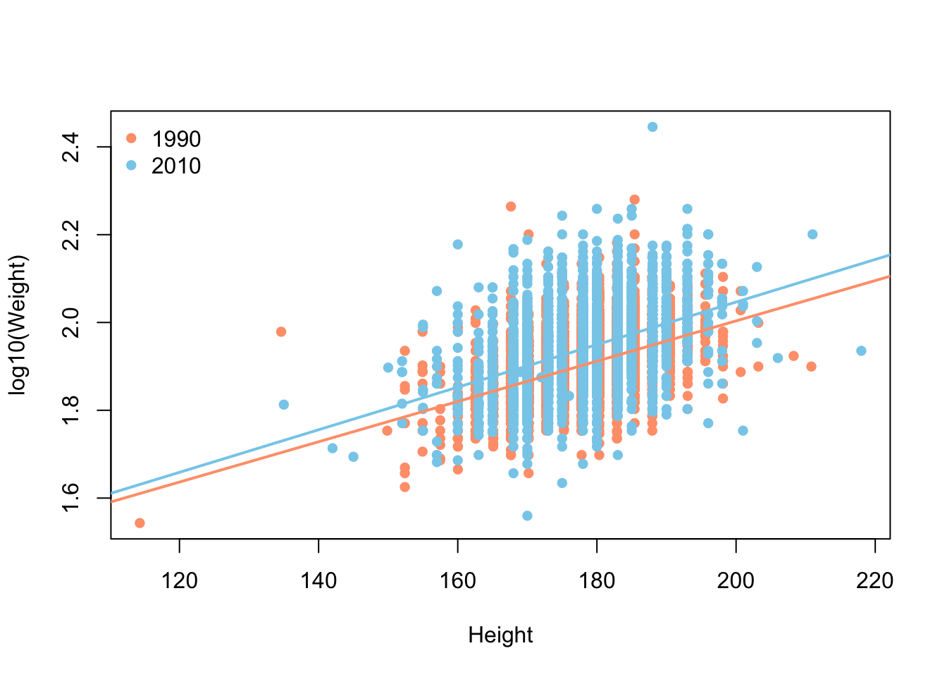
19.6 Exercises
-
Count the other way. We tabulated
Yearwith base R’stable()and withdplyr’scount(). Do the same for theSexcolumn using both dialects, and confirm they report the same group sizes in different formats.NoteSolution -
A boxplot, both ways. Earlier we drew a boxplot of
WeightbySexfor the 2010 data. Draw the equivalent forHeightbySex, once with base R’splot()and once withggplot2.NoteSolution# base R plot(Height ~ Sex, brfss_2010_DF)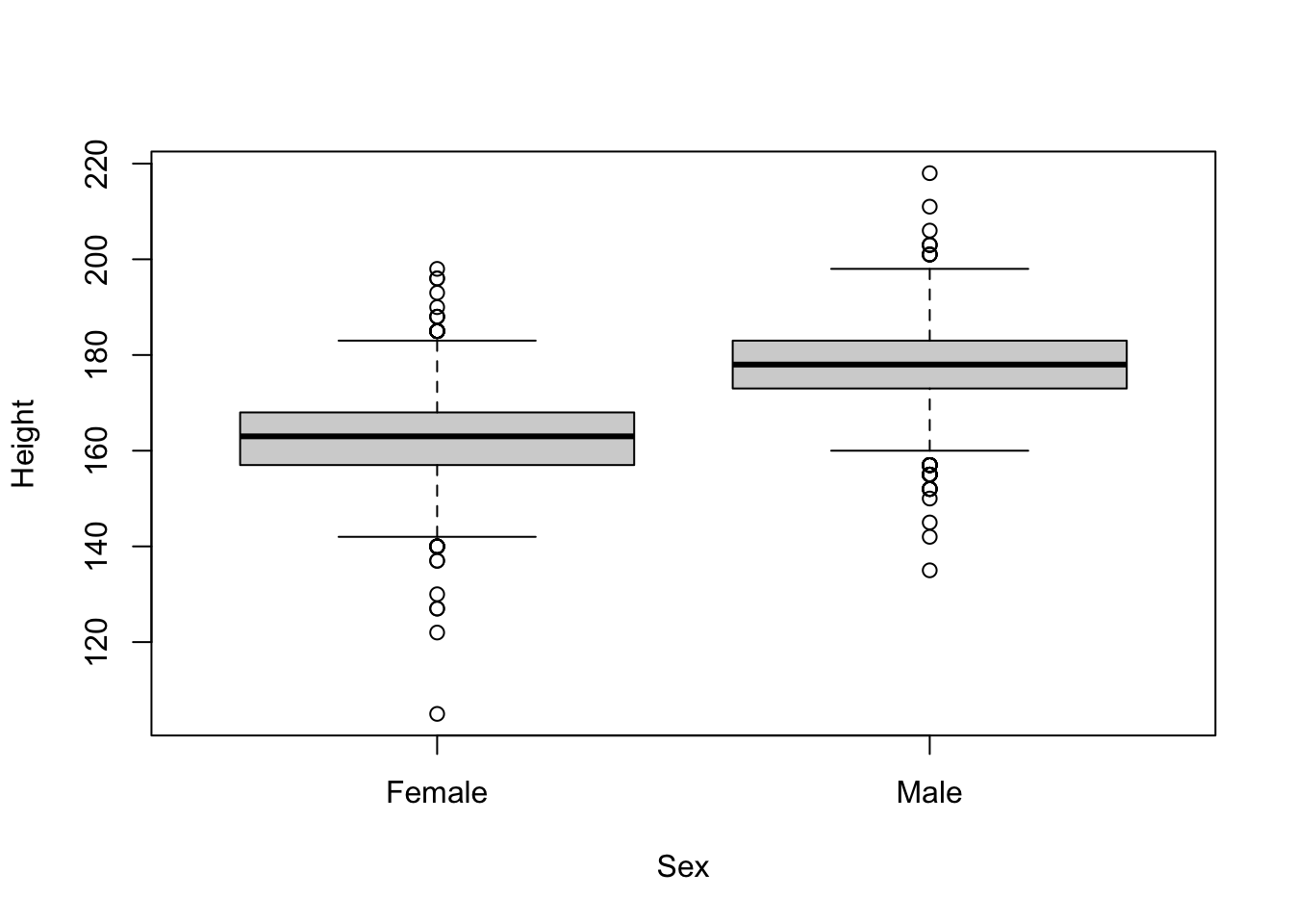
# ggplot2
ggplot(brfss_2010_tbl) +
    aes(x = Sex, y = Height) +
    geom_boxplot()
Warning: Removed 127 rows containing non-finite outside the scale range (`stat_boxplot()`).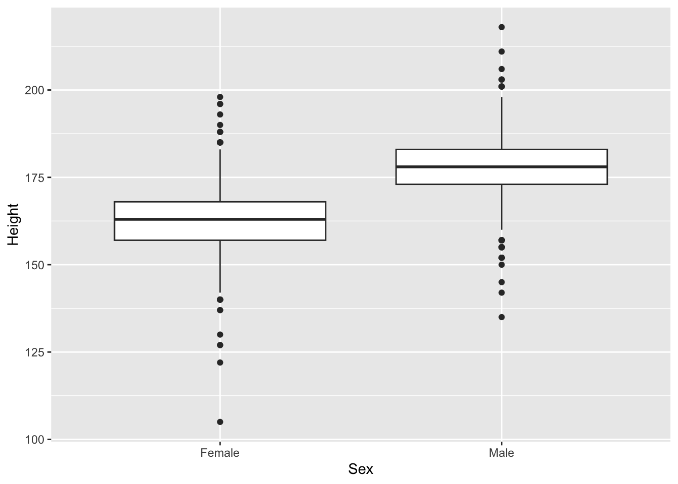
The base R formula
Height ~ Sexreads “Height as a function of Sex”; inggplot2the same mapping is spelled out inaes().
19.7 Summary
You’ve now seen the same analysis — loading, tabulating, summarizing, and plotting — written twice, in two of R’s most common dialects:
-
Reading data:
read.csv()gives a basedata.frame;readr::read_csv()gives a tibble, which is a data frame with friendlier printing and type guessing. -
Summarizing: base R reaches for
table()andaggregate();dplyrusescount(),summarize(), andgroup_by(), often reshaped withtidyr::pivot_wider(). -
Plotting: base graphics build a plot with
plot()plus helpers likelines()andlegend();ggplot2builds it up in layers from anaes()mapping andgeom_*()functions.
Neither dialect is the winner. Base R is always available and concise for quick checks; the tidyverse shines when a pipeline of steps needs to stay readable. Knowing both means you can read anyone’s code and pick the clearer tool for the job in front of you.