Exploratory data analysis (EDA) is an approach to analyzing data sets to summarize their main characteristics, often with visual methods. A statistical model can be used or not, but primarily EDA is for seeing what the data can tell us beyond the formal modeling or hypothesis testing task.
EDA is a crucial step in the data analysis process. It allows us to understand the data, identify patterns, and develop hypotheses. EDA is also useful for identifying outliers, missing values, and other data quality issues.
It is worth noting that EDA is not a formal process. There are no strict rules or guidelines for conducting EDA. Instead, it is an iterative process that involves exploring the data from multiple angles to gain a comprehensive understanding of the data.
6.2 The insurance dataset
We are going to load up our insurance.csv dataset again and explore it in detail.
Rows: 1338 Columns: 7
── Column specification ────────────────────────────────────────────────────────
Delimiter: ","
chr (3): sex, smoker, region
dbl (4): age, bmi, children, charges

ℹ Use `spec()` to retrieve the full column specification for this data.
ℹ Specify the column types or set `show_col_types = FALSE` to quiet this message.
At this point, you might want to refresh your memory of the contents of the insurance dataset.
How many rows does thd dataset have?
How many columns?
What are the column names for the dataset?
What are the data types in each column?
Possible solutions to the questions
nrow(insurance)ncol(insurance)# You could also use dim(insurance)colnames(insurance)# the `tibble` object gives column typeshead(insurance)# ORsummary(insurance)# ORlapply(insurance, class)
Before going further, let’s add the obese column again.
Check the structure of the insurance dataset again to ensure that you got what you wanted, a new column with either ‘obese’ or ‘not obese’ in each row.
6.3 Explore each variable (column)
When presented with a dataframe like the insurance data, we may want to interrogate the various columns to figure out what is in them. In this dataset, the columns are of two flavors. We can use the terms column and variable interchangably here since each column represents the measurements of that variable on a person.
The sex, smoker, and region variables are all categorical variables, in that they represent categories of “sex”, “smoker”, and “region”. The age, bmi, children, and charge variables represent numbers.
6.3.1 Categorical variables
For categorial variables, there are some useful functions to help summarize the data. But to do so, we need to be able to pull out the individual columns. Let’s take the “region” column as an example. All of the following will get us the region column.
The unique() function returns all unique values of a variable. The table() function counts the number of each value. While min() and max() are perhaps not that meaningful, they can sometimes be useful, even for categorical variables.
Can you explain what the min() and max() are doing here?
Do the same exercise with sex, smoker, and obese variables.
6.3.2 Numeric variables
The other variables in our insurance dataset are numeric. Note that they are not all continuous numbers, though, with some of them being quite discrete (there are no fractional numbers of children).
For numerical variables, we can start to use statistics to summarize the data.
What is a statistic?
A statistic is a single value that summarizes a dataset. We use them all the time in data analysis. The mean, median, standard deviation, mode, etc. are all univariate statistics. Correlation is an example of a bivariate statistic that summarizes the relationship between two variables. Statistics like the t-statistic summarize the differences in centrality between two samples.
The summary() function gets us a bunch of statistics quickly.
      age            sex                 bmi           children
 Min.   :18.00   Length:1338        Min.   :15.96   Min.   :0.000
 1st Qu.:27.00   Class :character   1st Qu.:26.30   1st Qu.:0.000
 Median :39.00   Mode  :character   Median :30.40   Median :1.000
 Mean   :39.21                      Mean   :30.66   Mean   :1.095
 3rd Qu.:51.00                      3rd Qu.:34.69   3rd Qu.:2.000
 Max.   :64.00                      Max.   :53.13   Max.   :5.000
    smoker             region             charges         obese
 Length:1338        Length:1338        Min.   : 1122   Length:1338
 Class :character   Class :character   1st Qu.: 4740   Class :character
 Mode  :character   Mode  :character   Median : 9382   Mode  :character
                                       Mean   :13270
                                       3rd Qu.:16640
                                       Max.   :63770
We can also apply individual statistical measures to a single column.
And even though the children variable/column is a numeric column, we may still be interested in the unique values or a table showing the distribution of the number of children per patient.
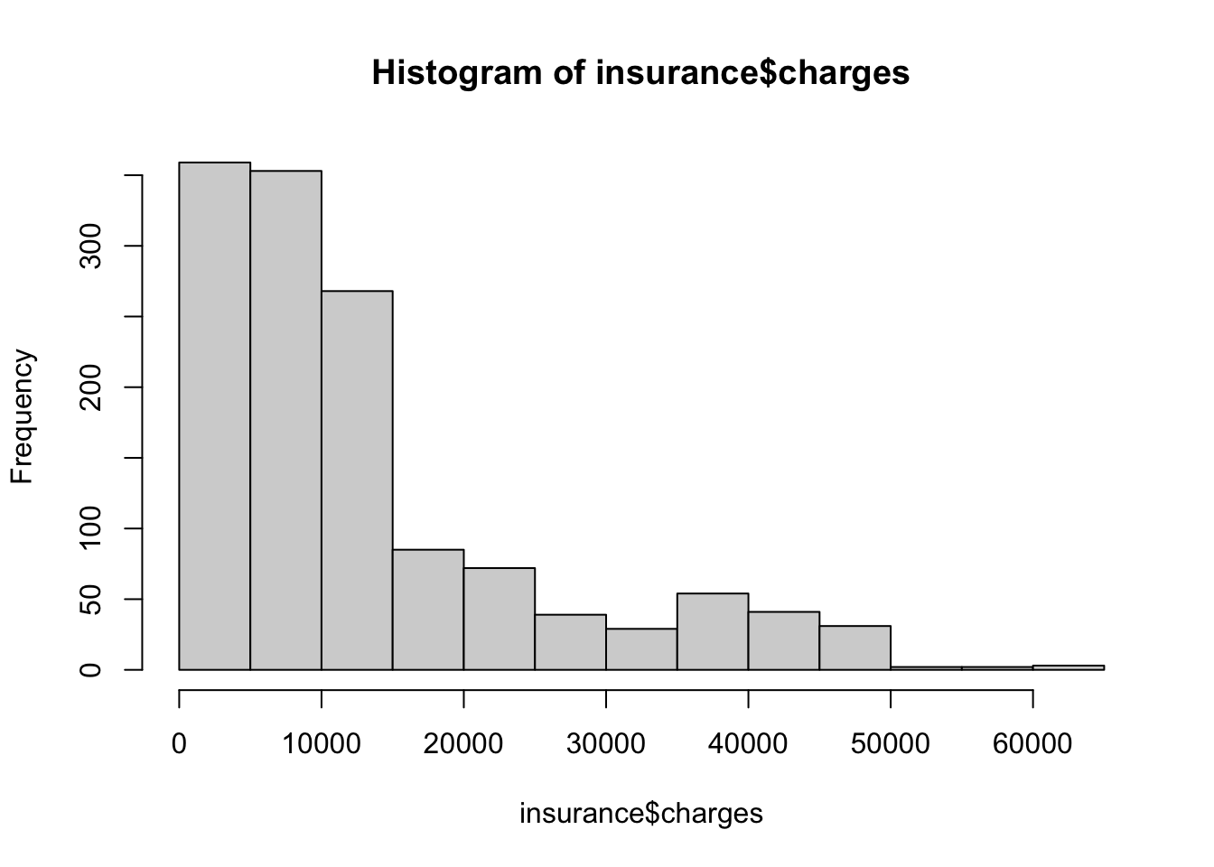
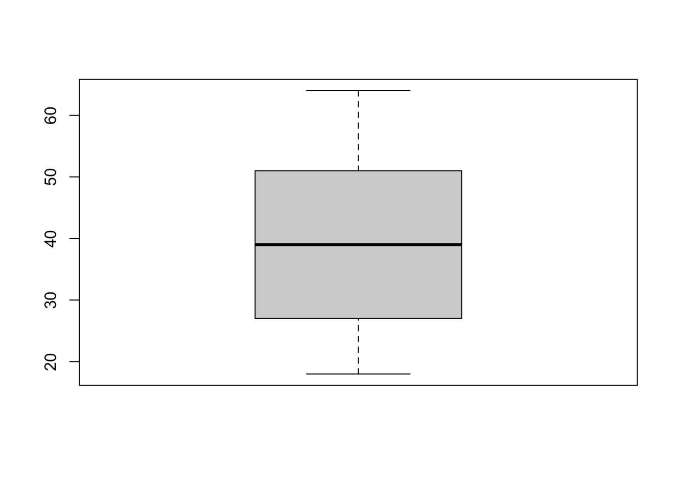
We may also be interested in seeing the distribution of a numeric variable graphically. The histogram hist() is probably the most common way of examining the distribution of a numeric variable.
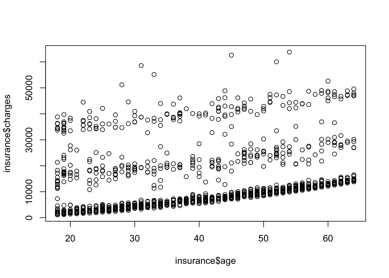
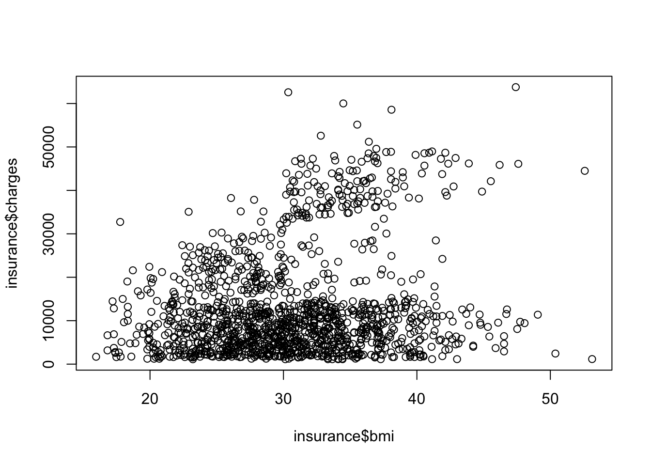
What do you see in this table? Is this a useful way to look at the data?
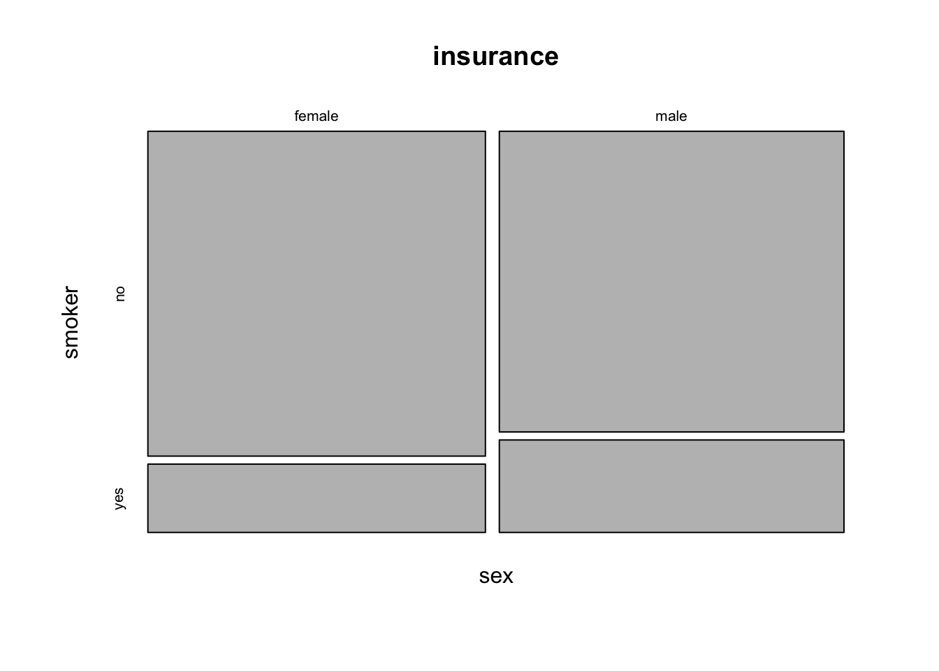
Another way to look at the relationship between two categorical variables is to use a mosaic plot. What is a mosaic plot? A mosaic plot is a special type of stacked bar chart that shows percentages of data in groups. The plot is a graphical representation of a contingency table. How are mosaic plots used? Mosaic plots are used to show relationships and to provide a visual comparison of groups.
The ~ symbol is used to specify the formula interface in R. The formula interface is used in many R functions to specify the relationship between variables. In this case, we are specifying that we want to look at the relationship between sex and smoker in the insurance dataset.
In other uses, the formula interface is used to specify the relationship between the dependent and independent variables in a regression model. For example, y ~ x specifies that y is the dependent variable and x is the independent variable.
6.4.2 Categorical vs. numeric
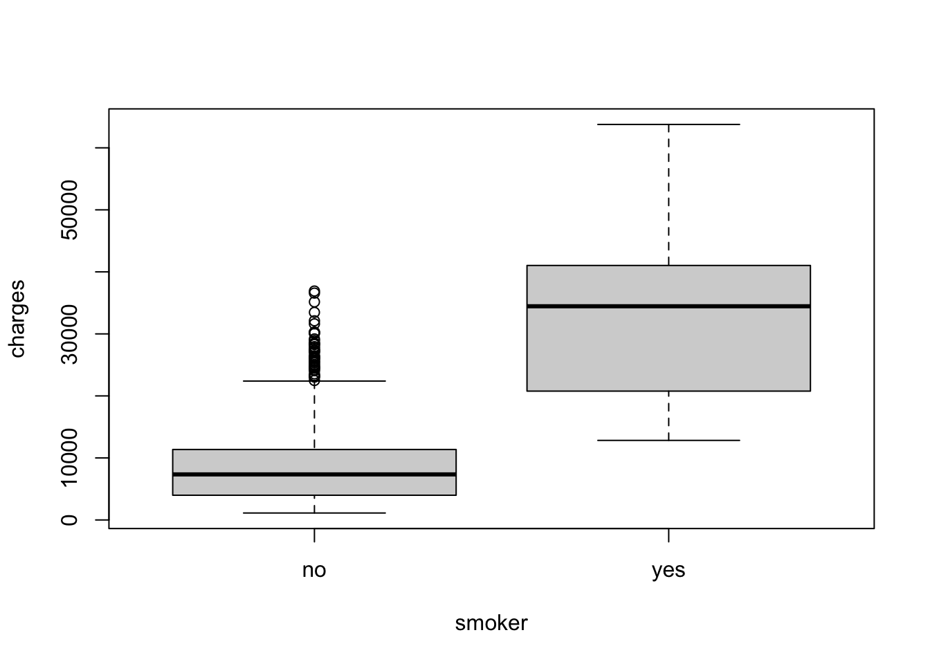
We can also look at the relationship between a categorical and a numeric variable. One way to do this is to use a boxplot.
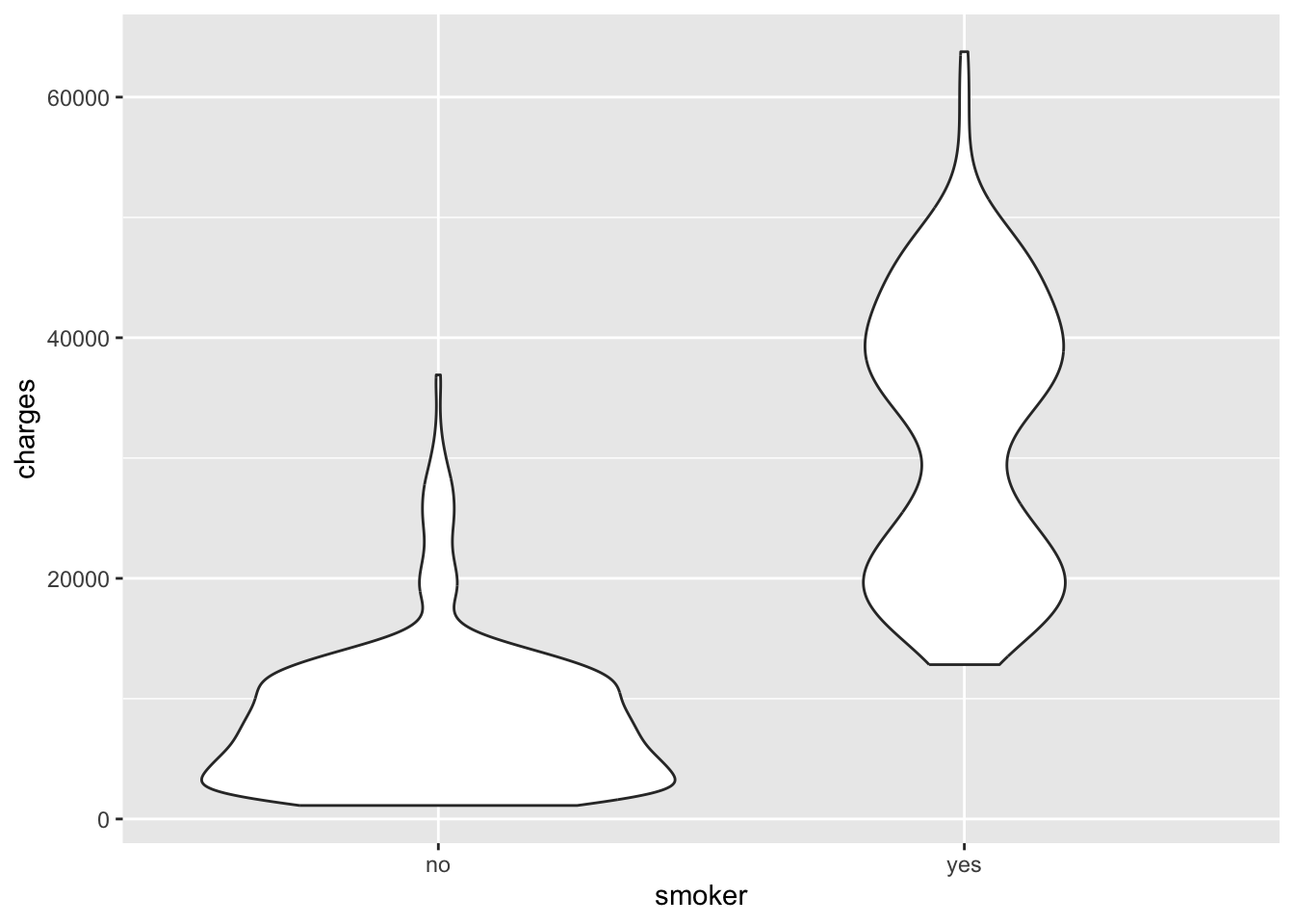
Another way to look at the relationship between a categorical and a numeric variable is to use a violin plot. What is a violin plot? A violin plot is a method of plotting numeric data and can be considered a combination of the box plot and the kernel density plot.
This is our first introduction to the ggplot2 package. The ggplot2 package is a plotting system for R, based on the grammar of graphics. It is a powerful and flexible package that allows you to create complex plots with relatively little code.
We’ll be using ggplot2 a lot in the future, so this is just a “hello world” example.
Source Code
# Exploratory data analysis## What is exploratory data analysis?Exploratory data analysis (EDA) is an approach to analyzing data sets to summarize their main characteristics, often with visual methods. A statistical model can be used or not, but primarily EDA is for seeing what the data can tell us beyond the formal modeling or hypothesis testing task.EDA is a crucial step in the data analysis process. It allows us to understand the data, identify patterns, and develop hypotheses. EDA is also useful for identifying outliers, missing values, and other data quality issues.It is worth noting that EDA is not a formal process. There are no strict rules or guidelines for conducting EDA. Instead, it is an iterative process that involves exploring the data from multiple angles to gain a comprehensive understanding of the data.## The `insurance` datasetWe are going to load up our `insurance.csv` dataset again and explore it in detail. ```{r}insurance_url <-"https://raw.githubusercontent.com/stedy/Machine-Learning-with-R-datasets/master/insurance.csv"insurance <- readr::read_csv(insurance_url)```At this point, you might want to refresh your memory of the contents of the `insurance` dataset. - How many rows does thd dataset have?- How many columns?- What are the column names for the dataset?- What are the data types in each column?```{r eval=FALSE}#| code-fold: true#| code-summary: Possible solutions to the questionsnrow(insurance)ncol(insurance)# You could also use dim(insurance)colnames(insurance)# the `tibble` object gives column typeshead(insurance)# ORsummary(insurance)# ORlapply(insurance, class)```Before going further, let's add the `obese` column again. ```{r}insurance$obese <-ifelse(insurance$bmi >30, "obese", "not obese")```Check the structure of the `insurance` dataset again to ensure that you got what you wanted, a new column with either 'obese' or 'not obese' in each row. ## Explore each variable (column)When presented with a dataframe like the `insurance` data, we may want to interrogate the various columns to figure out what is in them. In this dataset, the columns are of two flavors. We can use the terms `column` and `variable` interchangably here since each column represents the measurements of that variable on a person.The sex, smoker, and region variables are all `categorical` variables, in that they represent categories of "sex", "smoker", and "region". The age, bmi, children, and charge variables represent numbers.### Categorical variablesFor categorial variables, there are some useful functions to help summarize the data. But to do so, we need to be able to pull out the individual columns. Let's take the "region" column as an example. All of the following will get us the region column.```{r eval=FALSE}insurance$regioninsurance[["region"]]insurance[, "region"]```The `unique()` function returns all unique values of a variable. The `table()` function counts the number of each value. While `min()` and `max()` are perhaps not that meaningful, they can sometimes be useful, even for categorical variables.Let's apply these to the `region` variable/column.```{r}unique(insurance$region)table(insurance[["region"]])min(insurance$region)max(insurance$region)```Can you explain what the `min()` and `max()` are doing here?Do the same exercise with sex, smoker, and obese variables.### Numeric variablesThe other variables in our `insurance` dataset are numeric. Note that they are not all `continuous` numbers, though, with some of them being quite discrete (there are no fractional numbers of children).For numerical variables, we can start to use `statistics` to summarize the data. ::: {.callout-important}## What is a statistic?A statistic is a single value that summarizes a dataset. We use them all the time in data analysis. The mean, median, standard deviation, mode, etc. are all univariate statistics. Correlation is an example of a bivariate statistic that summarizes the relationship between two variables. Statistics like the t-statistic summarize the differences in centrality between two samples. :::The `summary()` function gets us a bunch of statistics quickly. ```{r}summary(insurance)```We can also apply individual statistical measures to a single column.```{r}mean(insurance$age)```And even though the `children` variable/column is a numeric column, we may still be interested in the unique values or a table showing the distribution of the number of children per patient.```{r}unique(insurance$children)table(insurance$children)```We may also be interested in seeing the distribution of a numeric variable graphically. The histogram `hist()` is probably the most common way of examining the distribution of a numeric variable.```{r}hist(insurance$charges)```Plot the historgram of the other numeric variables.Another approach is to use a boxplot. ```{r}boxplot(insurance$age)```## Relationships between variablesWe can also start to look at the relationships between variables. Let's start with the relationship between `age` and `charges`.```{r}plot(insurance$age, insurance$charges)```What do you see in the plot?How about the relathionship between `bmi` and `charges`?```{r}plot(insurance$bmi, insurance$charges)```What do you see in this plot?### Categorical vs. categoricalWe can also look at the relationships between categorical variables. One way to do this is to use a `contingency table`.```{r}table(insurance$sex, insurance$smoker)```What do you see in this table? Is this a useful way to look at the data? Another way to look at the relationship between two categorical variables is to use a `mosaic plot`. What is a mosaic plot?A mosaic plot is a special type of stacked bar chart that shows percentages of data in groups. The plot is a graphical representation of a contingency table. How are mosaic plots used? Mosaic plots are used to show relationships and to provide a visual comparison of groups. ```{r}mosaicplot(~ sex + smoker, data = insurance)```What do you see in this plot?::: {.callout-note}## The `formula` interfaceThe `~` symbol is used to specify the formula interface in R. The formula interface is used in many R functions to specify the relationship between variables. In this case, we are specifying that we want to look at the relationship between `sex` and `smoker` in the `insurance` dataset.In other uses, the formula interface is used to specify the relationship between the dependent and independent variables in a regression model. For example, `y ~ x` specifies that `y` is the dependent variable and `x` is the independent variable.::: ### Categorical vs. numericWe can also look at the relationship between a categorical and a numeric variable. One way to do this is to use a `boxplot`.```{r}boxplot(charges ~ smoker, data = insurance)```What do you see in this plot? Another way to look at the relationship between a categorical and a numeric variable is to use a `violin plot`. What is a violin plot? A violin plot is a method of plotting numeric data and can be considered a combination of the box plot and the kernel density plot.This is our first introduction to the `ggplot2` package. The `ggplot2` package is a plotting system for R, based on the grammar of graphics. It is a powerful and flexible package that allows you to create complex plots with relatively little code.```{r}library(ggplot2)ggplot(insurance, aes(x = smoker, y = charges)) +geom_violin()```We'll be using `ggplot2` a lot in the future, so this is just a "hello world" example.