Chapter 5 Map visualizations
## Rows: 273,714
## Columns: 20
## $ name <chr> "Afghanistan", "Afghanistan", "Afghanistan", "Afghanis…
## $ topLevelDomain <list> [".af", ".af", ".af", ".af", ".af", ".af", ".af", ".a…
## $ alpha2Code <chr> "AF", "AF", "AF", "AF", "AF", "AF", "AF", "AF", "AF", …
## $ alpha3Code <chr> "AFG", "AFG", "AFG", "AFG", "AFG", "AFG", "AFG", "AFG"…
## $ capital <chr> "Kabul", "Kabul", "Kabul", "Kabul", "Kabul", "Kabul", …
## $ region <chr> "Asia", "Asia", "Asia", "Asia", "Asia", "Asia", "Asia"…
## $ subregion <chr> "Southern Asia", "Southern Asia", "Southern Asia", "So…
## $ population <int> 27657145, 27657145, 27657145, 27657145, 27657145, 2765…
## $ area <dbl> 652230, 652230, 652230, 652230, 652230, 652230, 652230…
## $ gini <dbl> 27.8, 27.8, 27.8, 27.8, 27.8, 27.8, 27.8, 27.8, 27.8, …
## $ borders <list> [<"IRN", "PAK", "TKM", "UZB", "TJK", "CHN">, <"IRN", …
## $ numericCode <chr> "004", "004", "004", "004", "004", "004", "004", "004"…
## $ cioc <chr> "AFG", "AFG", "AFG", "AFG", "AFG", "AFG", "AFG", "AFG"…
## $ ProvinceState <chr> NA, NA, NA, NA, NA, NA, NA, NA, NA, NA, NA, NA, NA, NA…
## $ CountryRegion <chr> "Afghanistan", "Afghanistan", "Afghanistan", "Afghanis…
## $ Lat <dbl> 33.93911, 33.93911, 33.93911, 33.93911, 33.93911, 33.9…
## $ Long <dbl> 67.70995, 67.70995, 67.70995, 67.70995, 67.70995, 67.7…
## $ date <date> 2020-01-22, 2020-01-23, 2020-01-24, 2020-01-25, 2020-…
## $ count <dbl> 0, 0, 0, 0, 0, 0, 0, 0, 0, 0, 0, 0, 0, 0, 0, 0, 0, 0, …
## $ subset <chr> "confirmed", "confirmed", "confirmed", "confirmed", "c…We need a description of the regions of the world.
The World object has a column, geometry, that describes the shape of each country
in the World dataset. Join the ejhu data.frame with the World data using
dplyr join as normal.
w2 = geo_ejhu %>%
dplyr::filter(!is.na(date) & subset=='confirmed') %>%
dplyr::group_by(iso_a3) %>%
dplyr::filter(date==max(date)) %>%
dplyr::mutate(cases_per_million = 1000000*count/pop_est) %>%
dplyr::ungroup()The R package ggplot2 has geospatial plotting capabilities built in for
geospatial simple features (sf) data types. In this first plot, we focus
in on Europe.
library(ggplot2)
# transform to lat/long coordinates
st_transform(w2, crs=4326) %>%
# Crop to europe (rough, by hand)
st_crop(xmin=-20,xmax=45,ymin=35,ymax=70) %>%
ggplot() +
geom_sf(aes(fill=cases_per_million)) +
scale_fill_continuous(
guide=guide_legend(label.theme = element_text(angle = 90),
label.position='bottom')
) +
labs(title='Cases per Million Inhabitants') +
theme(legend.position='bottom')
Another plot, but now for Africa.
library(ggplot2)
# transform to lat/long coordinates
st_transform(w2, crs=4326) %>%
# Crop to europe (rough, by hand)
st_crop(xmin=-20,xmax=50,ymin=-60,ymax=25) %>%
ggplot() +
geom_sf(aes(fill=cases_per_million)) +
scale_fill_continuous(
guide=guide_legend(label.theme = element_text(angle = 90),
label.position='bottom')
) +
labs(title='Cases per Million Inhabitants') +
theme(legend.position='bottom')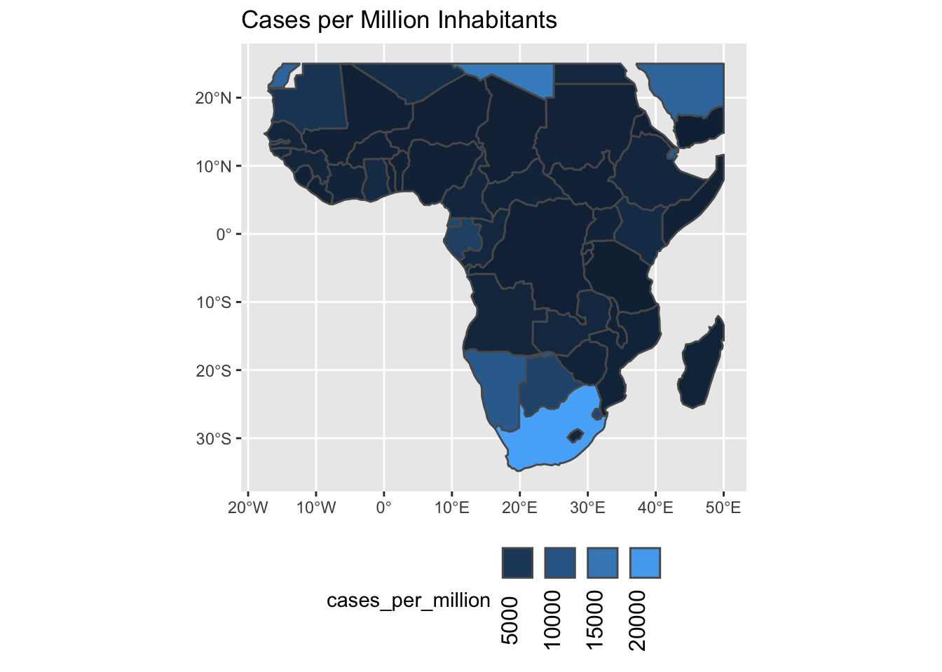
5.1 Interactive maps
The following will not produce a plot when run non-interactively. However, pasting this into your R session will result in an interactive plot with multiple “layers” that you can choose to visualize different quantitative variables on the map. Zooming also works as expected.
tmap_mode('view')
## geo_ejhu %>%
## filter(!is.na(date) & subset=='confirmed') %>%
## group_by(iso_a3) %>%
## filter(date==max(date)) %>%
## tm_shape() +
## tm_polygons(col='count')
w2 = geo_ejhu %>%
dplyr::filter(!is.na(date) & subset=='confirmed') %>%
group_by(iso_a3) %>%
dplyr::filter(date==max(date)) %>%
mutate(cases_per_million = 1000000*count/pop_est) %>%
dplyr::filter(region == 'Africa')
m = tm_shape(w2,id='name.x', name=c('cases_per_million'),popup=c('pop_est')) +
tm_polygons(c('Cases Per Million' = 'cases_per_million','Cases' = 'count',"Well-being index"='well_being', 'GINI'='gini'),
selected='cases_per_million',
border.alpha = 0.5,
alpha=0.6,
popup.vars=c('Cases Per Million'='cases_per_million',
'Confirmed Cases' ='count',
'Population' ='pop_est',
'gini' ='gini',
'Life Expectancy' ='life_exp')) +
tm_facets(as.layers = TRUE)
tmap_save(m, filename='abc.html')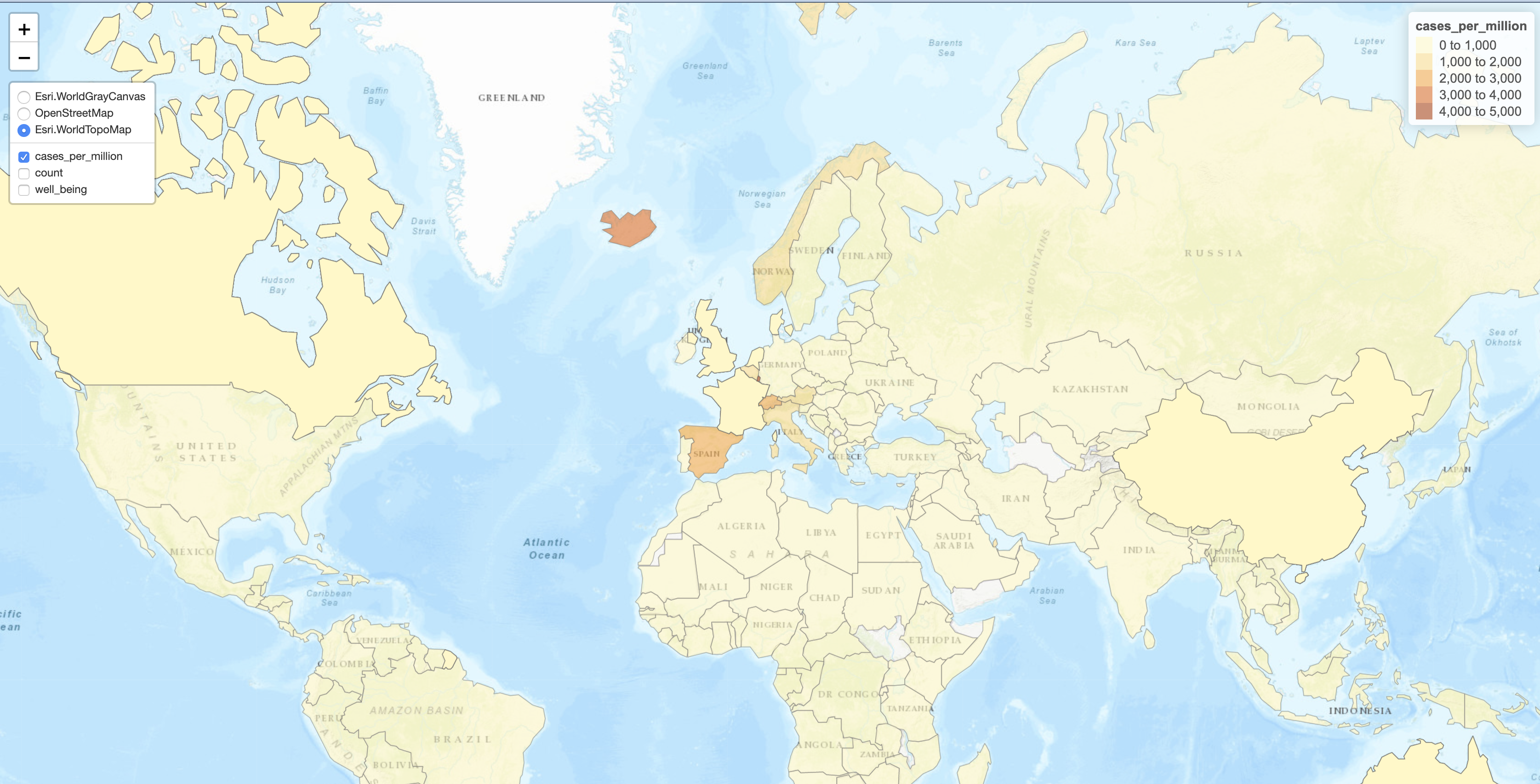
5.2 United States
county_geom = tidycensus::county_laea
nyt_counties = nytimes_county_data()
full_map = county_geom %>%
left_join(
nyt_counties %>%
group_by(fips) %>%
filter(date==max(date) & count>0 & subset=='confirmed'), by=c('GEOID'='fips')) %>%
mutate(mid=sf::st_centroid(geometry))
z = ggplot(full_map, aes(label=county)) +
geom_sf(aes(geometry=geometry),color='grey85') +
geom_sf(aes(geometry=mid, size=count, color=count), alpha=0.5, show.legend = "point") +
scale_color_gradient2(midpoint=5500, low="lightblue", mid="orange",high="red", space ="Lab" ) +
scale_size(range=c(1,10))
library(plotly)
ggplotly(z)United States confirmed cases by County with interactive plotly library. Click and drag to zoom in to a region of interest.
A static plot as a png:
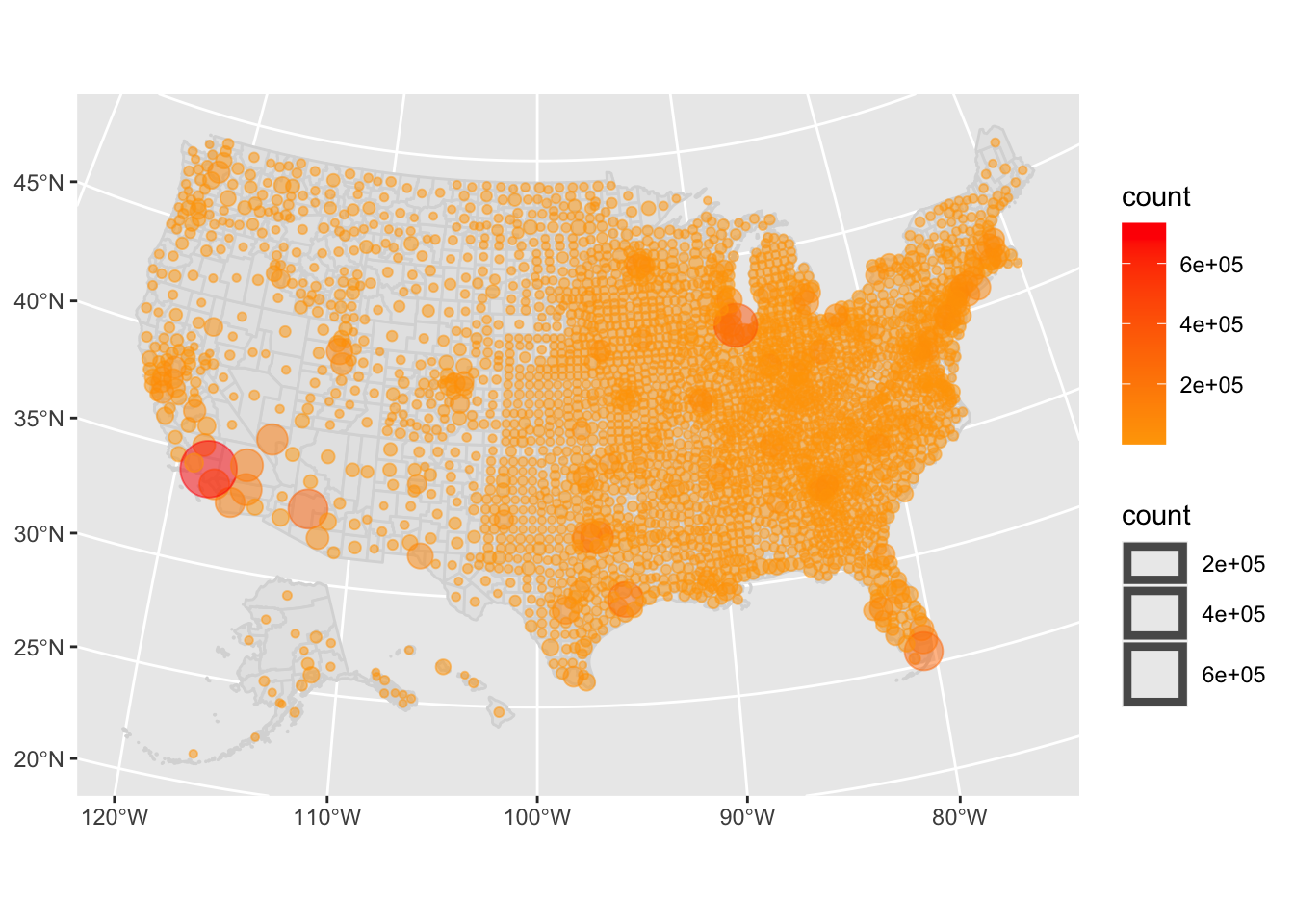
United States confirmed cases by County as a static graphic.
Alternatively, produce a PDF of the same plot.
## quartz_off_screen
## 25.3 Small multiples
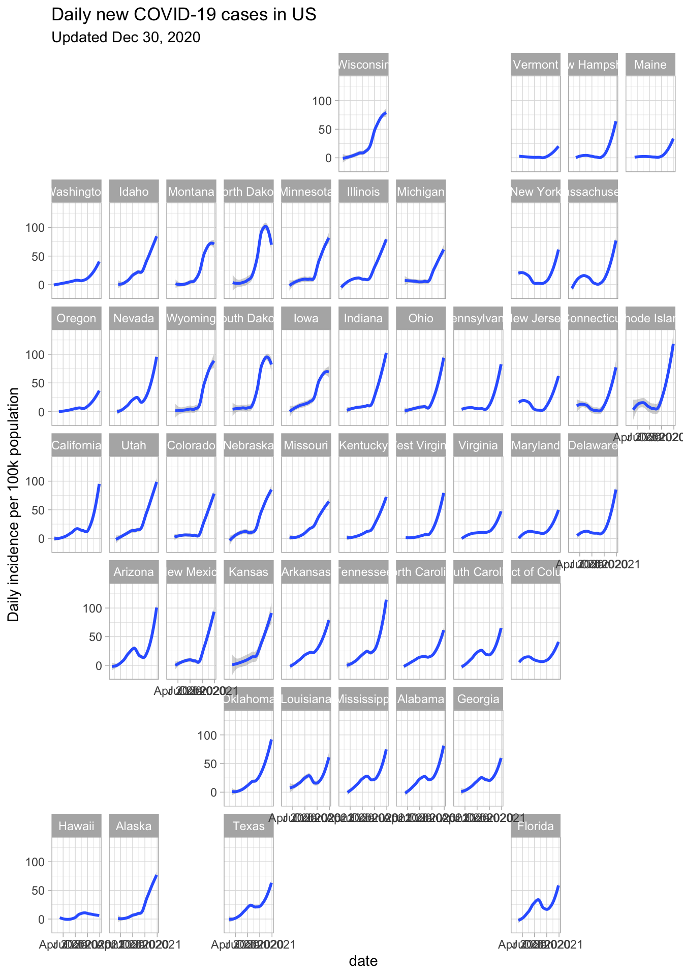
5.3.1 United states
library(sars2pack)
library(tidycensus)
library(dplyr)
library(ggplot2)
library(sf)
nys = nytimes_state_data() %>%
dplyr::filter(subset=='confirmed') %>%
add_incidence_column(grouping_columns = c('state'))
state_pops <-
suppressMessages(
get_acs(geography = "state",
variables = "B01003_001",
geometry = TRUE)) %>%
mutate(centroid = st_centroid(geometry))
nyspop = nys %>% left_join(state_pops, by=c('state'='NAME')) %>%
mutate(inc_pop = inc/estimate*100000)
library(geofacet)
ggplot(nyspop,aes(x=date, inc_pop)) +
geom_smooth() + facet_geo(~ state, grid=us_state_grid1) +
ylab('Daily incidence per 100k population') +
theme_light() +
ggtitle('Daily new COVID-19 cases in US',
subtitle=sprintf('Updated %s',format(Sys.Date(),'%b %d, %Y')))