Chapter 4 How much testing?
4.1 Outline of the problem
The COVID-19 pandemic has disrupted daily life throughout the world. Without a vaccine to confer immunity and lacking effective therapies once infected, public health measures such as social distancing, contact tracing, and case surveillance rule the day with respect to mitigating impacts of the disease on communities. As individual countries emerge from variable levels of lockdown, community testing to detect cases as quickly and thoroughly as possible is a recognized component of controlling the pandemic.
There is considerable agreement that widespread testing is a required component of moving beyond stay-at-home orders. The World Health Organization (WHO) has highlighted the need for extensive and widespread testing. Tedros Ghebreyesus, the chief executive of WHO, has suggested “You cannot fight a fire blindfolded. Our key message is test, test, test” (???). Robert Gallo, director of the Institute of Human Virology at the University of Maryland School of Medicine “is absolutely essential to control the epidemic” (???). Emily Gurley, an associate scientist at the Johns Hopkins Bloomberg School of Public Health told NPR (???), “Everyone staying home is just a very blunt measure. That’s what you say when you’ve got really nothing else. Being able to test folks is really the linchpin in getting beyond what we’re doing now.” Philip J. Rosenthal describes how early application of diagnostic testing lead to strong disease control in some countries (???).
So, how much testing is enough? Michael Ryan, executive director of the WHO Health Emergencies Program suggests that, “We would certainly like to see countries testing at the level of ten negative tests to one positive, as a general benchmark of a system that’s doing enough testing to pick up all cases.” (???) For particularly high-risk communities such as the elderly or those who are expected to come into contact with others regularly, aiming for a much lower proportion of positive test results is appropriate so as to capture the highest possible proportion of infected and infectious individuals.
Here, we present an intuitive and principled approach to visualizing comparative testing data for multiple geographic areas that visually presents:
- Quantity of testing across several orders-of-magnitude
- Proportion of positive test results
- Changes in testing and proportion positive tests over time
- Identifiable trends, including outlier behavior
- Progress toward meeting target proportion of positive testing
4.2 Motivation for visualization
We collected longitudinal testing datasets from Our World in Data
(OWID) (???) and the COVID Tracking Project
(covidtracking) (???) as provided by the R package,
sars2pack (???). The OWID collection tracks glogal test
reporting at the national level, though test reporting level (sample,
person, case, etc.) varies somewhat by country. The covidtracking
resource tracks state-level testing in the United States, again with
various definitions for what constitutes a test.
Each dataset is composed of one row per observation:
- Location
- Positive test results
- Total tests performed
- Date (in one-day increments)
One path of evolution for visualization approach is given in Figure ?? with a representative subset of states in the United States over 28 days ending 2020-12-30. Figure ??A depicts the proportion of positive tests on one day but does not provide any visual prompt of size of testing efforts. Figure ??B uses a scatterplot approach where the threshold for positive tests is a line. Let \(y\) be the number of positive tests and \(x\) be the total number of tests.
\[\begin{equation} y = mx + b \end{equation}\]
In equation (1), \(b\) is the y-intercept. Assuming that \(b = 0\) (since when no tests are done, \(x=0\) and \(y=0\)). The threshold for “enough” testing is when the slope, \(m\), is equal to the desired proportion of positive tests. Points that fall below the line given by equation (1) are doing adequate testing while those above should strive for more. The dashed line in Figure ??B is for \(m=0.1\) and the dotted line for \(m=0.2\). Interpreting results near the origin in Figure ??B is challenging given to the scale.
\[ \log_{10} y = \log_{10} x + \log_{10} m \]
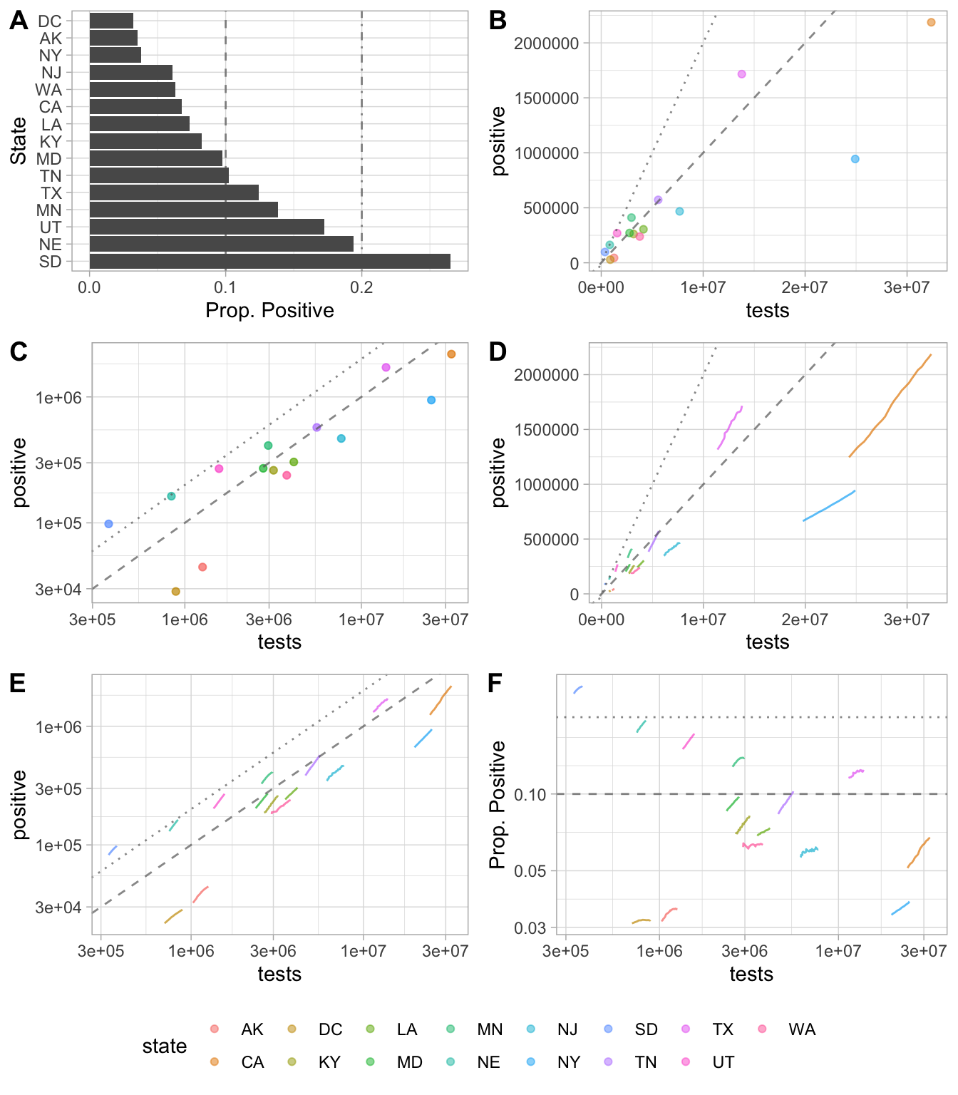
Testing and proportion of positive tests for several states in the United States over the past 28 days (2020-12-02 to 2020-12-30). Included in all panels for orientation, dashed line represents 10 threshold for positive tests and dotted line represents 20. Bar chart of proportion of positive tests at a single time point on the last day of the 28-day window (A) gives no sense of number of tests performed. Positive tests vs total number of tests (B) is hard to interpret near the origin. A log-log plot of positive tests vs total tests (C) deals with visualizing more clearly, but note that ….
\[\begin{equation} y = mx + b \end{equation}\]
\[\begin{align} b = 0\\ y = mx \\ \log_{10}y = \log_{10}xm \\ \log_{10}y = \log_{10}x + \log_{10}m \\ X = log_{10}x, Y=log_{10}y, M=log_{10}m \\ Y = X + M \\ X=0, Y=M=log_{10}m \end{align}\]
4.3 Intuitive visualization of amount of testing
See Figure ??.
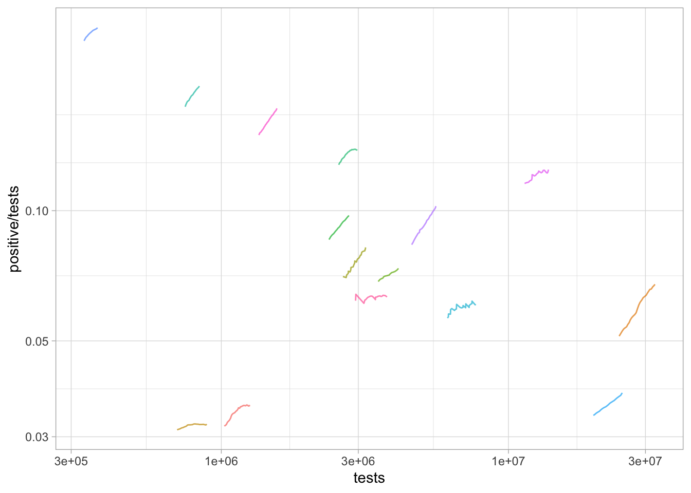
United States testing results.
Worldwide testing results.
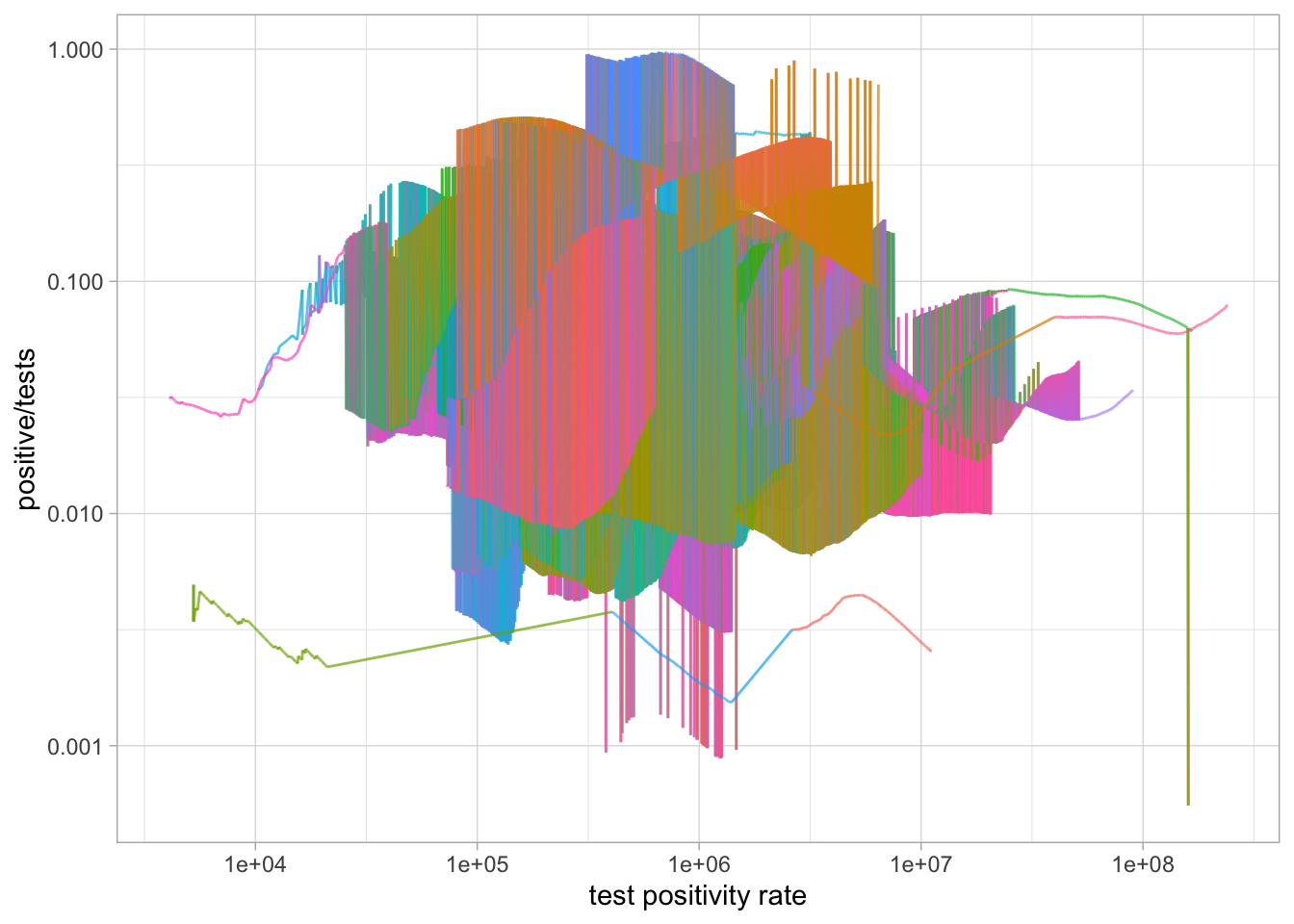
Worldwide testing results.