Chapter 3 Case tracking data
Datasets accessed from the internet come in many forms. We reformat the data into “tidy” data.frames that are described here.
The case-tracking datasets each contain at least one date column,
one count column that describe some quantity of people over
time. A third column, subset is often (but not always) present and
describes the type of “counting” for each record. For instance, common
values for subset are “confirmed” and “deaths”. Additional columns,
if present, usually specify geographical data for each record such as
the name of the city, state, country, etc.
The dataset from Johns Hopkins University is one example that we can look at to get familiar with the data.
jhu = jhu_data()
## Warning in with_tz(Sys.time(), tzone): Unrecognized time zone ''

## Warning in with_tz(Sys.time(), tzone): Unrecognized time zone ''

## Warning in with_tz(Sys.time(), tzone): Unrecognized time zone ''
colnames(jhu)
## [1] "ProvinceState" "CountryRegion" "Lat"           "Long"
## [5] "date"          "count"         "subset"
head(jhu)
## # A tibble: 6 x 7
##   ProvinceState CountryRegion   Lat  Long date       count subset
##   <chr>         <chr>         <dbl> <dbl> <date>     <dbl> <chr>
## 1 <NA>          Afghanistan    33.9  67.7 2020-01-22     0 confirmed
## 2 <NA>          Afghanistan    33.9  67.7 2020-01-23     0 confirmed
## 3 <NA>          Afghanistan    33.9  67.7 2020-01-24     0 confirmed
## 4 <NA>          Afghanistan    33.9  67.7 2020-01-25     0 confirmed
## 5 <NA>          Afghanistan    33.9  67.7 2020-01-26     0 confirmed
## 6 <NA>          Afghanistan    33.9  67.7 2020-01-27     0 confirmed
dplyr::glimpse(jhu)
## Rows: 273,714
## Columns: 7
## $ ProvinceState <chr> NA, NA, NA, NA, NA, NA, NA, NA, NA, NA, NA, NA, NA, NA,…
## $ CountryRegion <chr> "Afghanistan", "Afghanistan", "Afghanistan", "Afghanist…
## $ Lat           <dbl> 33.93911, 33.93911, 33.93911, 33.93911, 33.93911, 33.93…
## $ Long          <dbl> 67.70995, 67.70995, 67.70995, 67.70995, 67.70995, 67.70…
## $ date          <date> 2020-01-22, 2020-01-23, 2020-01-24, 2020-01-25, 2020-0…
## $ count         <dbl> 0, 0, 0, 0, 0, 0, 0, 0, 0, 0, 0, 0, 0, 0, 0, 0, 0, 0, 0…
## $ subset <chr> "confirmed", "confirmed", "confirmed", "confirmed", "co…3.1 Compare US datasets
We can employ comparisons of the multiple case-tracking datasets that
capture the cases at a US state level to get a sense of systematic
biases in the data and look for agreement across datasets. One
convenience function, combined_us_cases_data(), yields a stacked
dataframe with an identifier for each dataset.
us_states = combined_us_cases_data()
## Warning in with_tz(Sys.time(), tzone): Unrecognized time zone ''

## Warning in with_tz(Sys.time(), tzone): Unrecognized time zone ''

## Warning in with_tz(Sys.time(), tzone): Unrecognized time zone ''
head(us_states)
## # A tibble: 6 x 6
## # Groups:   fips [1]
##   dataset date       fips  count incidence state
##   <chr>   <date>     <chr> <dbl>     <dbl> <chr>
## 1 jhu     2020-01-22 00001     0        NA AL
## 2 jhu     2020-01-23 00001     0         0 AL
## 3 jhu     2020-01-24 00001     0         0 AL
## 4 jhu     2020-01-25 00001     0         0 AL
## 5 jhu     2020-01-26 00001     0         0 AL
## 6 jhu     2020-01-27 00001     0         0 AL
table(us_states$dataset)
##
## covidtracker          jhu      nytimes
##        16931        17836        16569
To get a sense of the data and their meaning, consider the following series of graphs based on three “randomly” chosen states.
The position_dodge here just moves the lines apart a bit so they do
not overlap and hide each other. The “confirmed cases” plot here shows
that over time, the datasets agree quite well. Adapting the
plot_epicurve() function a bit, we can quickly construct faceted,
stratified curves showing the behavior of three datasets across three
states over time.
plot_epicurve(us_states,
              filter_expression = state %in% interesting_states & count>10,
              case_column = 'count', color='dataset') +
    facet_grid(rows=vars(state)) + geom_line(position=pd) +
    ggtitle('Cumulative cases')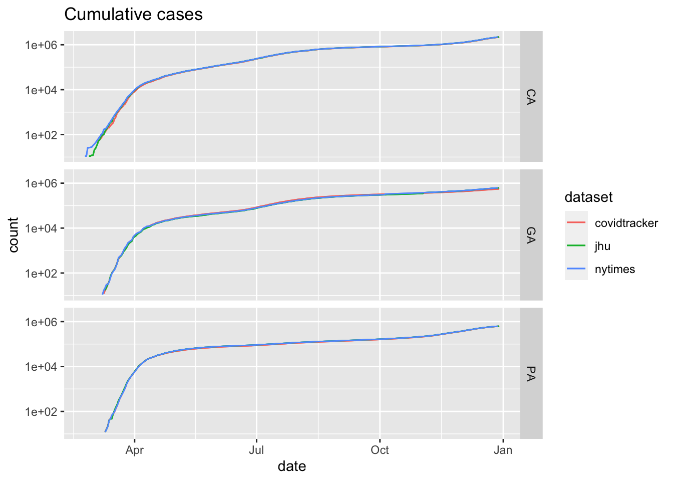
Confirmed cases from combined US states datasets for three states
However, the infection rate is more easily visualized with daily incidence curves.
plot_epicurve(us_states,
              filter_expression = state %in% interesting_states & incidence>10,
              case_column = 'incidence', color='dataset', log=FALSE) +
    facet_grid(cols=vars(state)) + geom_line(position=pd) +
    geom_smooth(alpha=0.4) + ggtitle('Daily reported cases')
## `geom_smooth()` using method = 'loess' and formula 'y ~ x'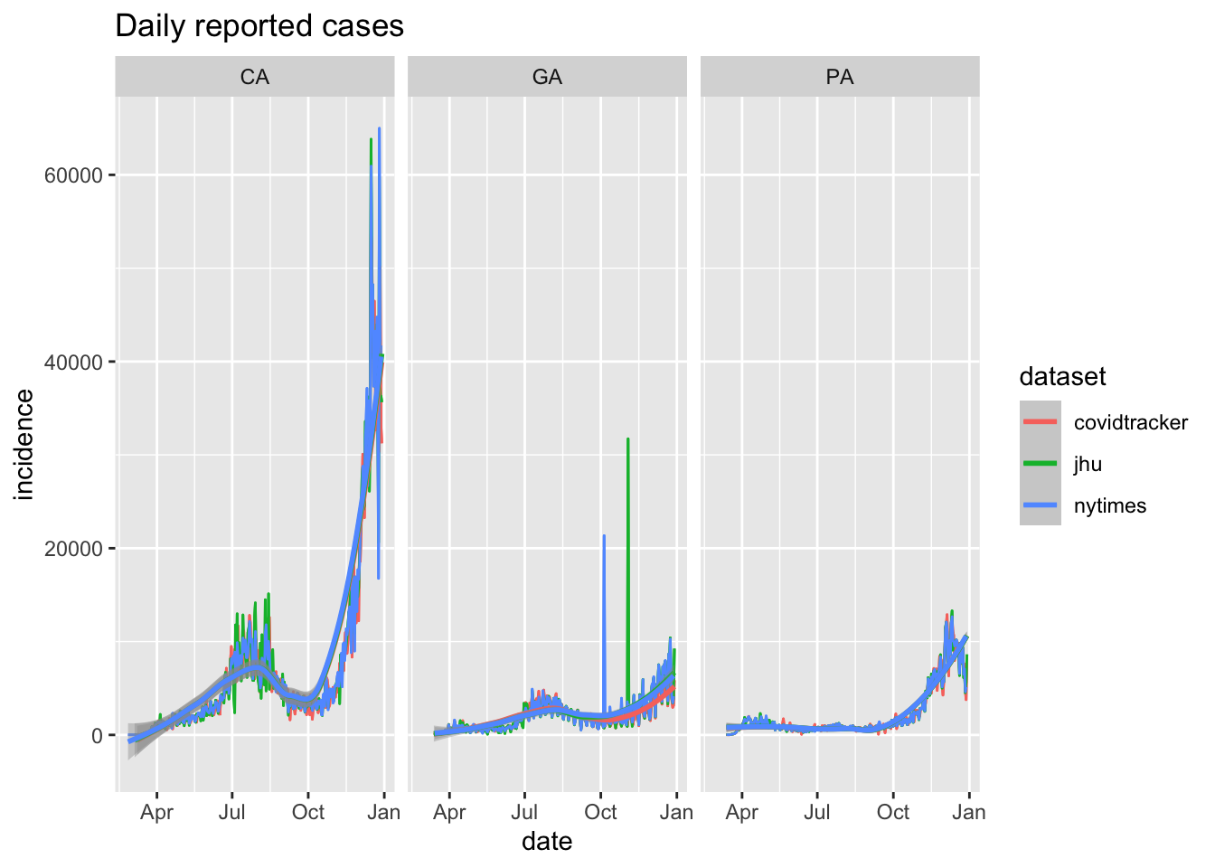
Daily incidence for three states from multiple data sources
library(zoo)
##
## Attaching package: 'zoo'
## The following objects are masked from 'package:base':
##
##     as.Date, as.Date.numeric
ecdc_data() %>%
    dplyr::filter(subset=='deaths') %>%
    dplyr::group_by(date,continent) %>%
    dplyr::summarize(count=sum(count)) %>%
    dplyr::group_by(continent) %>%
    dplyr::mutate(roll_mean = zoo::rollmean(count, 7, na.pad=TRUE)) %>%
    add_incidence_column(count_column='roll_mean', grouping_columns = c('continent')) %>%
    dplyr::filter(inc>0) %>%
    plot_epicurve(case_column='inc',color='continent', log=FALSE) +
    ylab('Daily reported deaths') +
    ggtitle('Daily reported deaths over time', subtitle='by continent (7-day moving average)')
## Warning in with_tz(Sys.time(), tzone): Unrecognized time zone ''
## `summarise()` regrouping output by 'date' (override with `.groups` argument)
Worldwide daily reported deaths by continent (seven day moving average)